Relevant Overviews
www.nngroup.com

User journeys should be managed like products — by people and teams with specialized, journey-dedicated roles who continually research, measure, optimize, and orchestrate the experience.
blog.prototypr.io

Tried and true principles for the past, present, and future of good design
tannerchristensen.com

there are many straightforward methods and strategies for measuring design impact. Two areas I recently combined while exploring the design impact at Gem—where we're building the source of truth for top-of-funnel recruiting—are top tasks and PURE (Pragmatic Usability Ratings by Experts). Here's how I did it.
uxplanet.org
One of these roles is a UX Strategist, which aligns user experience design with the business goals and strategy of the company.
uxdesign.cc
It isn’t a mystery that a large part of delivering a highly successful user experience is understanding what the customer wants/needs along with the cognition that consequently gets customers thinking about what they want/need.
blog.prototypr.io
what the differences are between the many different types of visualizations, from “flow-charts” to “User Flows,” and why so many people misunderstand them.
jonyablonski.com

This article explores a few cognitive biases I’ve experienced first-hand as well as strategies for mitigating their influence.
gerrymcgovern.com
As designers, as creators and managers of websites and apps, we can start by focusing on two principles: Do not track Delete
www.nngroup.com

Any efficient communication requires that communication partners establish and rely on common ground so that they can take communication shortcuts.
www.nngroup.com

Succinctly documenting the right details in key places helps Agile teams avoid information overload. When UX documentation is skipped or disorganized, teams waste time trying to find or remember information instead of improving the product.
www.nngroup.com

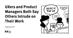
A survey of people in user experience and product management shows that these professionals disagree on who should be responsible for many key tasks, like doing discoveries and early design.
www.nngroup.com
A survey of 372 UX and PM professionals shows that duplicative work is frequent and generates confusion and inefficiency.
www.nngroup.com

Vertical navigation is a good fit for broad or growing IAs, but takes up more space than horizontal navigation. Ensure that it is left-aligned, keyword front-loaded, and visible.
Like
ux,
web design,
information architecture,
user experience,
clear menu,
clear navigation,
visual design
design.zeta.in

For digital designers who want to organise their working files to improve clarity and collaboration within and across teams
uxdesign.cc
Clarity, not creativity, is the backbone of good UX writing. Choose simple words and craft shorter sentences. Explain acronyms users might not know. Use proper punctuation. Be extra careful about things like cleverness, wordplay, and idioms that might affect usability. Above all, write to be understood.
boagworld.com

Probably my biggest frustrations ... is the utter contempt they seem to hold content in. ... they won’t hire a professional copywriter to work on the content ... never teach content creators how to create appropriate web content.
Do
ux,
web design,
content,
web writing,
content creation,
web architecture,
user experience,
content management,
copywriting
www.nngroup.com

A clear visual hierarchy guides the eye to the most important elements on the page. It can be created through variations in color and contrast, scale, and grouping.
Like
ux,
web design,
content,
user experience,
visual communication,
visual content,
visual hierarchy
www.nngroup.com

Refrain from opening new browser windows. [...] Carefully examine the user’s context, task at hand, and next steps when deciding whether to open links to documents and external sites in the same or a new browser tab."
lawsofsimplicity.com
Law 1 / Reduce - The simplest way to achieve simplicity is through thoughtful reduction.Law 2 / Organize - Organization makes a system of many appear fewer.Law 3 / Time - Savings in time feel like simplicity.Law 4 / Learn - Knowledge makes everything simpler.Law 5 / Differences - Simplicity and complexity need each other.Law 6 / Context - What lie…
Like
ux,
web design,
design,
content creation,
content structure,
user experience,
content management,
user behaviour
boagworld.com

"Designers love it, website owners want to fill it. Whitespace seems to be one of the most controversial aspects of design. Why then is it so important and how can we ensure it is maintained?"
theconversation.com

start to understand how we may need to balance social media with other more challenging, but ultimately more satisfying forms of communication
www.nngroup.com

Users have learned to ignore content that resembles ads, is close to ads, or appears in locations traditionally dedicated to ads.
www.nngroup.com
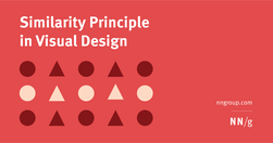
Summary: Design elements that appear similar in some way — sharing the same color, shape, or size — are perceived as related, while elements that appear dissimilar are perceived as belonging to separate groups.
timo-m-lange.myhub.ai
People do not read online: "fundamental scanning behaviors remain constant, even as designs change."
www.nngroup.com
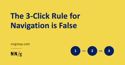
"While it is important to keep key information easily accessible, the 3-click rule is an arbitrary rule of thumb that is not backed by data."
www.nngroup.com

"Design for each channel’s unique strengths and role in the customer journey to create usable context-specific experiences."
www.nngroup.com
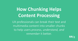
Chunking is a concept where text and multimedia content is broken up into smaller chunks to help users process, understand, and remember it better.
www.nngroup.com

Good evidence why coming up with ever new, more "beautiful", "attractive" and trendy designs that "pop" is not always a good thing.
gerrymcgovern.com
"A link is a promise. A menu is a selection of promises. Without the link there is no Web."
www.nngroup.com
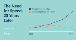
"In spite of an increase in Internet speed, webpage speeds have not improved over time."