Curated Resource ( ? )

Similarity Principle in Visual Design
Similarity Principle in Visual Design

my notes ( ? )

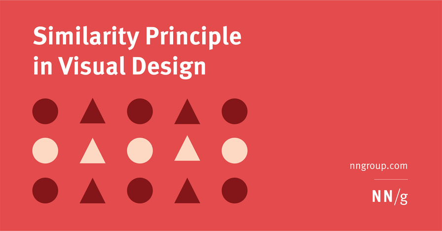
Summary: Design elements that appear similar in some way — sharing the same color, shape, or size — are perceived as related, while elements that appear dissimilar are perceived as belonging to separate groups.

Read the Full Post

The above notes were curated from the full post www.nngroup.com/articles/gestalt-similarity/.

Related reading

More Stuff I Like

More Stuff tagged ux , web design , design , web development , psychology and ux , visual design

See also: UX

Cookies disclaimer

MyHub.ai saves very few cookies onto your device: we need some to monitor site traffic using Google Analytics, while another protects you from a cross-site request forgeries. Nevertheless, you can disable the usage of cookies by changing the settings of your browser. By browsing our website without changing the browser settings, you grant us permission to store that information on your device. More details in our Privacy Policy.