Relevant Overviews
SUPA: A strategic UX service to validate projects early. Align user needs with business goals, mitigate risks, and shape product strategy from the start.

A simpler approach to a complicated topic.
Designing for digital products requires a different mindset than traditional websites. It’s all about continuous adaptation, refining, and iterating as user behavior and needs evolve. Paul Boag reflects on the key differences, including how the frequency of usage impacts your design approach and what you can do about it.
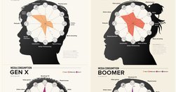
With frequent myths and actual behavior patterns that go beyond heavy use of social media
Tables frequently appear on the web but aren’t easy to design and code. People will expect tables. Not those fancy ones from design inspiration sites but Excel-looking monsters with hundreds of cells and complex interaction. In this case, a designer faces many challenges. With this illustrated guide, Slava Shestopalov explains the table anatomy and

As a designer, designing for trust in Artificial Intelligence (AI) products is paramount. AI presents unique challenges that require transparent interfaces, clear feedback, and ethical considerations to build user confidence.

Our research and evaluation show that there are currently few design-specific AI tools that meaningfully enhance UX design workflows. As of Spring 2024, AI isn’t ready for designers to take advantage of them. AI tools won’t be replacing UX designers any time soon. Currently available LLM-based tools are not shortcutting steps in the design process
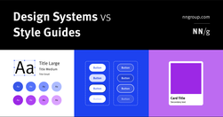
Design systems are a set of standards (like Google’s Material Design or IBM’s Carbon Design System) needed to manage design at scale. Style guides (like content or visual style guides) are just one piece in a design system.
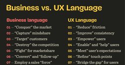
As designers, especially in large enterprises, we often might feel misunderstood and underappreciated. It might feel like every single day you have to fight for your users, explain yourself and defend your work. It’s unfair, exhausting, painful and frustrating.

Whitespace is an effective principle to achieve a balanced design, making it easier for your users to scan and read. Consider using a consistent spacing system and the proximity principle to achieve a balanced use of whitespace.
AI is accelerating change. Companies are reacting by “doing AI”without prioritizing the experience of the people on the receiving end–Design is more important than ever. To respond, we must get smart, fast. This starts with understanding the emerging patterns of interaction, affordances, and heuristics in an AI world. The pages below are summaries
Scrolling, scanning, skipping: How do users consume content online? Here’s what you need to know about reading behavior and design strategies to prevent harmful scanning patterns.
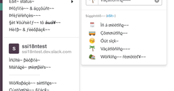
To prevent failure and make our designs more resilient, we need to explore edge cases and exceptions already during the design process. Let’s take a closer look at what to watch out for.
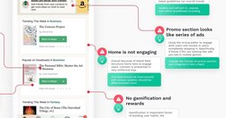
Good redesigns are evolutions, not revolutions. Useful guidelines on when and how to redesign, how to avoid pitfalls and how to help users embrace the new design.
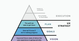
UX strategy is a plan of action that allows the organization to reach a higher state of user experience over a certain period of time. It lies at the intersection of product design and business strategy and serves as a guide for prioritizing and executing UX work over time.
Design System In 90 Days Canvas (FigJam template), with useful prompts to get a design system up and running — and adopted! — in 90 days, for small and large organizations that are building a design system or plan to set up one. Kindly shared by Dan Mall as a part of the Design System University. (shared by Vitaly Friedman, LinkedIn)
Effective homepages are simple and easy to access, communicate the organization’s and site’s purpose, show engaging content, and prompt users to take action.
html.to.design converts any website into fully editable Figma designs.
Design thinking is a non-linear, iterative process that can have anywhere from three to seven phases, depending on whom you talk to. The Hasso Plattner Institute of Design at Stanford (the d.school) proposes the five-stage design thinking model: Empathize, define, ideate, prototype, test.

Choosing the right prototyping tool can be difficult among the many options available. There are 5 key factors to consider when selecting the best fit for your project or team: project type and goals, cost, tool capabilities, learnability and ease of use, and stakeholder buy-in.

In a distracted environment, the best form of smartphone interaction is a high-speed, easy-to-use one. Luke calls the typical mobile usage a "one thumb, one eyeball" experience, since the highly distracted environment causes most mobile users to engage in one-handed use with short spans of partial attention.

Unsure where to start? Use this collection of links to our articles and videos to learn about visual design in UX.
Unsure where to start? Use this collection of links to our articles and videos to learn about design thinking.
We’re not as rational as we think. The human brain is designed to make quick and effective decisions rather than stick to facts at all times. Instead of acting rationally, we prefer to act fast. This may lead to better outcomes indeed, but it might also lead you astray. Cognitive biases can be both a blessing and a curse.

We can’t “fix” our minds and stop making errors in judgment, but we can become more aware of biases that influence our decision making.
Below is a list of cognitive biases and design principles (with examples and tips) for each category. Let’s dive right in.

Tried and true principles for the past, present, and future of good design

100. When we design products and services, it’s not about what we want them to be — it’s what we want the people using them to be: generous, helpful, thoughtful, useful, beautiful, respectful, kind.
Although successful websites typically have high usability, average sites can hurt their business by copying design elements that don't work well in other contexts.

ood UI design is all about guiding attention to what’s important. When making the right thing for the user the easy and obvious thing, you can’t ignore cognitive biases. After all, these biases are brain shortcuts that let us quickly and effortlessly make decisions and react to our environment.