Relevant Overviews

Generative-AI outputs need to be concise, scannable, follow the inverted pyramid, and use plain language.

The Problem: AI is destroying web economics. Google created a toxic incentive system. Traffic collapse is accelerating. Content creation incentives are disappearing. The Solution: Collective action to create scarcity. The Vision: A better future - quality over clickbait.
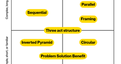
10 patterns to structure your content for understanding, engagement, and effectiveness - and a matrix to help you choose the right one.
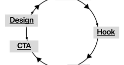
Content creation is more like building with Legos. You take different pieces and put them together to make something new. You start with a bunch of ideas, tools, and resources. Your job is to piece them together in a way that makes sense and connects with your audience. This means planning, organizing, and even redoing things.
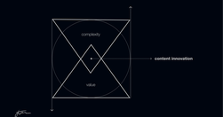
90% of that content is just digital noise. It's complex, confusing, and ultimately valueless to the audience. True content innovation requires the opposite approach. It's about simplifying and focusing on delivering maximum value. This is the content innovation paradox: Less complexity creates more value.

Websites and apps are our modern equivalent of phones. You create them so that people can serve themselves. Make your site or app a good conversational partner.
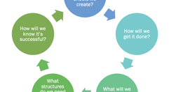
When organizations want to get more strategic about their content – when they want it to be more effective, more efficient, and advance their goals, they turn to content strategists. The core of what we do is to help the organization ask and answer key questions.
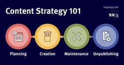
A content strategy is a high-level plan that guides the intentional creation and maintenance of information in a digital product.
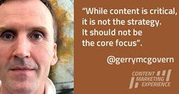
The single most important thing I’ve learned about online marketing is that it is about paying attention. Offline marketing is about getting attention, but once someone is on your website, they know what they want to do, so your first job is to help them do what they came to you website to do as quickly and easily as possible.

Probably my biggest frustrations ... is the utter contempt they seem to hold content in. ... they won’t hire a professional copywriter to work on the content ... never teach content creators how to create appropriate web content.

Whether we’re looking at The Correspondent, the world atlas or the national news, migration across the Mediterranean is depicted on maps as thick red arrows heading towards us. Far more than we realise, these arrows define how we view migration. Can that be changed?
The illusion of cheap storage has encouraged by far the worst hoarding habits in human history.

Users pay close attention to photos and other images that contain relevant information but ignore fluffy pictures used to "jazz up" web pages.
The Europa Web Guide is the official rulebook for the European Commission's web presence, covering editorial, legal, technical, visual and contractual aspects. All European Commission web sites must observe the rules and guidelines it contains. Web practitioners are invited to observe its contents and keep abreast of updates.
Quick accessibility checklist (by European Commission)
Writing tips from "Writing for the European Commission web presence"
Law 1 / Reduce - The simplest way to achieve simplicity is through thoughtful reduction.Law 2 / Organize - Organization makes a system of many appear fewer.Law 3 / Time - Savings in time feel like simplicity.Law 4 / Learn - Knowledge makes everything simpler.Law 5 / Differences - Simplicity and complexity need each other.Law 6 / Context - What lie…
Gerry McGovern on skills needed for digital communication people. For example: - choose the right word to drive action; - make it easy finding content allowing users to complete a task quickly; - design for maintenance and evolution; - love metadata, be an information architect. I wished I had all of those.
People do not read online: "fundamental scanning behaviors remain constant, even as designs change."

"The Huffington Post is the third most popular online news site, after only Yahoo! News and Google News. They must be doing something right!"

"Plain Language For Everyone, Even Experts" (video)

"Design for each channel’s unique strengths and role in the customer journey to create usable context-specific experiences."
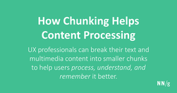
Chunking is a concept where text and multimedia content is broken up into smaller chunks to help users process, understand, and remember it better.
One self-experiment we all should try once: To understand this website based on its images.
Cheap storage. Cheap processing power. Cheap energy. It’s all great. We don’t have to think. We just dump our content onto the website and let search engines figure it out.

4 Steps to communicate anything clearly, according to a scientist who teaches quantum physics to kids
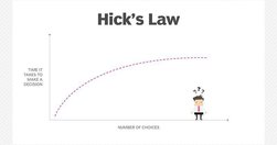
Choice seems appealing. But choice overload means we need longer to make decisions. Too long and people will abandon the task and look elsewhere.

Choose ‘fluent’ words - short, simple, easy-to-pronounce terms

Online writing - use more lists, use them bullets, use this template. "People love listicles. Lists get attention, reach skimmers and scanners, get remembered and shared."