Relevant Overviews
Could this statement apply to other products or services?A value proposition should be specific enough that it only makes sense in your context. “Help you and your users succeed” could work just as well on a SaaS website or on the site of a user researcher. If it can work on a different kind of website, it isn’t a proposition at all. It’s just a s…
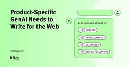
Generative-AI outputs need to be concise, scannable, follow the inverted pyramid, and use plain language.

B2B sites and other sites with specialized content that target professionals or enthusiasts should use their audiences’ jargon to communicate more precisely and professionally.

Specialised language Designing for people with autism, using specialised language, not 'owning' the words, and some AI label testing.
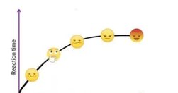
How minimizing reader decisions makes writing more powerful 💪

Text makes up the entire web. How you write and format your text can make it more readable for everyone and more accessible for people with disabilities. Some text accessibility issues include underlined text, justified text, and very small text. Each of these is easy to avoid and fix.

Content should be written and structured to help them understand and take the most important actions.
Helpful guides and starter kits to design effective journey maps that generate insights
Web users generally prefer writing that is concise, easy to scan, and objective (rather than promotional) in style. We incorporated these and other attributes into a redesign of Web content. The rewritten website scored 159% higher than the original in measured usability.

Designing for digital products requires a different mindset than traditional websites. It’s all about continuous adaptation, refining, and iterating as user behavior and needs evolve. Paul Boag reflects on the key differences, including how the frequency of usage impacts your design approach and what you can do about it.

Use this glossary to quickly clarify key terms and concepts related to UX deliverables.

Create engaging stories by synchronizing with the readers’ brains.

Learn how to boost website conversion rates through effective objection handling. Identify concerns, address them proactively, and implement strategies to build trust and drive sales.
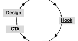
Content creation is more like building with Legos. You take different pieces and put them together to make something new. You start with a bunch of ideas, tools, and resources. Your job is to piece them together in a way that makes sense and connects with your audience. This means planning, organizing, and even redoing things.

Unsure where to start? Use this collection of links to our articles and videos to learn how users interact with the web and how to design effective web user experiences.
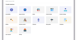
A growing directory of free articles, tools and resources to help you write clear, accessible content.

Readability in user experience (UX) design refers to how easily users can read and understand textual content. It is crucial for a positive user experience as it directly impacts how effectively users can consume information on a website or application. Designers aim to enhance readability via appropriate presentation and language to make sure user
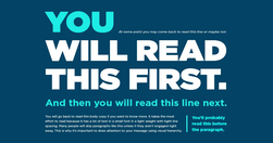
What grade level should you be writing at? How do you determine your copy’s grade level?
Verbs of Creation and ConstructionAssembleBuildConcoctCraftCultivateDesignEngineerFabricateForgeFormulateGenerateMoldProduceSculptSynthesizeWeaveVerbs of Sound and VoiceBellowBoomChirpCrackleGrowlHissHowlMurmurRoarRumbleScreamShriekSizzleSnapSqueakThunderTrillWarbleWhisperVerbs of Light and DarkBeamBlazeDazzleFlickerGlimmerGleamGlowIlluminateRadi…
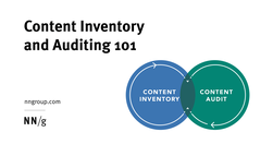
A content inventory and audit are two important activities to complete before developing a strategy to improve your digital content. Conduct them together to set your content up for success.
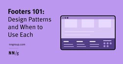
Footers can be found at the bottom of almost every web page, and often take many forms, depending on the type of content on a website. Regardless of the form they take, their presence is critical (and highly underrated).

90% of that content is just digital noise. It's complex, confusing, and ultimately valueless to the audience. True content innovation requires the opposite approach. It's about simplifying and focusing on delivering maximum value. This is the content innovation paradox: Less complexity creates more value.
Premature error messages, aggressively styled fields, and unnecessarily disruptive system-status messages feel bad-mannered and increase cognitive load for users during otherwise simple tasks.

Why inclusive language matters Words hold power. Using inclusive language means you're thinking about: the impact of language, the origins of phrases and idioms before you use them, how you talk about people, characteristics and identities, how your own identity or experiences could create bias in your content.
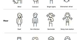
Gaining buy-in for accessibility can be challenging due to common myths and misunderstandings. For many, accessibility remains a big mystery. Here are some practical techniques for winning stakeholder support.
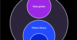
Design systems are a set of standards (like Google’s Material Design or IBM’s Carbon Design System) needed to manage design at scale. Style guides (like content or visual style guides) are just one piece in a design system.
UX Writing Top 20 practical tips to boost your designs 👇🔶 Be concise❌ You must log in to comment✅ Log in to comment🔶 Use active voice❌ The button should be clicked✅ Click the button🔶 Avoid jargon❌ System error (code 2234)✅ Log in error🔶 Be consistent❌ Add to cart vs. My bag✅ Add to bag vs. My bag🔶 Avoid double negatives❌ Unsubscribe not to receiv…

Labels in a card sorting study must be neutral to prevent keyword matching and encourage careful, conceptual groupings from users.
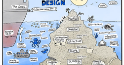
If you’d like to improve user experience, content design can help. But how? We have a few tricks up our sleeve, so I’d like to share with you a reference list of ways we can give users an experience which feels more intuitive and caters better to their needs.
Opening links, whether they are to the same website or another, in a new tab can pose a variety of issues for users, especially as web traffic from mobile devices continues to increase.