Relevant Overviews

Unsure where to start? Use this collection of links to our articles and videos to learn how users interact with the web and how to design effective web user experiences.
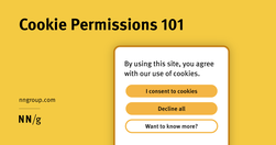
Cookie permissions need to follow the law and strike the balance between respecting user privacy and being user-friendly.

Whitespace is an effective principle to achieve a balanced design, making it easier for your users to scan and read. Consider using a consistent spacing system and the proximity principle to achieve a balanced use of whitespace.
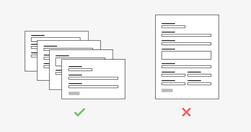
While completing a form isn’t usually a particularly fun task for a user, it is often a necessary step of a process. For example, a user might be asked to fill out a short form with payment details to buy an item or they might have to complete a form as part of a job application.

Effective homepages are simple and easy to access, communicate the organization’s and site’s purpose, show engaging content, and prompt users to take action.

It's hard work to make a user interface that's easy to use. The end result may seem obvious to an outsider, but ease-of-use comes from trying out many design ideas and rejecting ones that are too difficult while polishing those that make the UI better.

Qualitative usability testing aims to identify issues in an interface, while quantitative usability testing is meant to provide metrics that capture the behavior of your whole user population.

Local navigation indicates to users where they are and what other content is nearby in an information hierarchy.

Even people with limited drawing abilities can learn to sketch a wireframe if they learn a few common conventions used to represent various design elements.

Tried and true principles for the past, present, and future of good design

This article explores a few cognitive biases I’ve experienced first-hand as well as strategies for mitigating their influence.

Persistent headers can be useful to users if they are unobtrusive, high-contrast, minimally animated, and fit user needs.
Frequent major redesigns and changes throughout the interface support users’ need to learn and adapt to new situations.
90% of data does not get used three months after it’s published. Most Web teams know that they are not working in a professional manner, and yet they feel that there is nothing they can do about it. Digital has in so many ways destroyed content professionalism.

Although successful websites typically have high usability, average sites can hurt their business by copying design elements that don't work well in other contexts.

Summary: For mobile navigation, image grids should be saved for deeper IA levels where visual differentiation between menu items is critical, as they increase page load times, create longer pages, and cause more scrolling.
We must design things on the basis that we want them to last, ... Because when you expect nothing to last, nothing does.