Relevant Overviews
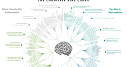
UX & Psychology: Guides and Cheatsheets. With useful resources on how people think, decide, remember and focus attention — guides, glossaries, Miro/Figjam boards and cheat sheets (LinkedIn post by Vitaly Friedman)
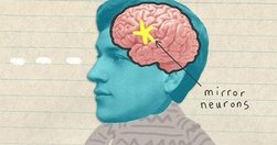
Create engaging stories by synchronizing with the readers’ brains.
Psychology plays such a huge role in user interface and user experience design. Nowhere is this more obvious than in the arena of charity web design.
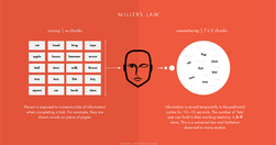
Understanding How the Human Brain Works Helps Us Build Designs That Work For Humans.
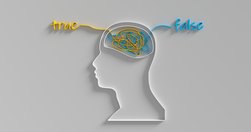
In psychology, a false memory refers to a mental experience that’s remembered as factual but is either entirely false or significantly different from what actually occurred. These can be small details, like misremembering the color of a car, or more substantial, like entirely fabricated events.

Human memory is not a literal reproduction of the past, but instead relies on constructive processes that are sometimes prone to error and distortion.
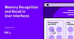
Recalling items from scratch is harder than recognizing the correct option in a list of choices because the extra context helps users retrieve information from memory.

What users believe they know about a user interface impacts how they use it. Mismatched mental models are common, especially with designs that try something new.
Users visit websites and use apps to get things done, so emphasize the content of interest to communicate with your audience. Avoid design pollution that decorates the UI with non-communicative elements.

The foundation of user experience is the difference between the people on the design team and the people using the product. You can't ask users to design, but you also can't ask the designers whether their own design will be easy for the target audience to use.

Some UX designers (and many clients) aim to "jazz up" the design to supposedly engage users. This usually backfires because extraneous design elements get in the way of users' tasks.

The smaller the word count (and in general, the more concise your online communication), the more users will comprehend and retain your message.
To strengthen people’s memory skills, we should design interfaces that help users practice recall.
It isn’t a mystery that a large part of delivering a highly successful user experience is understanding what the customer wants/needs along with the cognition that consequently gets customers thinking about what they want/need.

Whether we’re looking at The Correspondent, the world atlas or the national news, migration across the Mediterranean is depicted on maps as thick red arrows heading towards us. Far more than we realise, these arrows define how we view migration. Can that be changed?

start to understand how we may need to balance social media with other more challenging, but ultimately more satisfying forms of communication

"This article presents three experiments (total N = 1718) investigating the possibility of familiarity backfire within the context of correcting novel misinformation claims and after a 1-week study-test delay."
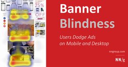
Users have learned to ignore content that resembles ads, is close to ads, or appears in locations traditionally dedicated to ads.
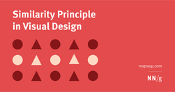
Summary: Design elements that appear similar in some way — sharing the same color, shape, or size — are perceived as related, while elements that appear dissimilar are perceived as belonging to separate groups.