Relevant Overviews

UX Myths collects the most frequent user experience misconceptions and explains why they don't hold true. And you don't have to take our word for it, we'll show you a lot of research findings and articles by design and usability gurus.Myth #34: Simple = minimalMyth #33: Mobile users are distractedMyth #32: Success happens overnightMyth #31: UX de…

Search ranking manipulation has died; serving users has won. Catering to human needs now trumps gaming algorithms for dominating search engine results pages (SERPs).
Use this curated set of free NN/g templates and guides for inspiration and to accelerate your product development activities and UX career.
Designing for digital products requires a different mindset than traditional websites. It’s all about continuous adaptation, refining, and iterating as user behavior and needs evolve. Paul Boag reflects on the key differences, including how the frequency of usage impacts your design approach and what you can do about it.
Naming is in our nature. It’s a way to express ourselves and signal an object’s significance. Naming products, features, and plans effectively is more about logic than imagination. Names signal a product’s purpose, benefit, or behavior and collectively align user expectations with functionality and value.
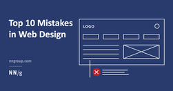
The ten most egregious offenses against users. Web design disasters and HTML horrors are legion, though many usability atrocities are less common than they used to be.
Be skeptical of the marketing claims being made by AI tools designed for UX researchers. Many of these systems are not able to do everything they claim.
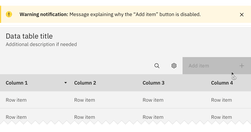
Both hiding and disabling features can be utterly confusing to users. And for both, we need very, very good reasons. Let’s take a closer look at what we need to consider when it comes to hiding and disabling — and possible alternatives that help enhance the UX.
Content standards in design systems support a holistically consistent user experience and efficient collaboration between writers, content, and UI designers.
A few relevant, high-quality visuals placed next to associated text can boost users’ comprehension of your content and its memorability.
Cookie permissions need to follow the law and strike the balance between respecting user privacy and being user-friendly.
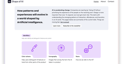
AI is accelerating change. Companies are reacting by “doing AI”without prioritizing the experience of the people on the receiving end–Design is more important than ever. To respond, we must get smart, fast. This starts with understanding the emerging patterns of interaction, affordances, and heuristics in an AI world. The pages below are summaries
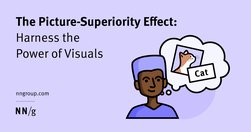
People often remember visuals better than words. Designers can leverage the picture-superiority effect to make their products memorable and learnable.
Scrolling, scanning, skipping: How do users consume content online? Here’s what you need to know about reading behavior and design strategies to prevent harmful scanning patterns.
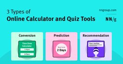
Most calculator and quiz tools provide at least one or more of the following services: converting inputs, predicting the future, or providing recommendations.
Calculators and quizzes provide personalized information. Users approach these tools with an exploratory mindset and appreciate them while making decisions.
Undoubtedly there are major advantages of live validation in forms. Most importantly, if an input expects a particular type of content, we can flag issues immediately, so users can fix these issues rather than operating under a wrong assumption.
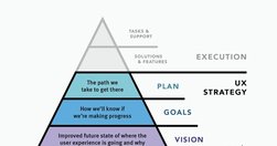
UX strategy is a plan of action that allows the organization to reach a higher state of user experience over a certain period of time. It lies at the intersection of product design and business strategy and serves as a guide for prioritizing and executing UX work over time.
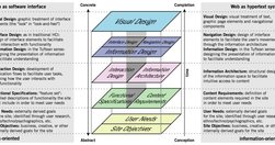
The content - not the beautiful scroll animations - is the thing people use your product for. It is not lesser than. It is not an afterthought. It even has its own set of roles (content design, UX writing, information architecture, etc). The content is the scaffolding of the experience. When you minimize it, it is only to your own detriment.
Design System In 90 Days Canvas (FigJam template), with useful prompts to get a design system up and running — and adopted! — in 90 days, for small and large organizations that are building a design system or plan to set up one. Kindly shared by Dan Mall as a part of the Design System University. (shared by Vitaly Friedman, LinkedIn)
Effective homepages are simple and easy to access, communicate the organization’s and site’s purpose, show engaging content, and prompt users to take action.
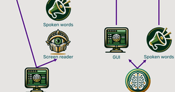
Traditional methods for accessibility have been tried for 30 years without substantially improving computer usability for disabled users. It’s time for a change, and AI will soon come to the rescue with the ability to generate a different user interface for every user, optimized for that person’s unique needs.

To be effective, QR codes need clear, brief, contextual information and must lead the user to relevant pages. QR codes provide a seamless transition from the physical world to digital spaces or across digital channels. QR codes have a lower interaction cost than typing in a URL,
We spent over 60 hours analyzing 150+ companies to find the best user onboarding examples. From home page copy and sign-up pages to onboarding emails and product tours, you can find plenty of examples to take inspiration from.

AI can already perform many UX tasks, ranging from design and research ideation to analyzing qualitative user data at scale. It’s the perfect assistant that quickly produces the first drafts of any UX method plan or deliverable. It will do more in the future,... possibly complete UI designs. But AI will not eliminate the need to watch human users.

UX unfolds over time, with a factor of 31 billion from the shortest time period of interest (0.1 seconds for the illusion of instantaneous response time) to the longest time span we can realistically consider (a century for major social channels).

How did he overcome the stranger-danger bias? Through good design.
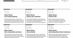
Link collection (LinkedIn post by Vitaly Friedman): Free Storytelling Masterclass (+ PDFs) (https://lnkd.in/eiFscUtf), a comprehensive guide with 9 modules on storytelling, PDF worksheets, 1-pager sketchnotes, reading lists, free lectures, video courses, etc. Kindly shared by Jeremy Connell-Wait

In a case study of ChatGPT evaluating 12 e-commerce screenshots, most of the AI-driven redesign suggestions were inconsistent and untrustworthy. Human UX expertise must be employed to judge UX advice from AI.
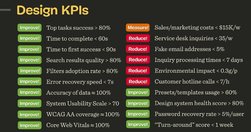
Good design decisions are intentional. They aren’t guesses nor a matter of personal preference. They are deliberate and measurable. Over the last few years, I’ve started using design KPIs that inform and guide design decisions. - by Vitaly Friedman