Relevant Overviews

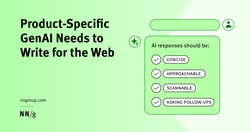
Generative-AI outputs need to be concise, scannable, follow the inverted pyramid, and use plain language.

Text makes up the entire web. How you write and format your text can make it more readable for everyone and more accessible for people with disabilities. Some text accessibility issues include underlined text, justified text, and very small text. Each of these is easy to avoid and fix.

Web users generally prefer writing that is concise, easy to scan, and objective (rather than promotional) in style. We incorporated these and other attributes into a redesign of Web content. The rewritten website scored 159% higher than the original in measured usability.

People Don’t Read Online—They Scan. This Is How to Write for Them Scanning is searching. Reader’s behavior when scanning may seem pure laziness, but it’s not. It’s an efficient strategy to seek out and filter information. Scanning also allows readers to avoid informational overload.

How writing reframes our knowledge and drives our decisions. Our message is effectively drowning in a sea of organizational and semantic noise that is part and parcel of the product itself. how do we make this easier on the user? Nope… not empathy. Writing. Writing about anything presupposes some degree of understanding of the context.

Financial writing is full of jargon and complexity. But a series of research suggests that investors are drawn to simple, clear writing with short sentences. The simple reason is that complex writing is off-putting — people tune out and find it dull, a fact confirmed by neuroscience research.

In this guide, I’m going to teach you my step-by-step process for writing high-converting website copy.

“We found, surprisingly, that no single feature of a headline’s writing style makes much of a difference in forecasting success.”

Research spanning 20 years proves PDFs are problematic for online reading. Yet they’re still prevalent and users continue to get lost in them. They’re unpleasant to read and navigate and remain unfit for digital-content display.

“If you are not calling out sections of your web pages or prose on those pages with subheads, you are making a big mistake!” write Pernice et al. “If you take nothing else [away], please take this: Use subheads and subsubheads.”

Clarity, not creativity, is the backbone of good UX writing. Choose simple words and craft shorter sentences. Explain acronyms users might not know. Use proper punctuation. Be extra careful about things like cleverness, wordplay, and idioms that might affect usability. Above all, write to be understood.

Imperative voice gets shared. Imperative voice boosts email click, open and read rates.
"understand the digital reader’s brain, and to get a couple of concrete writing tips for your next digital text." "Nothing can surpass a text when it comes to transforming abstract thoughts into concrete expression."
The “known-new contract” is a linguistic concept used to describe how writers achieve cohesion between sentences by first presenting what readers already know (information previously presented) before introducing new information.
The Europa Web Guide is the official rulebook for the European Commission's web presence, covering editorial, legal, technical, visual and contractual aspects. All European Commission web sites must observe the rules and guidelines it contains. Web practitioners are invited to observe its contents and keep abreast of updates.
Quick accessibility checklist (by European Commission)
Writing tips from "Writing for the European Commission web presence"

From now, house style guide recommends terms such as ‘climate crisis’ and ‘global heating’
People do not read online: "fundamental scanning behaviors remain constant, even as designs change."

"The Huffington Post is the third most popular online news site, after only Yahoo! News and Google News. They must be doing something right!"

"Plain Language For Everyone, Even Experts" (video)