Relevant Overviews

User experience is about understanding people, their wants, needs, expectations, and predicting them. But, as a UX designer, you have the power to manage user experience and create a product in a way that will guide a consumer to the result you expect. That’s exactly what we are going to focus on today.

Related ArticleBuilding Interactive UX MapsInteractions can be applied to high-fidelity UX maps to showcase user research and further engage with stakeholders.
UI components and design patterns, from dashboards and design systems to data visualization and presentation decks — all in one single post.
Undoubtedly there are major advantages of live validation in forms. Most importantly, if an input expects a particular type of content, we can flag issues immediately, so users can fix these issues rather than operating under a wrong assumption.
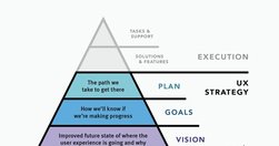
UX strategy is a plan of action that allows the organization to reach a higher state of user experience over a certain period of time. It lies at the intersection of product design and business strategy and serves as a guide for prioritizing and executing UX work over time.

Mobile devices … seamlessly bridge the gap between the physical and digital realms, making information and services readily accessible to their users at all times. Mobile design is a balancing act between functionality and simplicity, in which the goal is to create a user experience that is easy to use for all.
html.to.design converts any website into fully editable Figma designs.
Helpful guides and starter kits to design effective journey maps that generate insights - shared by Vitaly Friedman on LinkedIn
300 million people have some kind of colorweakness or are colorblind. As designers, we know that it’s always a bad choice to combine red and green, but if we want to be truly inclusive for colorblind people, we need to go beyond that. "never rely on colors alone to communicate"
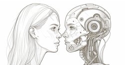
AI can already perform many UX tasks, ranging from design and research ideation to analyzing qualitative user data at scale. It’s the perfect assistant that quickly produces the first drafts of any UX method plan or deliverable. It will do more in the future,... possibly complete UI designs. But AI will not eliminate the need to watch human users.
Today, one billion people are 60 years or older. That’s 12% of the entire world population, and the age group is growing faster than any other group. Yet online the needs of older adults are rarely often overlooked or omitted. What do we need to consider to make our designs more inclusive for older adults? (shared via LinkedIn by Vitaly Friedman)

How did he overcome the stranger-danger bias? Through good design.
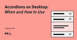
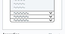
While accordions can simplify long content pages and minimize scrolling, they diminish content visibility and increase interaction cost. On desktop, use accordions for content-heavy pages where users will not need to access content under several accordions.

Avoid using accordions when: 1. Users need access to most content; 2. There's little visible content on the page; 3. Content is complex with multiple levels; 4. Content can't be effectively chunked; 5. An uninterrupted reading flow is prioritized.

Free study guides by Nielsen Norman group on almost every UX topic. Each study guide is a curated collection of free articles and videos, organised by theme and suggested reading order.
UX Guidelines For... Almost Everything! Design patterns and best practices, from dashboards, data tables and filters to onboarding, sorting and search UX -- by Vitaly Friedman, UX Designer • Smart Interface Design Patterns • Founder/Editor-in-chief of SmashingMag
Unsure where to start? Use this collection of links to our articles and videos to learn more about accessible and inclusive design.
To improve crossfunctional collaboration, UX teams must be aware of the challenges they face and develop tailored solutions for each unique challenge

Determining the nature and properties of trust at first may seem pointless [...] As it relates to UX design, it’s a scientific concept that means the difference between a user building faith in a design and staying to interact more, or that user leaving, never to return and perhaps telling others to beware of it.

The choices are so many that the decision to pick one (the optimal), becomes unmanageably hard. And even when a choice is made, second thoughts and doubts about whether it was the best, linger in the background, slowly consuming brain energy and peace of mind.
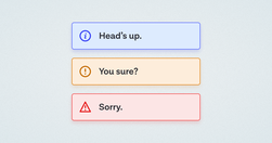
A while back, in the early days of our design system, we had a ticket for a component sitting in our backlog, with the title “Alert.” My initial reaction was “Oh yeah, a colored box with a little icon to the left of it and some text, easy.” Oh dear reader, how naive I was…
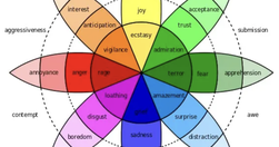
What separates great products from good ones? Attractive designs? User testing? Genius designers? Well, these might be contributory factors, but the true distinction lies in how they make users feel. Emotional design plays a huge role in the success of UX design.

The MVP awoke one morning from uneasy dreams and found itself transformed into a giant insect. It had devolved so far that it bore no resemblance to its former self. However, the fault was not in The Lean Startup but in a pervasive culture of overpromising and underdelivering.
Skilled UX designers and teams use tools such as empathy mapping to help them create products that keep the user or customer at the center of the design process, resulting in a product that resonates with users and provides a good user experience. But what is an empathy map, what are its uses, and how does empathy mapping fit into the process?
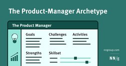
Product managers share common goals, strengths, activities, and skill sets. Awareness of these commonalities helps designers figure out how to best collaborate with product managers on Agile teams.

Chat GPT to brainstorm ideas, write document outlines, compose tweets, make my emails friendlier, and much more. Recently, I even used it to suggest a possible information architecture based on the site content I provided.

The more choices a user has to make, the bigger the risk of getting into trouble. More features can easily reduce usability.

It's hard work to make a user interface that's easy to use. The end result may seem obvious to an outsider, but ease-of-use comes from trying out many design ideas and rejecting ones that are too difficult while polishing those that make the UI better.
Unsure where to start? Use this collection of links to our articles and videos to learn about visual design in UX.