Overview: UX
Relevant resources
support.builtintelligence.com

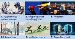
Condensed presentation of Jakob Nielsen’s 10 usability heuristics in infographics that explain what each heuristic means and show design patterns that support the heuristics as well as anti-patterns that undermine usability by violating the heuristics.
jakobnielsenphd.substack.com

Usability goes beyond simplicity; it's a dialogue between design and user, built on subtlety, emotional insight, and cognitive understanding. True usability shines under pressure, ensuring users effortlessly achieve goals even amidst stress or distraction. At its core, usability quietly empowers users, turning complex technology into invisible, sea
uxmyths.com

UX Myths collects the most frequent user experience misconceptions and explains why they don't hold true. And you don't have to take our word for it, we'll show you a lot of research findings and articles by design and usability gurus.Myth #34: Simple = minimalMyth #33: Mobile users are distractedMyth #32: Success happens overnightMyth #31: UX de…
jakobnielsenphd.substack.com

Search ranking manipulation has died; serving users has won. Catering to human needs now trumps gaming algorithms for dominating search engine results pages (SERPs).
www.linkedin.com
SUPA: A strategic UX service to validate projects early. Align user needs with business goals, mitigate risks, and shape product strategy from the start.
jakobnielsenphd.substack.com
UX has come a long way since its early beginnings at Bell Labs in the 1940s. As we enter Year 2 of the AI revolution, it’s clear that the core principles of UX design are not being replaced but are evolving with AI integration.
www.nngroup.com
Use this curated set of free NN/g templates and guides for inspiration and to accelerate your product development activities and UX career.
www.smashingmagazine.com
Designing for digital products requires a different mindset than traditional websites. It’s all about continuous adaptation, refining, and iterating as user behavior and needs evolve. Paul Boag reflects on the key differences, including how the frequency of usage impacts your design approach and what you can do about it.
www.buttonconf.com
Naming is in our nature. It’s a way to express ourselves and signal an object’s significance. Naming products, features, and plans effectively is more about logic than imagination. Names signal a product’s purpose, benefit, or behavior and collectively align user expectations with functionality and value.
www.nngroup.com
The ten most egregious offenses against users. Web design disasters and HTML horrors are legion, though many usability atrocities are less common than they used to be.
www.nngroup.com

Unsure where to start? Use this collection of links to our articles and videos to learn how users interact with the web and how to design effective web user experiences.
www.nngroup.com

Unsure where to start? Use this collection of links to our articles and videos to learn how UX can build trust, influence, and partner with product managers to drive positive product outcomes.
www.nngroup.com
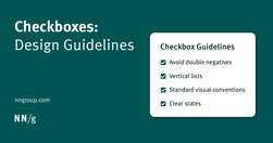
Checkboxes allow users to select one, some, or none of items from a list. They can be used standalone, in checkbox lists, or nested checkbox lists.
www.nngroup.com

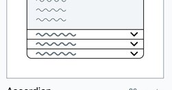
Tabs and accordions organize and layer content on the same page. Tabs suit a few long sections, while accordions fit many short ones. Choose based on your content structure and user needs for optimal layout.
www.nngroup.com
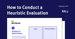
Step-by-step instructions to systematically review your product to find potential usability and experience problems. Download a free heuristic evaluation template. A heuristic evaluation is a method for identifying design problems in a user interface. Evaluators judge the design against a set of guidelines (called heuristics) that make systems ea…
medium.com
A UI/UX designer focuses on the appearance of an interface and how users will use said interface. A content-first designer, a.k.a., a content designer or UX writer, will focus on the content users will interact with.
www.nngroup.com

Be skeptical of the marketing claims being made by AI tools designed for UX researchers. Many of these systems are not able to do everything they claim.
mailchi.mp
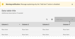
Both hiding and disabling features can be utterly confusing to users. And for both, we need very, very good reasons. Let’s take a closer look at what we need to consider when it comes to hiding and disabling — and possible alternatives that help enhance the UX.
www.nngroup.com
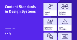
Content standards in design systems support a holistically consistent user experience and efficient collaboration between writers, content, and UI designers.
www.nngroup.com

A few relevant, high-quality visuals placed next to associated text can boost users’ comprehension of your content and its memorability.
www.nngroup.com
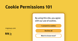
Cookie permissions need to follow the law and strike the balance between respecting user privacy and being user-friendly.
www.interaction-design.org

Prompt engineering is the process of creating effective prompts for artificial intelligence (AI) systems. A prompt in AI is a specific instruction or input given to an AI system to elicit a desired response or output. Effective prompt engineering results in good communication between the user and the AI system, where the user guides the AI systems
www.shapeof.ai
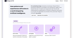
AI is accelerating change. Companies are reacting by “doing AI”without prioritizing the experience of the people on the receiving end–Design is more important than ever. To respond, we must get smart, fast. This starts with understanding the emerging patterns of interaction, affordances, and heuristics in an AI world. The pages below are summaries
jakobnielsenphd.substack.com
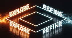
The dual prompting approach in AI-driven UX design distinguishes between exploratory and detail-refining phases. Alternating these prompt styles can optimize your UX strategies and harness AI's potential for innovation and precision. Use both zero-shot and few-shot prompting for greater breadth and depth in creative problem-solving.
smart-interface-design-patterns.com
UI components and design patterns, from dashboards and design systems to data visualization and presentation decks — all in one single post.
www.nngroup.com
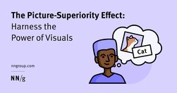
People often remember visuals better than words. Designers can leverage the picture-superiority effect to make their products memorable and learnable.
www.smashingmagazine.com

Scrolling, scanning, skipping: How do users consume content online? Here’s what you need to know about reading behavior and design strategies to prevent harmful scanning patterns.
www.nngroup.com
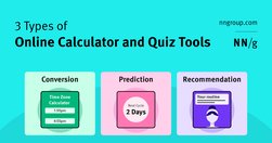
Most calculator and quiz tools provide at least one or more of the following services: converting inputs, predicting the future, or providing recommendations.
www.nngroup.com
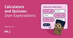
Calculators and quizzes provide personalized information. Users approach these tools with an exploratory mindset and appreciate them while making decisions.
mailchi.mp
To prevent failure and make our designs more resilient, we need to explore edge cases and exceptions already during the design process. Let’s take a closer look at what to watch out for.