
Fonts can have an impact on our ability to read and get the information we want quickly.

Spoiler: It can't save you from lazy thinking, it can't find your voice, and it can't write your truth.
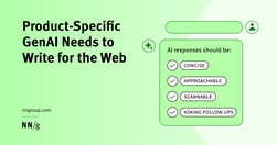
Generative-AI outputs need to be concise, scannable, follow the inverted pyramid, and use plain language.

B2B sites and other sites with specialized content that target professionals or enthusiasts should use their audiences’ jargon to communicate more precisely and professionally.

Specialised language Designing for people with autism, using specialised language, not 'owning' the words, and some AI label testing.
Techniques like summaries, bullet points, callouts, bolding, and helpful visuals improve comprehension and engagement with content exceeding 1,000 words.
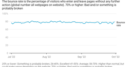
This blog post was submitted to online course "Professional Communication: Business Writing and Storytelling" (Economist Education) . It was then adapted and used on an intranet. "Easy writing makes hard reading" - Ernest Hemingway "The discipline of the written word punishes both stupidity and dishonesty" - John Steinbeck

ProPublica’s plain language experiment is a first for a mainstream news organization. Disability experts say it shouldn’t be the last.
An examination of translating text to make it as accessible as possible. Looking at how to make writing easier to read

Easy-to-read information is important for people with intellectual disabilities. It is important so they can: Learn new things. Take part in society. Know their rights and stand up for them. Make their own choices.
What makes a text nice to read? To know more about this, it is important to take a closer look at how people are reading. Additionally, it may be the case that someone is impaired, physically or mentally, to read a text. How does it work?
In this guide, I’m going to teach you my step-by-step process for writing high-converting website copy.

Aaron Berman shared some useful writing tips for anyone writing on complex issues that he learned writing the (US) President's Daily Briefs. Check out the five tips below, illustrated with examples from Star Wars and Star Trek.

Unsure where to start? Use this collection of links to our articles and videos to learn how to write and present information that aligns with users’ needs and online reading behaviors.

...from news media to legal guidance to academic research, the way we write often creates barriers to who can read it. Plain language—a style of writing that uses simplified sentences, everyday vocabulary, and clear structure—aims to remove those barriers.

Plain language and website fonts affect the reading experience more than you think

"...when reading a book excerpt or newspaper article, students were better at recalling “other relevant information” when reading in the print versus the digital medium."

“We found, surprisingly, that no single feature of a headline’s writing style makes much of a difference in forecasting success.”
Forcing users to browse PDF files causes frustration and slow task completion, compared to standard webpages. Use PDF only for documents that users will print. In those cases, following 10 basic guidelines will minimize usability problems.

“If you are not calling out sections of your web pages or prose on those pages with subheads, you are making a big mistake!” write Pernice et al. “If you take nothing else [away], please take this: Use subheads and subsubheads.”

Take a tip from the Times. Write headlines that: Average 8 or 9 words Never grow longer than 14 words Sometimes have as few as four words

Clarity, not creativity, is the backbone of good UX writing. Choose simple words and craft shorter sentences. Explain acronyms users might not know. Use proper punctuation. Be extra careful about things like cleverness, wordplay, and idioms that might affect usability. Above all, write to be understood.

Probably my biggest frustrations ... is the utter contempt they seem to hold content in. ... they won’t hire a professional copywriter to work on the content ... never teach content creators how to create appropriate web content.

Imperative voice gets shared. Imperative voice boosts email click, open and read rates.
"Users rarely read an entire webpage. That means you need to adopt a different style when writing for the web. A style that accommodates this lack of attention."
"understand the digital reader’s brain, and to get a couple of concrete writing tips for your next digital text." "Nothing can surpass a text when it comes to transforming abstract thoughts into concrete expression."
The “known-new contract” is a linguistic concept used to describe how writers achieve cohesion between sentences by first presenting what readers already know (information previously presented) before introducing new information.

"If you can write a half decent document you may be mistaken for thinking writing for the web will be easy. However, the web requires a focus of writing rarely needed elsewhere."
The Europa Web Guide is the official rulebook for the European Commission's web presence, covering editorial, legal, technical, visual and contractual aspects. All European Commission web sites must observe the rules and guidelines it contains. Web practitioners are invited to observe its contents and keep abreast of updates.
