Relevant Overviews

Usability goes beyond simplicity; it's a dialogue between design and user, built on subtlety, emotional insight, and cognitive understanding. True usability shines under pressure, ensuring users effortlessly achieve goals even amidst stress or distraction. At its core, usability quietly empowers users, turning complex technology into invisible, sea

Unsure where to start? Use this collection of links to our articles and videos to learn how users interact with the web and how to design effective web user experiences.
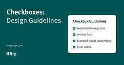
Checkboxes allow users to select one, some, or none of items from a list. They can be used standalone, in checkbox lists, or nested checkbox lists.

Tabs and accordions organize and layer content on the same page. Tabs suit a few long sections, while accordions fit many short ones. Choose based on your content structure and user needs for optimal layout.
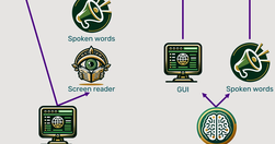
Traditional methods for accessibility have been tried for 30 years without substantially improving computer usability for disabled users. It’s time for a change, and AI will soon come to the rescue with the ability to generate a different user interface for every user, optimized for that person’s unique needs.

Updated intranet guidelines feature enhanced content practices by teams, refined search design to meet elevated expectations, task-oriented navigation, and standardized design elements for visual consistency.
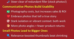
High-quality, detailed photographs convey information with authenticity, fostering trust in the content provided on a website. Investing in premium images is essential, as indistinct or amateurish pictures can perplex users and erode credibility. But AI-generated images can sometimes substitute at drastically lower cost.

In a case study of ChatGPT evaluating 12 e-commerce screenshots, most of the AI-driven redesign suggestions were inconsistent and untrustworthy. Human UX expertise must be employed to judge UX advice from AI.

If a website is difficult to use, people leave. How to define usability? How, when, and where to improve it? Why should you care? Overview defines key usability concepts and answers basic questions.

Usability assesses how easy user interfaces are to use. Usability is defined by 5 quality components: learnability, efficiency, memorability, errors, and satisfaction.

Users should not have to wonder whether different words, situations, or actions mean the same thing. Follow platform and industry conventions.
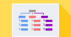
The number one most annoying feature of a website is improper or confusing navigation, leaving users lost and wondering what to do next. If you’re lucky enough, some users just might scour through the website to accomplish their purpose of visiting the website. However, most users simply pop-out and add more numbers to the website bounce rate...
Jakob Nielsen's 10 general principles for interaction design. They are called "heuristics" because they are broad rules of thumb and not specific usability guidelines.

Some UX designers (and many clients) aim to "jazz up" the design to supposedly engage users. This usually backfires because extraneous design elements get in the way of users' tasks.

concept of card sorting... UX. The popular, low-tech research technique is used to organize data sets. It’s especially useful for information architecture, menu structures, workflows and website navigation. While it’s easy enough to run a card sort, there’s a massive difference between a flop and a success.

User research is an essential part of UX design. Unless we understand who we are designing for and why, how can we even know what to create or where to begin?

40 participants is an appropriate number for most quantitative studies, but there are cases where you can recruit fewer users.

usability testing is not your only option. If I am honest, I am doing less and less usability testing, but instead focusing more on lightweight testing that can be done often and brings more value in getting projects out of the door.

Qualitative usability testing aims to identify issues in an interface, while quantitative usability testing is meant to provide metrics that capture the behavior of your whole user population.

Jakob Nielsen's 10 general principles for interaction design. They are called "heuristics" because they are broad rules of thumb and not specific usability guidelines.
Refrain from opening new browser windows. [...] Carefully examine the user’s context, task at hand, and next steps when deciding whether to open links to documents and external sites in the same or a new browser tab."

Users pay close attention to photos and other images that contain relevant information but ignore fluffy pictures used to "jazz up" web pages.

An interface to control a spacecraft - how complex and complicated does it have to be?
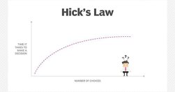
Choice seems appealing. But choice overload means we need longer to make decisions. Too long and people will abandon the task and look elsewhere.