Relevant Overviews
support.builtintelligence.com

Condensed presentation of Jakob Nielsen’s 10 usability heuristics in infographics that explain what each heuristic means and show design patterns that support the heuristics as well as anti-patterns that undermine usability by violating the heuristics.
jakobnielsenphd.substack.com
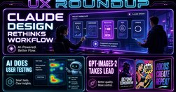
Claude Design should be used differently than canvas-based design tools
www.nngroup.com
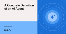
An AI agent pursues a goal by iteratively taking actions, evaluating progress, and deciding next steps. Useful agents must be reliable, adaptive, and accurate.
mailchi.mp
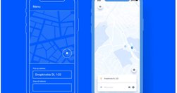
How to choose between modals and pages, when to avoid modals, or how to choose the right level of interruption or navigation. The only limits for tomorrow are the doubts we have today.
www.linkedin.com
The strategic thinking was all mine. The understanding of what makes landing pages convert came from 30 years of doing this work. But the documentation, the articulation, the packaging of that knowledge into something comprehensive and usable came from working with AI.
www.nngroup.com
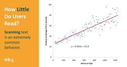
On the average Web page, users have time to read at most 28% of the words during an average visit; 20% is more likely.
timo-m-lange.myhub.ai
To maximize access to your records, we recommend establishing a naming convention for your files. A file naming convention is a framework for naming your files in a way that describes what they contain and how they relate to other files.
www.uxtigers.com

Juice the creative output of old knowledge workers with a wide range of AI-created ideas. Then leverage their superior crystallized intelligence and human judgment for wise winnowing, narrowing these options to select the best solution. Finally, remix with human insight for true human-computer symbiant power.
jakobnielsenphd.substack.com

AI video models advanced significantly in 2025, particularly in avatar expressiveness, enabling me to produce much better videos than in 2024. Further improvements are needed in 2026 to realize the potential of individual creators. Here are my 10 most popular videos, as determined by audience clicks and viewing durations.
www.theguardian.com

‘Style to be good must be clear. Clearness is secured by using words that are current and ordinary.’ Aristotle
styleguide.mailchimp.com

This style guide was created for Mailchimp employees, but we hope it’s helpful for other content and communications teams too.
design.shelter.org.uk
Humble page on writing online content, which is concise and absolutely packed with useful, practical guidance for their content designers and writers to follow.
www.nngroup.com

To create appealing designs, align type and elements to a grid, build a clear visual hierarchy, use color intentionally, and stay consistent with every design choice.
jakobnielsenphd.substack.com
User testing is straightforward, but it involves many moving parts, making it best to have a systematic process for planning and executing studies, as well as ensuring follow-up.
www.nngroup.com
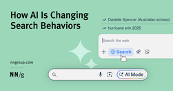
Summary: Our study shows that generative AI is reshaping search, but long-standing habits persist. Many users still default to Google, giving Gemini a fighting chance.
jakobnielsenphd.substack.com
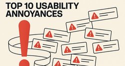
Users encounter usability annoyances daily in their computer use. Sometimes annoyances can be sidestepped at the cost of extra delays in achieving the user’s task, and sometimes the cumulative effect of too many annoyances makes users abandon the task, resulting in lost business for the offending company.
www.nngroup.com
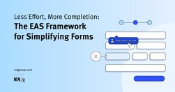
Use the EAS framework — Eliminate first, Automate where possible, and Simplify what remains — to minimize user effort and improve form completion rates.
www.nngroup.com
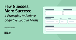
Four principles of form design — structure, transparency, clarity, and support — minimize users’ cognitive load and improve usability.
www.youtube.com

The Problem: AI is destroying web economics. Google created a toxic incentive system. Traffic collapse is accelerating. Content creation incentives are disappearing. The Solution: Collective action to create scarcity. The Vision: A better future - quality over clickbait.
uxmyths.com

UX Myths collects the most frequent user experience misconceptions and explains why they don't hold true. And you don't have to take our word for it, we'll show you a lot of research findings and articles by design and usability gurus.Myth #34: Simple = minimalMyth #33: Mobile users are distractedMyth #32: Success happens overnightMyth #31: UX de…
jakobnielsenphd.substack.com

Search ranking manipulation has died; serving users has won. Catering to human needs now trumps gaming algorithms for dominating search engine results pages (SERPs).
webaim.org
Typefaces are groups of designed text characters, such as Arial, Helvetica, and Times New Roman. Fonts are sub-sets of typefaces that have a consistent appearance, such as a 14 point and bold font in the Arial typeface. Typography—how typefaces and fonts present text—is very impactful on reading, which is a core component of visual accessibility.
uxdesign.cc
Wireframes miss the plot on nearly every perceived benefit. Here’s how to stop wasting your time and produce better designs faster.
uxdesign.cc
Wireframes miss the plot on nearly every perceived benefit. Here’s how to stop wasting your time and produce better designs faster.
uxdesign.cc

Wireframes miss the plot on nearly every perceived benefit. Here’s how to stop wasting your time and produce better designs faster.
www.linkedin.com

This cheat sheet shows the design breakpoints in detail including minor and major breakpoints. Designers often pick 3 major breakpoints to aim for responsiveness: 💎 480 px 💎 768 px 💎 1024, 1280, or 1440 px You have to define the breakpoints based on the content and layout of the design.
www.linkedin.com
comprehensive design system for enterprise products for employees and IT operations — with data visualization, workspace templates, conversational interfaces, on mobile and on desktop. Some kits are work in progress, others are very advanced.
www.nature.com
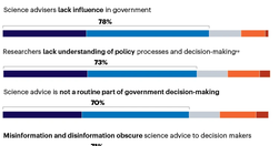
Killer viruses. Artificial intelligence. Extreme weather. Microplastics. Mental health. These are just a few of the pressing issues on which governments need science to inform their policies. But the systems that connect scientists with politicians are not working well...
www.linkedin.com
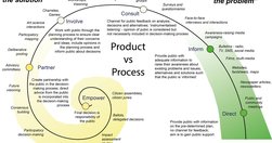
Reaching beyond the immediate, easy and accessible but narrow science-informed and science-aware audiences requires a deep and enduring focus on processes of engagement and partnership rather than dissemination products. It's a mindset switch to seeing the public as the solution to the communication challenge.
www.linkedin.com
The truth about navigation patterns Four patterns that drive results How to make faster UI decisions in Figma