Relevant Overviews

To create appealing designs, align type and elements to a grid, build a clear visual hierarchy, use color intentionally, and stay consistent with every design choice.

Visual design requires knowledge and understanding of many jargon terms. Use this glossary as a reference as you delve into visual and user interface design. Use this glossary to quickly clarify key terms and concepts related to visual design.

Whitespace is an effective principle to achieve a balanced design, making it easier for your users to scan and read. Consider using a consistent spacing system and the proximity principle to achieve a balanced use of whitespace.

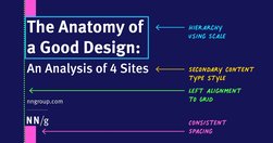
Visually pleasing designs use consistent type styles and spacing, create a visual hierarchy, and utilize an underlying grid structure.

Unsure where to start? Use this collection of links to our articles and videos to learn about visual design in UX.
Users visit websites and use apps to get things done, so emphasize the content of interest to communicate with your audience. Avoid design pollution that decorates the UI with non-communicative elements.

Vertical navigation is a good fit for broad or growing IAs, but takes up more space than horizontal navigation. Ensure that it is left-aligned, keyword front-loaded, and visible.

Summary: For mobile navigation, image grids should be saved for deeper IA levels where visual differentiation between menu items is critical, as they increase page load times, create longer pages, and cause more scrolling.

"Designers love it, website owners want to fill it. Whitespace seems to be one of the most controversial aspects of design. Why then is it so important and how can we ensure it is maintained?"

Users have learned to ignore content that resembles ads, is close to ads, or appears in locations traditionally dedicated to ads.

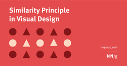
Summary: Design elements that appear similar in some way — sharing the same color, shape, or size — are perceived as related, while elements that appear dissimilar are perceived as belonging to separate groups.