Relevant Overviews

Fonts can have an impact on our ability to read and get the information we want quickly.
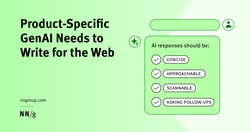
Generative-AI outputs need to be concise, scannable, follow the inverted pyramid, and use plain language.

B2B sites and other sites with specialized content that target professionals or enthusiasts should use their audiences’ jargon to communicate more precisely and professionally.

Specialised language Designing for people with autism, using specialised language, not 'owning' the words, and some AI label testing.

Content should be written and structured to help them understand and take the most important actions.
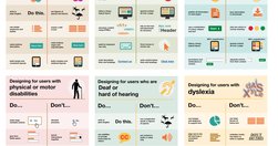
Guidelines to understand and design for Dyslexia, Dyscalculia, Autism and ADHD
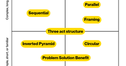
10 patterns to structure your content for understanding, engagement, and effectiveness - and a matrix to help you choose the right one.

Stakeholders deem UX work to be “obvious” | Rubric for scoring insightful use of AI | Make it easy to see all user-contributed photos | New image-generation model from Black Forest Labs

Learn how to boost website conversion rates through effective objection handling. Identify concerns, address them proactively, and implement strategies to build trust and drive sales.
The ten most egregious offenses against users. Web design disasters and HTML horrors are legion, though many usability atrocities are less common than they used to be.
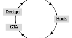
Content creation is more like building with Legos. You take different pieces and put them together to make something new. You start with a bunch of ideas, tools, and resources. Your job is to piece them together in a way that makes sense and connects with your audience. This means planning, organizing, and even redoing things.

Unsure where to start? Use this collection of links to our articles and videos to learn how users interact with the web and how to design effective web user experiences.

Being a lone content designer (also known as UX writer) can be tricky — no one to help with those quick questions, feedback from non-content designers, and lots of work from every direction. But we have a great opportunity in front of us. Here are my tips for navigating being a lone content designer based on my experience at Gett.

Whether you identify as a content designer, strategist or UX writer, it’s likely you’ve thought about where you go from here.
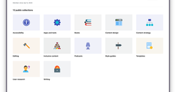
A growing directory of free articles, tools and resources to help you write clear, accessible content.
Readability in user experience (UX) design refers to how easily users can read and understand textual content. It is crucial for a positive user experience as it directly impacts how effectively users can consume information on a website or application. Designers aim to enhance readability via appropriate presentation and language to make sure user
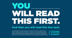
What grade level should you be writing at? How do you determine your copy’s grade level?
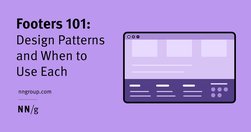
Footers can be found at the bottom of almost every web page, and often take many forms, depending on the type of content on a website. Regardless of the form they take, their presence is critical (and highly underrated).
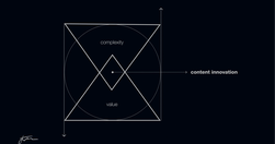
90% of that content is just digital noise. It's complex, confusing, and ultimately valueless to the audience. True content innovation requires the opposite approach. It's about simplifying and focusing on delivering maximum value. This is the content innovation paradox: Less complexity creates more value.
Premature error messages, aggressively styled fields, and unnecessarily disruptive system-status messages feel bad-mannered and increase cognitive load for users during otherwise simple tasks.

Why inclusive language matters Words hold power. Using inclusive language means you're thinking about: the impact of language, the origins of phrases and idioms before you use them, how you talk about people, characteristics and identities, how your own identity or experiences could create bias in your content.

Tabs and accordions organize and layer content on the same page. Tabs suit a few long sections, while accordions fit many short ones. Choose based on your content structure and user needs for optimal layout.
UX Writing Top 20 practical tips to boost your designs 👇🔶 Be concise❌ You must log in to comment✅ Log in to comment🔶 Use active voice❌ The button should be clicked✅ Click the button🔶 Avoid jargon❌ System error (code 2234)✅ Log in error🔶 Be consistent❌ Add to cart vs. My bag✅ Add to bag vs. My bag🔶 Avoid double negatives❌ Unsubscribe not to receiv…
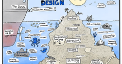
If you’d like to improve user experience, content design can help. But how? We have a few tricks up our sleeve, so I’d like to share with you a reference list of ways we can give users an experience which feels more intuitive and caters better to their needs.

Bad writing can be avoided by following Orwell’s 6 little rules. The problem is the absolute nature of Orwell’s rules. The first five all include either a “never” or an “always”. That's why Orwell himself doesn’t always obey them and The Economist's Johnson revised them.

Websites and apps are our modern equivalent of phones. You create them so that people can serve themselves. Make your site or app a good conversational partner.
A UI/UX designer focuses on the appearance of an interface and how users will use said interface. A content-first designer, a.k.a., a content designer or UX writer, will focus on the content users will interact with.
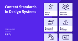
Content standards in design systems support a holistically consistent user experience and efficient collaboration between writers, content, and UI designers.
A few relevant, high-quality visuals placed next to associated text can boost users’ comprehension of your content and its memorability.
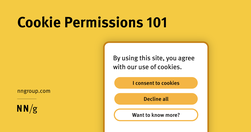
Cookie permissions need to follow the law and strike the balance between respecting user privacy and being user-friendly.