Relevant Overviews

Content should be written and structured to help them understand and take the most important actions.
Golden Rules For UX Writing. With practical guidelines on how to avoid confusion and help people understand better (LinkedIn post by Vitaly Friedman)

Whether you identify as a content designer, strategist or UX writer, it’s likely you’ve thought about where you go from here.

Readability in user experience (UX) design refers to how easily users can read and understand textual content. It is crucial for a positive user experience as it directly impacts how effectively users can consume information on a website or application. Designers aim to enhance readability via appropriate presentation and language to make sure user

What grade level should you be writing at? How do you determine your copy’s grade level?
Premature error messages, aggressively styled fields, and unnecessarily disruptive system-status messages feel bad-mannered and increase cognitive load for users during otherwise simple tasks.
UX Writing Top 20 practical tips to boost your designs 👇🔶 Be concise❌ You must log in to comment✅ Log in to comment🔶 Use active voice❌ The button should be clicked✅ Click the button🔶 Avoid jargon❌ System error (code 2234)✅ Log in error🔶 Be consistent❌ Add to cart vs. My bag✅ Add to bag vs. My bag🔶 Avoid double negatives❌ Unsubscribe not to receiv…

Websites and apps are our modern equivalent of phones. You create them so that people can serve themselves. Make your site or app a good conversational partner.

A UI/UX designer focuses on the appearance of an interface and how users will use said interface. A content-first designer, a.k.a., a content designer or UX writer, will focus on the content users will interact with.

Content standards in design systems support a holistically consistent user experience and efficient collaboration between writers, content, and UI designers.

From providing accurate context to creating a cohesive structure, each of these key principles can elevate your content designs and ensure you’re communicating effectively with your audience
How to communicate effectively when users fail and succeed (shared on LinkedIn by Vitaly Friedman)

If you're a marketer, manager, developer, designer or writer wanting to up your UX writing game, then these guides are right up your alley.

A good design process: How is someone navigating through it? How are these things co-located together? Which pages are we grouping together? Can people find them? ... less attached to the tone of voice and more interested in simplicity and utility ... more like an architect than a prose-writer, putting LEGO blocks together in the most useful w…

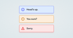
A while back, in the early days of our design system, we had a ticket for a component sitting in our backlog, with the title “Alert.” My initial reaction was “Oh yeah, a colored box with a little icon to the left of it and some text, easy.” Oh dear reader, how naive I was…

The smaller the word count (and in general, the more concise your online communication), the more users will comprehend and retain your message.

Aaron Berman shared some useful writing tips for anyone writing on complex issues that he learned writing the (US) President's Daily Briefs. Check out the five tips below, illustrated with examples from Star Wars and Star Trek.

Unsure where to start? Use this collection of links to our articles and videos to learn how to write and present information that aligns with users’ needs and online reading behaviors.