Relevant Overviews
www.nngroup.com

It's hard work to make a user interface that's easy to use. The end result may seem obvious to an outsider, but ease-of-use comes from trying out many design ideas and rejecting ones that are too difficult while polishing those that make the UI better.
www.interaction-design.org

A myriad of fields, skills and insights come together to create the overarching discipline of user experience design... Let’s explore five behavioral science insights you can use right now to design better products
www.interaction-design.org

UX (user experience) research is the systematic study of target users and their requirements, to add realistic contexts and insights to design processes. UX researchers adopt various methods to uncover problems and design opportunities. Doing so, they reveal valuable information which can be fed into the design process.
www.nngroup.com
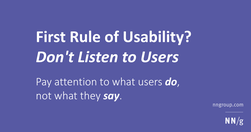
To design the best UX, pay attention to what users do, not what they say. Self-reported claims are unreliable, as are user speculations about future behavior. Users do not know what they want.
www.nngroup.com

Unsure where to start? Use this collection of links to our articles and videos to learn how to write and present information that aligns with users’ needs and online reading behaviors.
www.nngroup.com

To keep your stakeholders and team members engaged, incorporate storytelling techniques such as writing for your audience, adding anecdotes, and using analogies in your asynchronous research deliverables.
www.nngroup.com
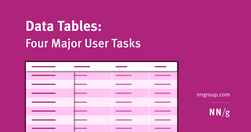
Table design should support four common user tasks: find records that fit specific criteria, compare data, view/edit/add a single row’s data, and take actions on records.
www.nngroup.com

To strengthen people’s memory skills, we should design interfaces that help users practice recall.
www.nngroup.com
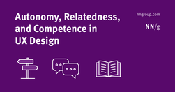
Addressing these 3 fundamental psychological needs in our products increases user motivation and well-being and keeps them engaged and likely to use our designs.
www.nngroup.com
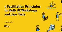
Both UX workshops and usability tests benefit when facilitators are focused on goals, follow a meeting guide yet are open to improvisation, encourage participants to act, and don’t talk too much.
baymard.com

The homepage remains the “front door” for the many users who still begin their browsing experience here. Avoiding the 8 common UX issues discussed in this article is the first step toward improving users’ Homepage experience
www.nngroup.com
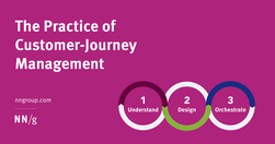
User journeys should be managed like products — by people and teams with specialized, journey-dedicated roles who continually research, measure, optimize, and orchestrate the experience.
blog.prototypr.io

Tried and true principles for the past, present, and future of good design
tannerchristensen.com
there are many straightforward methods and strategies for measuring design impact. Two areas I recently combined while exploring the design impact at Gem—where we're building the source of truth for top-of-funnel recruiting—are top tasks and PURE (Pragmatic Usability Ratings by Experts). Here's how I did it.
uxdesign.cc
It isn’t a mystery that a large part of delivering a highly successful user experience is understanding what the customer wants/needs along with the cognition that consequently gets customers thinking about what they want/need.
gerrymcgovern.com
As designers, as creators and managers of websites and apps, we can start by focusing on two principles: Do not track Delete
www.nngroup.com
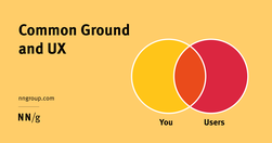
Any efficient communication requires that communication partners establish and rely on common ground so that they can take communication shortcuts.
www.nngroup.com

Succinctly documenting the right details in key places helps Agile teams avoid information overload. When UX documentation is skipped or disorganized, teams waste time trying to find or remember information instead of improving the product.
www.nngroup.com

A survey of people in user experience and product management shows that these professionals disagree on who should be responsible for many key tasks, like doing discoveries and early design.
www.nngroup.com
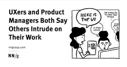
A survey of 372 UX and PM professionals shows that duplicative work is frequent and generates confusion and inefficiency.
www.nngroup.com

Vertical navigation is a good fit for broad or growing IAs, but takes up more space than horizontal navigation. Ensure that it is left-aligned, keyword front-loaded, and visible.
Like
ux,
web design,
information architecture,
user experience,
clear menu,
clear navigation,
visual design
boagworld.com

Probably my biggest frustrations ... is the utter contempt they seem to hold content in. ... they won’t hire a professional copywriter to work on the content ... never teach content creators how to create appropriate web content.
Do
ux,
web design,
content,
web writing,
content creation,
web architecture,
user experience,
content management,
copywriting
www.nngroup.com
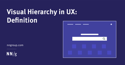
A clear visual hierarchy guides the eye to the most important elements on the page. It can be created through variations in color and contrast, scale, and grouping.
Like
ux,
web design,
content,
user experience,
visual communication,
visual content,
visual hierarchy
www.nngroup.com
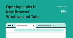
Refrain from opening new browser windows. [...] Carefully examine the user’s context, task at hand, and next steps when deciding whether to open links to documents and external sites in the same or a new browser tab."
lawsofsimplicity.com
Law 1 / Reduce - The simplest way to achieve simplicity is through thoughtful reduction.Law 2 / Organize - Organization makes a system of many appear fewer.Law 3 / Time - Savings in time feel like simplicity.Law 4 / Learn - Knowledge makes everything simpler.Law 5 / Differences - Simplicity and complexity need each other.Law 6 / Context - What lie…
Like
ux,
web design,
design,
content creation,
content structure,
user experience,
content management,
user behaviour
boagworld.com

"Designers love it, website owners want to fill it. Whitespace seems to be one of the most controversial aspects of design. Why then is it so important and how can we ensure it is maintained?"
timo-m-lange.myhub.ai
People do not read online: "fundamental scanning behaviors remain constant, even as designs change."
www.nngroup.com
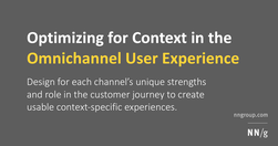
"Design for each channel’s unique strengths and role in the customer journey to create usable context-specific experiences."
www.nngroup.com
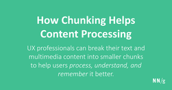
Chunking is a concept where text and multimedia content is broken up into smaller chunks to help users process, understand, and remember it better.
www.nngroup.com
Good evidence why coming up with ever new, more "beautiful", "attractive" and trendy designs that "pop" is not always a good thing.