Relevant Overviews
We must design things on the basis that we want them to last, ... Because when you expect nothing to last, nothing does.

Imperative voice gets shared. Imperative voice boosts email click, open and read rates.
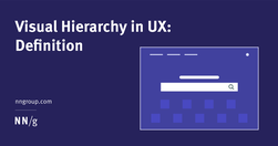
A clear visual hierarchy guides the eye to the most important elements on the page. It can be created through variations in color and contrast, scale, and grouping.

Jakob Nielsen's 10 general principles for interaction design. They are called "heuristics" because they are broad rules of thumb and not specific usability guidelines.
Refrain from opening new browser windows. [...] Carefully examine the user’s context, task at hand, and next steps when deciding whether to open links to documents and external sites in the same or a new browser tab."
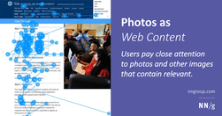
Users pay close attention to photos and other images that contain relevant information but ignore fluffy pictures used to "jazz up" web pages.
Law 1 / Reduce - The simplest way to achieve simplicity is through thoughtful reduction.Law 2 / Organize - Organization makes a system of many appear fewer.Law 3 / Time - Savings in time feel like simplicity.Law 4 / Learn - Knowledge makes everything simpler.Law 5 / Differences - Simplicity and complexity need each other.Law 6 / Context - What lie…

"Designers love it, website owners want to fill it. Whitespace seems to be one of the most controversial aspects of design. Why then is it so important and how can we ensure it is maintained?"
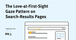
"Eyetracking studies show that users sometimes look at only a single result on a search-results page because that result is good enough for their needs."
People do not read online: "fundamental scanning behaviors remain constant, even as designs change."
"Design for each channel’s unique strengths and role in the customer journey to create usable context-specific experiences."
Chunking is a concept where text and multimedia content is broken up into smaller chunks to help users process, understand, and remember it better.
We live in a supercharged attention economy - the internet is a buffet. Keep in mind when we create and how we consume content! What kind of information do we give to our audiences? Junk, or healthy stuff?
Cheap storage. Cheap processing power. Cheap energy. It’s all great. We don’t have to think. We just dump our content onto the website and let search engines figure it out.
Traditional, mass marketing branding still good for low information type customers. If they’re high information customers, you need to give them the facts and be useful because that’s what they want.
Good evidence why coming up with ever new, more "beautiful", "attractive" and trendy designs that "pop" is not always a good thing.
"A link is a promise. A menu is a selection of promises. Without the link there is no Web."
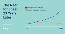
"In spite of an increase in Internet speed, webpage speeds have not improved over time."