Relevant Overviews
Overview: Content creation & management
Relevant resources
Cookie permissions need to follow the law and strike the balance between respecting user privacy and being user-friendly.
People often remember visuals better than words. Designers can leverage the picture-superiority effect to make their products memorable and learnable.

Scrolling, scanning, skipping: How do users consume content online? Here’s what you need to know about reading behavior and design strategies to prevent harmful scanning patterns.

What does research look like in a content design context? Where does it fit in in the content design process? Who does the research and who’s responsible for sharing the research findings? Which format is the best for sharing content design research findings? When do you know you’ve done “enough research” and can get to work?
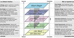
The content - not the beautiful scroll animations - is the thing people use your product for. It is not lesser than. It is not an afterthought. It even has its own set of roles (content design, UX writing, information architecture, etc). The content is the scaffolding of the experience. When you minimize it, it is only to your own detriment.

What does it mean to design for neurodiversity? We look at steps we can take to make content more accessible to more people.
From providing accurate context to creating a cohesive structure, each of these key principles can elevate your content designs and ensure you’re communicating effectively with your audience
How to communicate effectively when users fail and succeed (shared on LinkedIn by Vitaly Friedman)

If you're a marketer, manager, developer, designer or writer wanting to up your UX writing game, then these guides are right up your alley.

Free study guides by Nielsen Norman group on almost every UX topic. Each study guide is a curated collection of free articles and videos, organised by theme and suggested reading order.
Techniques like summaries, bullet points, callouts, bolding, and helpful visuals improve comprehension and engagement with content exceeding 1,000 words.
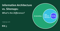
Information architecture is the practice of structuring, organizing, and labeling content from your website. Sitemaps are visualization tools that are used predominantly for planning purposes.

How writing reframes our knowledge and drives our decisions. Our message is effectively drowning in a sea of organizational and semantic noise that is part and parcel of the product itself. how do we make this easier on the user? Nope… not empathy. Writing. Writing about anything presupposes some degree of understanding of the context.
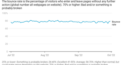
This blog post was submitted to online course "Professional Communication: Business Writing and Storytelling" (Economist Education) . It was then adapted and used on an intranet. "Easy writing makes hard reading" - Ernest Hemingway "The discipline of the written word punishes both stupidity and dishonesty" - John Steinbeck

A good design process: How is someone navigating through it? How are these things co-located together? Which pages are we grouping together? Can people find them? ... less attached to the tone of voice and more interested in simplicity and utility ... more like an architect than a prose-writer, putting LEGO blocks together in the most useful w…
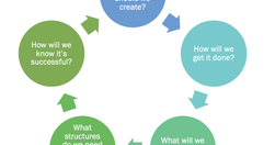
When organizations want to get more strategic about their content – when they want it to be more effective, more efficient, and advance their goals, they turn to content strategists. The core of what we do is to help the organization ask and answer key questions.
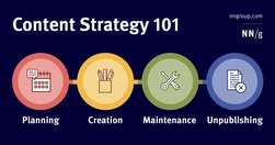
A content strategy is a high-level plan that guides the intentional creation and maintenance of information in a digital product.

In this guide, I’m going to teach you my step-by-step process for writing high-converting website copy.
Users visit websites and use apps to get things done, so emphasize the content of interest to communicate with your audience. Avoid design pollution that decorates the UI with non-communicative elements.
Forcing users to browse PDF files causes frustration and slow task completion, compared to standard webpages. Use PDF only for documents that users will print. In those cases, following 10 basic guidelines will minimize usability problems.
As designers, as creators and managers of websites and apps, we can start by focusing on two principles: Do not track Delete
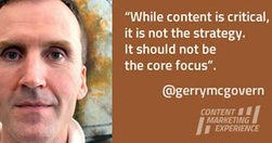
The single most important thing I’ve learned about online marketing is that it is about paying attention. Offline marketing is about getting attention, but once someone is on your website, they know what they want to do, so your first job is to help them do what they came to you website to do as quickly and easily as possible.
90% of data does not get used three months after it’s published. Most Web teams know that they are not working in a professional manner, and yet they feel that there is nothing they can do about it. Digital has in so many ways destroyed content professionalism.

Probably my biggest frustrations ... is the utter contempt they seem to hold content in. ... they won’t hire a professional copywriter to work on the content ... never teach content creators how to create appropriate web content.

A clear visual hierarchy guides the eye to the most important elements on the page. It can be created through variations in color and contrast, scale, and grouping.

Whether we’re looking at The Correspondent, the world atlas or the national news, migration across the Mediterranean is depicted on maps as thick red arrows heading towards us. Far more than we realise, these arrows define how we view migration. Can that be changed?
The illusion of cheap storage has encouraged by far the worst hoarding habits in human history.

Refrain from opening new browser windows. [...] Carefully examine the user’s context, task at hand, and next steps when deciding whether to open links to documents and external sites in the same or a new browser tab."
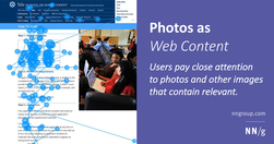
Users pay close attention to photos and other images that contain relevant information but ignore fluffy pictures used to "jazz up" web pages.
The Europa Web Guide is the official rulebook for the European Commission's web presence, covering editorial, legal, technical, visual and contractual aspects. All European Commission web sites must observe the rules and guidelines it contains. Web practitioners are invited to observe its contents and keep abreast of updates.