How to choose between modals and pages, when to avoid modals, or how to choose the right level of interruption or navigation. The only limits for tomorrow are the doubts we have today.
Users encounter usability annoyances daily in their computer use. Sometimes annoyances can be sidestepped at the cost of extra delays in achieving the user’s task, and sometimes the cumulative effect of too many annoyances makes users abandon the task, resulting in lost business for the offending company.
Use the EAS framework — Eliminate first, Automate where possible, and Simplify what remains — to minimize user effort and improve form completion rates.
Four principles of form design — structure, transparency, clarity, and support — minimize users’ cognitive load and improve usability.
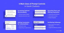
When following good practices, prompt controls can increase the discoverability of genAI chatbots’ features, offer inspiration, and minimize manual user input.
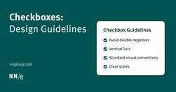
Checkboxes allow users to select one, some, or none of items from a list. They can be used standalone, in checkbox lists, or nested checkbox lists.
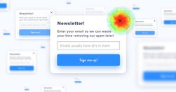
If I want your newsletter, I’ll find it on the page myself!
A UI/UX designer focuses on the appearance of an interface and how users will use said interface. A content-first designer, a.k.a., a content designer or UX writer, will focus on the content users will interact with.
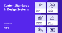
Content standards in design systems support a holistically consistent user experience and efficient collaboration between writers, content, and UI designers.
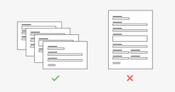
While completing a form isn’t usually a particularly fun task for a user, it is often a necessary step of a process. For example, a user might be asked to fill out a short form with payment details to buy an item or they might have to complete a form as part of a job application.
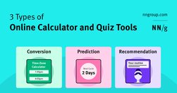
Most calculator and quiz tools provide at least one or more of the following services: converting inputs, predicting the future, or providing recommendations.
Calculators and quizzes provide personalized information. Users approach these tools with an exploratory mindset and appreciate them while making decisions.
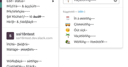
To prevent failure and make our designs more resilient, we need to explore edge cases and exceptions already during the design process. Let’s take a closer look at what to watch out for.
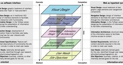
The content - not the beautiful scroll animations - is the thing people use your product for. It is not lesser than. It is not an afterthought. It even has its own set of roles (content design, UX writing, information architecture, etc). The content is the scaffolding of the experience. When you minimize it, it is only to your own detriment.
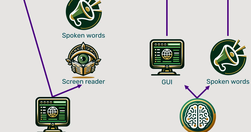
Traditional methods for accessibility have been tried for 30 years without substantially improving computer usability for disabled users. It’s time for a change, and AI will soon come to the rescue with the ability to generate a different user interface for every user, optimized for that person’s unique needs.

A bottom sheet is a user-interface pattern used commonly in mobile apps for providing contextual details or controls in the lower area of the screen. Definition: A bottom sheet is an overlay that is anchored to the bottom edge of a mobile device’s screen and that displays additional details or actions.

Users spend most of their time on other websites, so they expect your site to work like all the other sites they already know. When a design deviates from users’ expectations, usability suffers. Don’t be arrogant and assume that your new design idea is so brilliant that it can overrule decades of user habituation.
Heuristic evaluation is the activity of using a set of guidelines (heuristics) to evaluate if an interface is user-friendly. Let’s look at what heuristics are and how you can conduct a heuristic evaluation to improve the usability of your designs

In a distracted environment, the best form of smartphone interaction is a high-speed, easy-to-use one. Luke calls the typical mobile usage a "one thumb, one eyeball" experience, since the highly distracted environment causes most mobile users to engage in one-handed use with short spans of partial attention.
User interface design is hard. With so many options to choose from regarding layout, spacing, typography, and colour, making design decisions can be overwhelming. When you add usability, accessibility, and psychology to the mix, it gets even harder. Luckily, UI design doesn’t have to be so hard.