Relevant Overviews
These are the official guidelines for the Plain Writing Act of 2010. We developed these guidelines to help you and your agency write clearly, so your users can: Find what they need Understand what they find Use what they find to meet their needs
UX & Psychology: Guides and Cheatsheets. With useful resources on how people think, decide, remember and focus attention — guides, glossaries, Miro/Figjam boards and cheat sheets (LinkedIn post by Vitaly Friedman)
Golden Rules For UX Writing. With practical guidelines on how to avoid confusion and help people understand better (LinkedIn post by Vitaly Friedman)
Free Practical Guides To Web Accessibility. With useful guidelines and books to designing with accessibility and run accessibility testing (LinkedIn post by Vitaly Friedman)

Readability in user experience (UX) design refers to how easily users can read and understand textual content. It is crucial for a positive user experience as it directly impacts how effectively users can consume information on a website or application. Designers aim to enhance readability via appropriate presentation and language to make sure user

The collection contains: 197 Examples, 1457 Design Principles, 169 Creators
A content inventory and audit are two important activities to complete before developing a strategy to improve your digital content. Conduct them together to set your content up for success.
Footers can be found at the bottom of almost every web page, and often take many forms, depending on the type of content on a website. Regardless of the form they take, their presence is critical (and highly underrated).
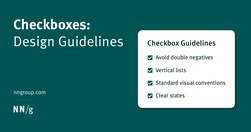
Checkboxes allow users to select one, some, or none of items from a list. They can be used standalone, in checkbox lists, or nested checkbox lists.

Why inclusive language matters Words hold power. Using inclusive language means you're thinking about: the impact of language, the origins of phrases and idioms before you use them, how you talk about people, characteristics and identities, how your own identity or experiences could create bias in your content.
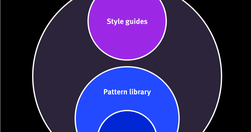
Design systems are a set of standards (like Google’s Material Design or IBM’s Carbon Design System) needed to manage design at scale. Style guides (like content or visual style guides) are just one piece in a design system.

Visual design requires knowledge and understanding of many jargon terms. Use this glossary as a reference as you delve into visual and user interface design. Use this glossary to quickly clarify key terms and concepts related to visual design.
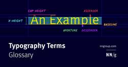
Typography is a key component in almost every digital experience. However, its complexity and jargon make it a common source of misunderstanding. Use this glossary to clarify key definitions related to typography.

Understanding cognitive biases are not only important for UX Research and UX design, but also for navigating everyday life. Bias seeps into our judgment and thinking which can warp the reality of experience based on our subjective views.

Step-by-step instructions to systematically review your product to find potential usability and experience problems. Download a free heuristic evaluation template. A heuristic evaluation is a method for identifying design problems in a user interface. Evaluators judge the design against a set of guidelines (called heuristics) that make systems ea…

A few relevant, high-quality visuals placed next to associated text can boost users’ comprehension of your content and its memorability.
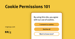
Cookie permissions need to follow the law and strike the balance between respecting user privacy and being user-friendly.
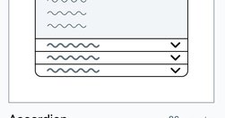
UI components and design patterns, from dashboards and design systems to data visualization and presentation decks — all in one single post.
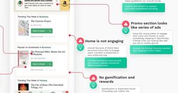
Good redesigns are evolutions, not revolutions. Useful guidelines on when and how to redesign, how to avoid pitfalls and how to help users embrace the new design.
Design System In 90 Days Canvas (FigJam template), with useful prompts to get a design system up and running — and adopted! — in 90 days, for small and large organizations that are building a design system or plan to set up one. Kindly shared by Dan Mall as a part of the Design System University. (shared by Vitaly Friedman, LinkedIn)
To be effective, QR codes need clear, brief, contextual information and must lead the user to relevant pages. QR codes provide a seamless transition from the physical world to digital spaces or across digital channels. QR codes have a lower interaction cost than typing in a URL,
We spent over 60 hours analyzing 150+ companies to find the best user onboarding examples. From home page copy and sign-up pages to onboarding emails and product tours, you can find plenty of examples to take inspiration from.
Helpful guides and starter kits to design effective journey maps that generate insights - shared by Vitaly Friedman on LinkedIn
300 million people have some kind of colorweakness or are colorblind. As designers, we know that it’s always a bad choice to combine red and green, but if we want to be truly inclusive for colorblind people, we need to go beyond that. "never rely on colors alone to communicate"
From providing accurate context to creating a cohesive structure, each of these key principles can elevate your content designs and ensure you’re communicating effectively with your audience
Today, one billion people are 60 years or older. That’s 12% of the entire world population, and the age group is growing faster than any other group. Yet online the needs of older adults are rarely often overlooked or omitted. What do we need to consider to make our designs more inclusive for older adults? (shared via LinkedIn by Vitaly Friedman)

Updated intranet guidelines feature enhanced content practices by teams, refined search design to meet elevated expectations, task-oriented navigation, and standardized design elements for visual consistency.
ite “Golden Rules,” that are applicable in most interactive systems. These principles, derived from experience and refined over three decades, require validation and tuning for specific design domains. No list such as this can be complete, but even the original list from 1985, has been well received as a useful guide to students and designers.

A bottom sheet is a user-interface pattern used commonly in mobile apps for providing contextual details or controls in the lower area of the screen. Definition: A bottom sheet is an overlay that is anchored to the bottom edge of a mobile device’s screen and that displays additional details or actions.
Design effective error messages by ensuring they are highly visible, provide constructive communication, and respect user effort.