PEOPLE DID NOT COME TO YOUR SITE OR PRODUCT TO CLICK THE BUTTON.

my notes ( ? )
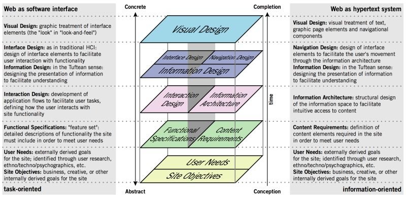
designers the extent of the depth they need to consider, because 22 years after this was published few of them even know what a "hypertext system" even is, and envision their work exclusively as a software interface.
Without both of these pillars, your UX design will fall over.
Some UXers understand this partially - but think that the interface is "more important" and the content can come afterwards. These are the people who champion ChatGPT as a great alternative to Lorem Ipsum. And they repeat the same mantra as every designer who invites AI into their workflow: "it's just for now, we will fix it later."
You will *not* be able to fix it later.
The elements you are generating are *foundational* to the way the product is used. They are not stacked on top. If you decided to outsource your thinking about the hypertext system, redoing it will require ripping out the guts of the software interface layers that you have built in parallel.
The content - not the beautiful scroll animations - is the thing people use your product for. It is not lesser than. It is not an afterthought. It even has its own set of roles (content design, UX writing, information architecture, etc).
The content is the scaffolding of the experience. When you minimize it, it is only to your own detriment.
Read the Full Post
The above notes were curated from the full post www.linkedin.com/posts/kristinahalvorson_as-if-ai-generated-user-research-wasnt-activity-7174094725459656704-LWAU?utm_source=share&utm_medium=member_desktop.Related reading
More Stuff I Like
More Stuff tagged content design , user interface design , user experience
See also: UX , Content creation & management