
Share Post Share Email Print They can be paper or click-through, but designing successful digital experiences involves making prototypes of your interfaces.

Understanding cognitive biases are not only important for UX Research and UX design, but also for navigating everyday life. Bias seeps into our judgment and thinking which can warp the reality of experience based on our subjective views.

Step-by-step instructions to systematically review your product to find potential usability and experience problems. Download a free heuristic evaluation template. A heuristic evaluation is a method for identifying design problems in a user interface. Evaluators judge the design against a set of guidelines (called heuristics) that make systems ea…
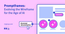
Promptframes complement traditional wireframes by integrating prompt writing and generative AI to increase content fidelity and accelerate the path to user testing. Never use lorem ipsum again.
Our research and evaluation show that there are currently few design-specific AI tools that meaningfully enhance UX design workflows. As of Spring 2024, AI isn’t ready for designers to take advantage of them. AI tools won’t be replacing UX designers any time soon. Currently available LLM-based tools are not shortcutting steps in the design process

User experience is about understanding people, their wants, needs, expectations, and predicting them. But, as a UX designer, you have the power to manage user experience and create a product in a way that will guide a consumer to the result you expect. That’s exactly what we are going to focus on today.

Boost your SEO with effective header tag usage. Learn how to optimize header tags to improve content scannability, search engine visibility, and user experience.

Related ArticleBuilding Interactive UX MapsInteractions can be applied to high-fidelity UX maps to showcase user research and further engage with stakeholders.
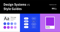
Design systems are a set of standards (like Google’s Material Design or IBM’s Carbon Design System) needed to manage design at scale. Style guides (like content or visual style guides) are just one piece in a design system.
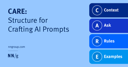
To get better results from generative-AI chatbots, write CAREful prompts. Include context, what you’re asking the system to do, rules for how to do it, and examples of what you want.

Websites and apps are our modern equivalent of phones. You create them so that people can serve themselves. Make your site or app a good conversational partner.
A UI/UX designer focuses on the appearance of an interface and how users will use said interface. A content-first designer, a.k.a., a content designer or UX writer, will focus on the content users will interact with.

Be skeptical of the marketing claims being made by AI tools designed for UX researchers. Many of these systems are not able to do everything they claim.

There’s a powerful force that flows through every user interface (UI): psychology. But like a certain force from a galaxy far, far away, psychology can be used for good or evil. On the light side we have behavioural nudges; on the dark side we have, well, dark patterns.

The Dunning-Kruger effect is a cognitive bias that impacts individuals' perception of their own abilities. For designers and clients, this bias can have significant implications for the overall quality of the user experience. If designers recognize the risks associated with the Dunning-Kruger effect and implement strategies to minimize its impact,
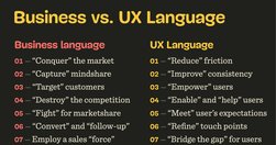
As designers, especially in large enterprises, we often might feel misunderstood and underappreciated. It might feel like every single day you have to fight for your users, explain yourself and defend your work. It’s unfair, exhausting, painful and frustrating.
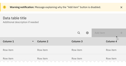
Both hiding and disabling features can be utterly confusing to users. And for both, we need very, very good reasons. Let’s take a closer look at what we need to consider when it comes to hiding and disabling — and possible alternatives that help enhance the UX.

Traditional usability tests are great, but they are not always the most appropriate tool for the job.
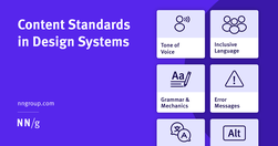
Content standards in design systems support a holistically consistent user experience and efficient collaboration between writers, content, and UI designers.

A few relevant, high-quality visuals placed next to associated text can boost users’ comprehension of your content and its memorability.
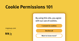
Cookie permissions need to follow the law and strike the balance between respecting user privacy and being user-friendly.

With the proper context, prompts, and scrutiny, AI chatbots can be used to create a successful user-research plan.

Whitespace is an effective principle to achieve a balanced design, making it easier for your users to scan and read. Consider using a consistent spacing system and the proximity principle to achieve a balanced use of whitespace.
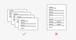
While completing a form isn’t usually a particularly fun task for a user, it is often a necessary step of a process. For example, a user might be asked to fill out a short form with payment details to buy an item or they might have to complete a form as part of a job application.
Example page (landing page)Innovation, training and toolsURL: https://joint-research-centre.ec.europa.eu/tools-and-laboratories_en (may have been updated since May 2023)On the basis of our open data principles we publish tools and databases. The tools and databases are categorised by name and acronym.LaboratoriesThe JRC maintains a wide range of l…

Prompt engineering is the process of creating effective prompts for artificial intelligence (AI) systems. A prompt in AI is a specific instruction or input given to an AI system to elicit a desired response or output. Effective prompt engineering results in good communication between the user and the AI system, where the user guides the AI systems
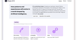
AI is accelerating change. Companies are reacting by “doing AI”without prioritizing the experience of the people on the receiving end–Design is more important than ever. To respond, we must get smart, fast. This starts with understanding the emerging patterns of interaction, affordances, and heuristics in an AI world. The pages below are summaries

The dual prompting approach in AI-driven UX design distinguishes between exploratory and detail-refining phases. Alternating these prompt styles can optimize your UX strategies and harness AI's potential for innovation and precision. Use both zero-shot and few-shot prompting for greater breadth and depth in creative problem-solving.
A good contract is key to starting a client project off successfully. It sets the right expectations and prevents misunderstandings and, ultimately, potential legal problems. Let’s take a closer look at how to create legal documents that protect everyone’s interests, as well as handy templates and frameworks you can use right away.

UI components and design patterns, from dashboards and design systems to data visualization and presentation decks — all in one single post.