Curated Resource ( ? )
The Picture-Superiority Effect: Harness the Power of Visuals
Curated:
29/04/2024 from
www.nngroup.com/articles/picture-superiority-effect/
my notes ( ? )
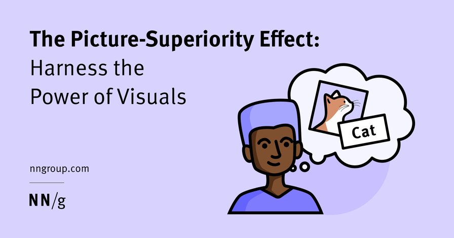
Definition: The picture-superiority effect refers to the fact that people tend to remember pictures better than words.
In This Article:
3 Ways to Leverage the Picture-Superiority Effect
What Is the Picture-Superiority Effect?
Definition: The picture-superiority effect refers to the fact that people tend to remember pictures better than words.
This phenomenon is well documented in cognitive psychology. One of the most popular theories for why pictures are more memorable than words belongs to the psychologist Allan Paivio. Paivo believed that the picture-superiority effect occurs because any visual is stored in two ways in memory — (1) as an image, and (2) as a word or phrase that describes the image. In contrast, words are stored in only one way — the word itself. While the mind can generate images for words, this process is not automatic and requires significant cognitive effort, making it less common.
Thus, Paivio’s theory says that images are more memorable than words because they have more representation in memory.
Why Images Matter
Visuals play an important role in UX design. They can illustrate concepts, showcase products, and communicate the company’s brand.
In ecommerce contexts, product images and marketing visuals ensure that users are more likely to remember the product, its value proposition, and the associated brand attributes. They help the company stand out from its competitors. One of our participants in a recent usability study of our consulting pages said,
“I know it seems almost mundane, but those simple things [imagery] help me organize my thoughts [...] it helps me remember you better [...] I found myself being attracted to a particular marketing group because their graphics educated me more than their nomenclature did. I didn't have to read it. I could just visually go through it. [...] So I actually selected them for training.”
Imagery can also help people grasp complex concepts. When people need to remember a complex concept or a process, they often rely on visuals stored in their memory.
UX practitioners can leverage the picture-superiority effect when communicating user-research insights. Visual artifacts, like maps and personas, help team members and stakeholders remember user-research insights. Memorable research findings are more likely to be referenced and used in everyday decision making.
Factors Affecting the Picture-Superiority Effect
The strength of the picture-superiority effect depends on several factors, including:
- Discoverability: People must discover and look at a visual for it to be memorable. French psychologist Paul Fraisse found that the picture-superiority effect diminishes if people don’t view an image long enough. The longer a person views an image, the more likely they are to remember it.
- Clarity: The more concrete and literal the visual is, the more memorable it will be. The mind can interpret and assign a label to a literal image more easily than to an abstract one. The more abstract the image, the more difficult its interpretation, and the lower its memorability.
- Familiarity: The more familiar a person is with a concept, the easier it will be to comprehend a visual of it and associate a word with it. People with minimal experience with a concept or object may not recognize an image of it and, therefore, will struggle to find a word to assign to it. The image will have lower memorability.
- Uniqueness: The more unique the visual is (relative to other visuals present), the more memorable it will be.
3 Ways to Leverage the Picture-Superiority Effect
Designers can leverage the picture-superiority effect by making some strategic choices when creating or choosing visuals for their designs.
#1: Place Visuals Where Users Spend Time
To boost discoverability, designers should:
- Place important visuals where users spend time. Analytics can help you identify where and how long people spend on different pages, screens, or web properties. On many websites, the homepage receives the most views. Therefore, it is particularly important to place meaningful visuals on your website’s homepage, if you want to boost the memorability of your products.
- Place high-value, information-carrying visuals above the fold. We know users spend 80% of their time above the page fold on websites. Save visuals that support the brand but don’t carry much information for the area below the fold.
- Ensure that visuals persist to give users the best chance of remembering them. Some websites feature an autoforwarding carousel of images. For example, Garmin’s homepage carousel (pictured below) auto-forwards approximately every four seconds. This risks that users do not have enough time to comprehend (and remember) the visuals.
In This Article:
Should You Use Images Instead of Words?
What Is the Picture-Superiority Effect?
Definition: The picture-superiority effect refers to the fact that people tend to remember pictures better than words.
This phenomenon is well documented in cognitive psychology. One of the most popular theories for why pictures are more memorable than words belongs to the psychologist Allan Paivio. Paivo believed that the picture-superiority effect occurs because any visual is stored in two ways in memory — (1) as an image, and (2) as a word or phrase that describes the image. In contrast, words are stored in only one way — the word itself. While the mind can generate images for words, this process is not automatic and requires significant cognitive effort, making it less common.
Thus, Paivio’s theory says that images are more memorable than words because they have more representation in memory.
Why Images Matter
Visuals play an important role in UX design. They can illustrate concepts, showcase products, and communicate the company’s brand.
In ecommerce contexts, product images and marketing visuals ensure that users are more likely to remember the product, its value proposition, and the associated brand attributes. They help the company stand out from its competitors. One of our participants in a recent usability study of our consulting pages said,
“I know it seems almost mundane, but those simple things [imagery] help me organize my thoughts [...] it helps me remember you better [...] I found myself being attracted to a particular marketing group because their graphics educated me more than their nomenclature did. I didn't have to read it. I could just visually go through it. [...] So I actually selected them for training.”
Imagery can also help people grasp complex concepts. When people need to remember a complex concept or a process, they often rely on visuals stored in their memory.
UX practitioners can leverage the picture-superiority effect when communicating user-research insights. Visual artifacts, like maps and personas, help team members and stakeholders remember user-research insights. Memorable research findings are more likely to be referenced and used in everyday decision making.
Factors Affecting the Picture-Superiority Effect
The strength of the picture-superiority effect depends on several factors, including:
- Discoverability: People must discover and look at a visual for it to be memorable. French psychologist Paul Fraisse found that the picture-superiority effect diminishes if people don’t view an image long enough. The longer a person views an image, the more likely they are to remember it.
- Clarity: The more concrete and literal the visual is, the more memorable it will be. The mind can interpret and assign a label to a literal image more easily than to an abstract one. The more abstract the image, the more difficult its interpretation, and the lower its memorability.
- Familiarity: The more familiar a person is with a concept, the easier it will be to comprehend a visual of it and associate a word with it. People with minimal experience with a concept or object may not recognize an image of it and, therefore, will struggle to find a word to assign to it. The image will have lower memorability.
- Uniqueness: The more unique the visual is (relative to other visuals present), the more memorable it will be.
3 Ways to Leverage the Picture-Superiority Effect
Designers can leverage the picture-superiority effect by making some strategic choices when creating or choosing visuals for their designs.
#1: Place Visuals Where Users Spend Time
To boost discoverability, designers should:
- Place important visuals where users spend time. Analytics can help you identify where and how long people spend on different pages, screens, or web properties. On many websites, the homepage receives the most views. Therefore, it is particularly important to place meaningful visuals on your website’s homepage, if you want to boost the memorability of your products.
- Place high-value, information-carrying visuals above the fold. We know users spend 80% of their time above the page fold on websites. Save visuals that support the brand but don’t carry much information for the area below the fold.
- Ensure that visuals persist to give users the best chance of remembering them. Some websites feature an autoforwarding carousel of images. For example, Garmin’s homepage carousel (pictured below) auto-forwards approximately every four seconds. This risks that users do not have enough time to comprehend (and remember) the visuals.
#2 Choose Literal Images over Abstract Ones
To ensure images are clear and familiar, avoid abstract visuals. Abstract visuals do not depict a recognizable, clear object, and as a result, don’t evoke a clear word when perceived; therefore, they are difficult to remember.
For example, the Adobe Podcast AI product homepage features an illustration highlighting a key feature called Mic Check. However, the illustration is too abstract to comprehend.
In contrast, the ChatGPT homepage (pictured below) features screenshots of the product on mobile and desktop; this illustration makes it easy for users to understand the product capabilities.
#3: Pick Unique Imagery
Images that differ from the imagery around them are more likely to be noticed, processed, and therefore, remembered. In contrast, images that are too similar may be associated with similar words and may be harder to distinguish from each other and recall.
For example, Google uses heavily branded icons for each service in its cloud-based software suite. The visuals for Meet, Chat, Drive, and Calendar are too similar, decreasing the picture-superiority effect.
While uniqueness is important, your images should not be visually jarring. To maintain overall visual cohesion, visuals should use similar color palettes, saturation, or photo crops The Google Drive icons above use the same color palette and saturation; however, the shapes and color placement are nearly identical; as a result, the icons are too similar to be easily distinguishable from each other.
Unique imagery applies not only to your product; your visuals should also be distinct from your competitors’ visuals. When visuals on your competitors’ products are too similar to your own, users may struggle to remember your product.
For example, Nortably.ai uses visuals and visual-design elements that are highly similar to those on Dovetail.com. The result is that both designs (and the corresponding products) are less memorable overall. This is one reason we advise designers not to blindly copy the designs of their competitors.
Should You Use Images Instead of Words?
Some people mistakenly use the picture-superiority effect to justify replacing text with images, such as incorporating icons in a user interface without text labels. However, words still matter! Adding text labels provides redundancy and will strengthen comprehension and memorability. In addition, labels will ensure that your icons will be comprehended correctly and will increase the target size, making it easier for people to click on those icons.
Conclusion
When the picture-superiority effect is effectively leveraged in interface design, users are more likely to leave with a more accurate and positive impression of your website, product, or brand. While visuals can add information and increase memorability, text is still required for good usability and conveying a clear message.
References
Read the Full Post
The above notes were curated from the full post www.nngroup.com/articles/picture-superiority-effect/.Related reading
More Stuff I Do
More Stuff tagged visual content , content design , images , photos , user experience
See also: UX , Content creation & management