Relevant Overviews
Effective icons depend on recognizability and interpretation. Evaluate them with methods appropriate for your specific research questions
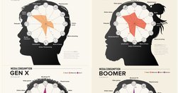
With frequent myths and actual behavior patterns that go beyond heavy use of social media
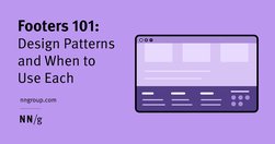
Footers can be found at the bottom of almost every web page, and often take many forms, depending on the type of content on a website. Regardless of the form they take, their presence is critical (and highly underrated).

Tabs and accordions organize and layer content on the same page. Tabs suit a few long sections, while accordions fit many short ones. Choose based on your content structure and user needs for optimal layout.

Tables frequently appear on the web but aren’t easy to design and code. People will expect tables. Not those fancy ones from design inspiration sites but Excel-looking monsters with hundreds of cells and complex interaction. In this case, a designer faces many challenges. With this illustrated guide, Slava Shestopalov explains the table anatomy and

There’s a powerful force that flows through every user interface (UI): psychology. But like a certain force from a galaxy far, far away, psychology can be used for good or evil. On the light side we have behavioural nudges; on the dark side we have, well, dark patterns.
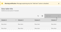
Both hiding and disabling features can be utterly confusing to users. And for both, we need very, very good reasons. Let’s take a closer look at what we need to consider when it comes to hiding and disabling — and possible alternatives that help enhance the UX.

Content standards in design systems support a holistically consistent user experience and efficient collaboration between writers, content, and UI designers.
UI components and design patterns, from dashboards and design systems to data visualization and presentation decks — all in one single post.
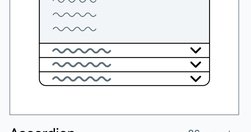
While accordions can simplify long content pages and minimize scrolling, they diminish content visibility and increase interaction cost. On desktop, use accordions for content-heavy pages where users will not need to access content under several accordions.

Avoid using accordions when: 1. Users need access to most content; 2. There's little visible content on the page; 3. Content is complex with multiple levels; 4. Content can't be effectively chunked; 5. An uninterrupted reading flow is prioritized.

A bottom sheet is a user-interface pattern used commonly in mobile apps for providing contextual details or controls in the lower area of the screen. Definition: A bottom sheet is an overlay that is anchored to the bottom edge of a mobile device’s screen and that displays additional details or actions.

New regulations from the Government of India prohibit the use of 12 common dark design patterns. These sneaky practices are unethical applications of established UX knowledge to make interface designs that harm users instead of helping them.