"Collaborative Doctoral Partnership (CDP) programme" section, copy written and maintained in cooperation with the JRC programme manager for the CDP.
"Facts4EUFuture" section, copy written for a campaign to promote a series of 11 reports 2018-2019 to inform the incoming EC presidency on upcoming trends. After relaunch of the Science Hub in 2022, the initial landing pages have been replaced with direct links to the "JRC Publications Repository".
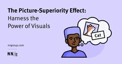
People often remember visuals better than words. Designers can leverage the picture-superiority effect to make their products memorable and learnable.
Scrolling, scanning, skipping: How do users consume content online? Here’s what you need to know about reading behavior and design strategies to prevent harmful scanning patterns.
"Working with us" section, copy written in January/February 2023 in cooperation with JRC HR colleagues.
About page, copy written in March 2023 based on JRC documents: - Revitalising the JRC Strategy 2030; - JRC strategy 2030; - JRC work programme 2023 - 2024: Brochure; - JRC Work Programme 2023 -2024: Factsheets; - JRC portfolio cards
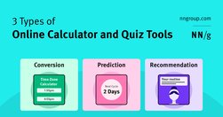
Most calculator and quiz tools provide at least one or more of the following services: converting inputs, predicting the future, or providing recommendations.
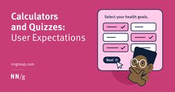
Calculators and quizzes provide personalized information. Users approach these tools with an exploratory mindset and appreciate them while making decisions.
To prevent failure and make our designs more resilient, we need to explore edge cases and exceptions already during the design process. Let’s take a closer look at what to watch out for.
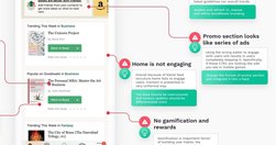
Good redesigns are evolutions, not revolutions. Useful guidelines on when and how to redesign, how to avoid pitfalls and how to help users embrace the new design.
Undoubtedly there are major advantages of live validation in forms. Most importantly, if an input expects a particular type of content, we can flag issues immediately, so users can fix these issues rather than operating under a wrong assumption.

When deciding between native and web-based mobile apps, crucial considerations arise that impact long-term success.
Userfocus User Experience ConsultantsHomeUX consultancyUX trainingArticlesAbout Us Is Consumer Research Losing Its Focus? Focus groups continually fail to tell us what customers want. The fundamental problem is that, in spite of what conventional wisdom tells us, it is not the voice of the consumer that matters. What matters is the mind of the c…

People new to user research often think of surveys and focus groups as the main ways to get insights into customer needs. Here are 60 alternative ideas you might want to try.
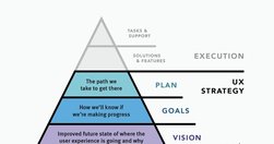
UX strategy is a plan of action that allows the organization to reach a higher state of user experience over a certain period of time. It lies at the intersection of product design and business strategy and serves as a guide for prioritizing and executing UX work over time.

The differences between responsive and adaptive design approaches spotlight important options for us as web and app designers. Choosing with insight can empower you to plan and execute your designs with better aim, purpose and results.

What does research look like in a content design context? Where does it fit in in the content design process? Who does the research and who’s responsible for sharing the research findings? Which format is the best for sharing content design research findings? When do you know you’ve done “enough research” and can get to work?
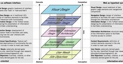
The content - not the beautiful scroll animations - is the thing people use your product for. It is not lesser than. It is not an afterthought. It even has its own set of roles (content design, UX writing, information architecture, etc). The content is the scaffolding of the experience. When you minimize it, it is only to your own detriment.

What does it mean to design for neurodiversity? We look at steps we can take to make content more accessible to more people.
Guardian article: A study from the University of Valencia found that print reading could boost skills by six to eight times more than digital reading
Design System In 90 Days Canvas (FigJam template), with useful prompts to get a design system up and running — and adopted! — in 90 days, for small and large organizations that are building a design system or plan to set up one. Kindly shared by Dan Mall as a part of the Design System University. (shared by Vitaly Friedman, LinkedIn)

Will AI turn our brains to mush? History suggests otherwise. From writing to calculators to spell check, new tech has always sparked fears of cognitive decline. But AI, like previous innovations, will free our minds for deeper thinking. Embrace AI as a forklift for the mind. AI won't make us stupid — it’ll make us smarter.
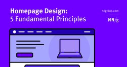
Effective homepages are simple and easy to access, communicate the organization’s and site’s purpose, show engaging content, and prompt users to take action.

Mobile devices … seamlessly bridge the gap between the physical and digital realms, making information and services readily accessible to their users at all times. Mobile design is a balancing act between functionality and simplicity, in which the goal is to create a user experience that is easy to use for all.
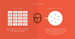
Understanding How the Human Brain Works Helps Us Build Designs That Work For Humans.
html.to.design converts any website into fully editable Figma designs.

Many writers turn to ChatGPT or other AI chatbots to edit and perfect their tone. Much like people, however, AI struggles to convey nuanced emotions.
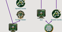
Traditional methods for accessibility have been tried for 30 years without substantially improving computer usability for disabled users. It’s time for a change, and AI will soon come to the rescue with the ability to generate a different user interface for every user, optimized for that person’s unique needs.

In psychology, a false memory refers to a mental experience that’s remembered as factual but is either entirely false or significantly different from what actually occurred. These can be small details, like misremembering the color of a car, or more substantial, like entirely fabricated events.

Human memory is not a literal reproduction of the past, but instead relies on constructive processes that are sometimes prone to error and distortion.