Curated Resource ( ? )
The Most Influential Psychological Studies on UX Design.
Curated:
13/03/2024 from
uxplanet.org/the-most-influential-psychological-studies-on-ux-design-2f92fa6e2442
my notes ( ? )
However, as I learned, I began to see these connections more and more. Nobody else in my class looked at basic psychology the same way I did, out of 40 students, 39 were pursuing science or medicine. And that one, of course, was me, a technology student. While the girl next to me worked with children suffering trauma, I was there trying to understand how to make someone click a button.
Those seemingly abstract psychological studies weren’t just theories in dusty textbooks; they were the secrets to understanding human cognition and behavior. So buckle up and prepare to dive deep into the extraordinary realm where psychology meets design.
Invisible Gorilla Experiment (Selective Attention)
Study Conducted by: Chabris and Simons
This experiment is often described as, “one of the most famous psychological demos ever.” Chabris and Simons were able to reveal that people who are focused on one thing can easily overlook something else. To demonstrate this effect they created a video where students pass a basketball between themselves. Viewers were asked to count the number of times the players with the white shirts pass the ball, often failing to notice a person in a gorilla suit who appears in the center of the image. Simons and Chabris were awarded an Ig Nobel Prize for this experiment.
This study helped prove humans have selective attention. Selective Attention is the process of focusing on a particular object in one's environment for a certain period of time. As attention is a limited resource — selective attention allows us to tune out unimportant details and focus on what matters.
What this means for designers
Designers tend to be hip to this concept, that to optimize a user’s experience we focus on the user’s journey and try not to create unnecessary noise on a page. People have selective attention and will only focus on the necessary journey to their objective. Nothing is more annoying than trying to find something on a page crowded by stuff you have no intention of using — If it’s not important to a user's task, users won’t care about or acknowledge it. Non-designers often interpret concepts such as white space as a “negative” or “lazy” way to design. Designers know white space and limited options are our friends and are commonly found in great designs.
Change blindness is a similar phenomenon where we don’t detect changes. Whether they’re in our environment, on websites, or directly in front of our faces. The Invisible Gorilla Experiment is not the only experiment that has revealed the brain missing information they were not focused on. The results of many other extensive experiments yielded high percentages of participants not noticing changes. These ranged from people changing clothes to a complete swap of a person they were talking to.
Change blindness is just one reason why automatically rotating carousels are a big no in design. Nielsen Norman ran an experiment with a carousel and recorded the details users could recall from the page. The user’s target was at the top of the page in 98-point font. However, some users failed to find it because the panel auto-rotated instead of staying still.
It also helps us to understand why error states are necessary, so changes are more noticeable. Changes that need to be done to continue on the journey should be visible and look different to catch attention. Users may not notice the small text in the corner or an error message that is the same text and color as the rest of the form. Users are drawn to completing what they are focusing on and may miss or disregard designs that are irrelevant or invisible to their set task.
Build for user needs, or your design may be overlooked. Yes even if it is a gorilla in the dead center of a basketball game.
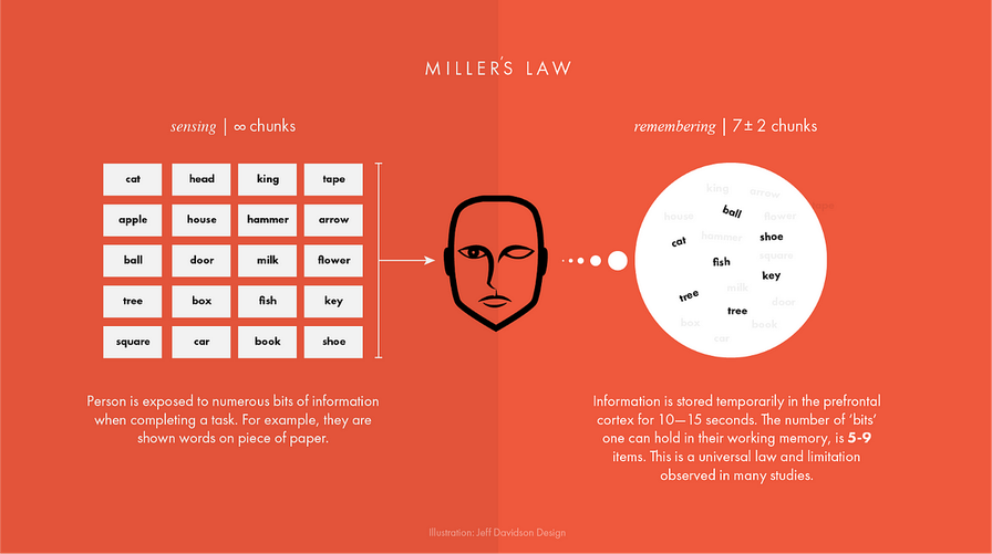
Magical Number Seven
Study Conducted by: George A. Miller
The 1956 Magical Number Seven study identified that in human cognition, the number of objects an average human can hold in working memory is a range of 7 ± 2. What this means is that the human memory capacity typically includes strings of words or concepts ranging from 5–9. This information on the limits to the capacity for processing information became one of the most highly cited papers in psychology.
What this means for designers
Do not make designs complex. Especially when we think about navigation menus it’s important to think about what information we are making users remember and what is visibile. This includes concepts such as sub-menus. Nobody wants to scroll through 10 selection options for what they want just to have to go back and re-read a couple. I mean… The study proves humans working memory of information is not as great as some may think.
We should not put the job on the users to be the ones to actively think about and retain information. Important information should be visible.
Information Architecture: UX designers need to structure and organize information in a way that aligns with users’ cognitive limitations. By considering Miller’s “magic number seven,” designers can create hierarchies, categories, and navigation systems that make it easier for users to process and remember information.
Content Presentation: Presenting information in bite-sized chunks or breaking down complex concepts into smaller, more manageable pieces can enhance user comprehension. By avoiding information overload and focusing on simplicity, designers can ensure that users can process and understand the content more effectively.
Form Design: When designing forms or input fields, UX designers can keep Miller’s findings in mind. By limiting the number of required fields or breaking down longer forms into multiple steps, designers can reduce cognitive load and enhance the user experience.
Visual Hierarchy: Visual elements such as headings, bullet points, and typography can help users scan and comprehend information more easily. Applying visual hierarchy techniques allows designers to prioritize and emphasize the most critical information, reducing cognitive strain on users.
Navigation and Menu Design: UX designers can use Miller’s findings to create intuitive navigation systems with a limited number of options. By presenting a manageable number of choices, designers help users make decisions more quickly and prevent decision fatigue.
Overall, Miller’s study reminds UX designers that understanding the limitations of human cognitive processing is crucial. By applying these insights, designers can create interfaces and experiences that align with users’ mental capacities, resulting in more effective and user-friendly designs.
Fitt’s Law
Study Conducted by: Paul Fitts
In 1954, psychologist Paul Fitts, examining the human motor system, showed that the time required to move to a target depends on the distance to it, yet relates inversely to its size. By his law, fast movements and small targets result in greater error rates, due to the speed-accuracy trade-off.
Fitts’ law states that the amount of time required for a person to move a pointer (e.g., mouse cursor) to a target area is a function of the distance to the target divided by the size of the target. Thus, the longer the distance and the smaller the target’s size, the longer it takes.
What this means for designers
Design is a trade-off. Large buttons are good, but as the button gets larger the ease of use increases just a little. Comparing a 1px button to a 20px button the usability increases dramatically. A 120px button? Even better, but compared to a 140px button — the difference won’t be as dramatic or noticeable when user testing.
The corners and edges of screens are also important elements in the design as a user may very quickly drag a cursor to the edge of a screen and the cursor will automatically stop there, so clicking edges is an easy task.
Hick’s Law
Law by William Edmund Hick and Ray Hyman
Hick’s Law (or the Hick-Hyman Law) is named after a British and an American psychologist team of William Edmund Hick and Ray Hyman. In 1952, this pair set out to examine the relationship between the number of stimuli present and an individual’s reaction time to any given stimulus. As you would expect, the more stimuli to choose from, the longer it takes the user to make a decision on which one to interact with. Users bombarded with choices have to take time to interpret and decide, giving them work they don’t want.
The formula for Hick’s Law is defined as follows:
RT = a + b log2 (n)
Where “RT” is the reaction time, “(n)” is the number of stimuli present, and “a” and “b” are arbitrary measurable constants that depend on the task that is to be carried out and the conditions under which it will be carried out. “A” could be finding the right present online for your mother-in-law; “B” could be an onscreen chat with your mother-in-law in which she reminds you it’s her birthday tomorrow.
What this means for designers
Generally, the application of Hick’s Law is simple — reduce the number of stimuli and get a faster decision-making process — but there are exceptions to the rule.
In practical terms for UX design, this means that providing users with too many options can lead to decision paralysis and slower reaction times. To enhance user experience, designers should aim to reduce the number of choices users have to make, streamlining the decision-making process.
While the general application of Hick’s Law suggests that fewer stimuli lead to faster decision-making, it’s important to note exceptions. For instance, if users have already made a decision before being presented with stimuli, their reaction time may be quicker. Therefore, designers need to consider user context and behavior to optimize the application of Hick’s Law in specific situations.
Hawthorne Effect
Study Conducted by: Henry A. Landsberger
1955 at Hawthorne Works in Chicago, Illinois
Hawthorne Effect Experiment Details: The Hawthorne Effect came from a 1955 study conducted by Henry Landsberger. This effect is a simple premise that human subjects in an experiment change their behavior simply because they are being studied.
What this means for designers
In User Experience, we discuss that user testing and research are only valid when conducted with proper experimental strategies. In light of this, if you observe your users for human research, you need to know that observation can significantly impact the user’s behavior.
When the user changes behavior during the testing because of your presence, this is a sign of a Hawthorne effect, and the results will not be accurate to a true environment. The bigger problem lies with faulty findings that may be used in the UX design decisions, leading to a product that may not solve an existing problem or be used in the real world.
In short, the Hawthorne effect likely gives designers false reports that do not necessarily reflect the users’ reality.
Avoid cues, or setting expectations.
Make it known there are no wrong answers when conducting interviews or tests, you did not design what they are using, and you want to know how they would use the software normally. Try and get their honest opinion and insights.
The Hawthorne Effect can influence the feedback that users provide. Designers can also try to gather feedback unobtrusively or use methods such as A/B testing or heat mapping to evaluate the effectiveness of different designs in analytical ways on top of feedback.
To mitigate the impact of the Hawthorne Effect during user testing, designers can try to create a natural testing environment, use unobtrusive methods to gather feedback, or use remote testing methods.
Design is Psychology and Psychology is design
These 5 psychological studies have shown up over and over in the UX design and research process. Whether I’m doing an interview or a user test or designing a button or site architecture, these concepts have been crucial to best practices. Take the time to delve into these research studies and understand what they mean for our designs. These simple yet complex concepts can make our designs so much more efficient if we keep them in mind.
Keep on learning!
References:
Chabris, Christopher, and Daniel Simons. The Invisible Gorilla. HarperCollins, 2011.
Fitts, Paul M. (1954). “The information capacity of the human motor system in controlling the amplitude of movement”. Journal of Experimental Psychology. 47 (6): 381–391. doi:10.1037/h0055392
Hick, W. E. (1952). “On the rate of gain of information”. Quarterly Journal of Experimental Psychology. 4 (1): 11–26. doi:10.1080/17470215208416600
Miller, G. A. (1956). The magical number seven, plus or minus two: Some limits on our capacity for processing information. Psychological Review, 63(2), 81–97. https://doi.org/10.1037/h0043158
Landsberger, H. A. (1958). Hawthorne revisited: Management and the worker: its critics, and developments in human relations in industry. Cornell University.
Read the Full Post
The above notes were curated from the full post uxplanet.org/the-most-influential-psychological-studies-on-ux-design-2f92fa6e2442.Related reading
More Stuff I Like
More Stuff tagged psychology and ux