Designing For Edge Cases and Exceptions (4 mins)

my notes ( ? )
Designing For Edge Cases and Exceptions (4 mins)
Good design paves happy paths for everyone, but also casts a wide safety net when things go sideways. We never know how a user will actually use a product, and it’s just a matter of time until errors or exceptions will occur.
To prevent failure and make our designs more resilient, we need to explore edge cases and exceptions already during the design process. Let’s take a closer look at what to watch out for.
Examining every part of the core flow is key to making your design fit for edge cases and exceptions. (Image source: “How to fix a bad user interface,” Scott Hurf)
Average Users Don’t Exist
I love to explore unhappy paths by setting up a dedicated design review to discover exceptions proactively. It can be helpful to also ask AI tooling to come up with alternate scenarios.
Once we start discussing exceptions, we start thinking outside the box. We have to actively challenge generic expectations, stereotypes, and assumptions that we as designers typically embed in our work, often unconsciously. And to me, that’s one of the most valuable assets of such discussions.
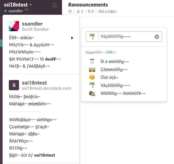
French texts are on average 20% longer than English ones, and Japanese texts are 30–60% shorter. We should simulate translation-induced expansion with pseudolocalization plugins. (Image source: “Localizing Slack,” Scott Sandler)
Whenever possible, flag any mentions of average users in your design discussions. Average users don’t exist, and usually it’s merely an aggregated average of assumptions and hunches. Nothing stress-tests your UX better than testing it in realistic conditions with realistic data sets and real people.
Design And Test Extreme Scales
An effective way to prepare your design for edge cases is to start by designing the core flow, then scrutinize every part of it. Users will dynamically move between the different states of your product as they interact with it, so to prevent slips and mistakes that could happen along the way, design defaults deliberately for blank, loading, partial, error, and ideal states.
Be sure to also design and test extreme scales. Can the form you’re working on handle extra long or short inputs, for example? And what happens if a user is on a slow connection or even offline?
Design always lives on a scale of extremes. Similar to tone of voice in UX, we could explore edge cases and map them on various levels of severity. Example: Voice and Tone on Zendesk.
Another question to ask is how your design handles incompability. Test with contradicting filters, preferences, and settings to detect bottlenecks. An option that could appear a bit radical but might also be worth exploring is allowing users to override validators when necessary to prevent them from getting stuck.
Irreversible actions like “Delete,” “Cancel,” or “Exit” also require special attention. Consider allowing users to undo critical actions for some period of time to have their back when they accidentally triggered an action they didn’t mean to.
If something didn’t work out as expected, error messages are crucial to help users get back on track. Avoid generic error messages, as they are often the main blockers. Instead, try to suggest presets, templates, or starter kits for quick recovery. You could also design a recovery UX to prepare for unwanted situations like delays, lock-outs, or missing data.
Key Takeaways
- People are never edge cases; “average” users don’t exist.
- Exceptions will occur eventually, it’s just a matter of time.
- To prevent failure, we need to explore unhappy paths early.
- Design full UI stack: blank, loading, partial, error, ideal states.
- Design defaults deliberately to prevent slips and mistakes.
- Start by designing the core flow, then scrutinize every part of it.
- Allow users to override validators, or add an option manually.
- Design for incompatibility: contradicting filters, prefs, settings.
- Avoid generic error messages: they are often main blockers.
- Suggest presets, templates, starter kits for quick recovery.
- Design extreme scales: extra long/short, wide/tall, offline/slow.
- Design irreversible actions, e.g. “Delete,” “Forget,” “Cancel,” “Exit.”
- Allow users to undo critical actions for some period of time.
- Design a recovery UX due to delays, lock-outs, missing data.
- Accessibility is a reliable way to ensure design resilience.
Useful Resources
- How To Fix A Bad User Interface, by Scott Hurff
- How To Design Edge Cases, by Tanner Christensen
- How To Find Edge Cases In UX, by Edward Chechique
- Just About Everyone Is an Edge Case, by Kevin Ferris
- Edge Cases In UX, by Krisztina Szerovay
Recommended Books
- Design For Real Life, by Sara Wachter-Boettcher, Eric Meyer
- The End of Average, by Todd Rose
- Think Like a UX Researcher, by David Travis, Philip Hodgson
- Mismatch: How Inclusion Shapes Design, by Kat Holmes
Read the Full Post
The above notes were curated from the full post mailchi.mp/smashingmagazine.com/ux-training-spring-2024-week-three-1135434?e=eaf6a42f86.Related reading
More Stuff I Like
More Stuff tagged edge cases , ui , ux , design , user interface design
See also: UX