Relevant Overviews
Law 1 / Reduce - The simplest way to achieve simplicity is through thoughtful reduction.Law 2 / Organize - Organization makes a system of many appear fewer.Law 3 / Time - Savings in time feel like simplicity.Law 4 / Learn - Knowledge makes everything simpler.Law 5 / Differences - Simplicity and complexity need each other.Law 6 / Context - What lie…

"Designers love it, website owners want to fill it. Whitespace seems to be one of the most controversial aspects of design. Why then is it so important and how can we ensure it is maintained?"

start to understand how we may need to balance social media with other more challenging, but ultimately more satisfying forms of communication

Users have learned to ignore content that resembles ads, is close to ads, or appears in locations traditionally dedicated to ads.
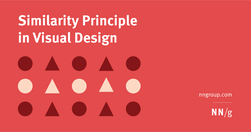
Summary: Design elements that appear similar in some way — sharing the same color, shape, or size — are perceived as related, while elements that appear dissimilar are perceived as belonging to separate groups.
People do not read online: "fundamental scanning behaviors remain constant, even as designs change."

"While it is important to keep key information easily accessible, the 3-click rule is an arbitrary rule of thumb that is not backed by data."

"Design for each channel’s unique strengths and role in the customer journey to create usable context-specific experiences."
Chunking is a concept where text and multimedia content is broken up into smaller chunks to help users process, understand, and remember it better.
Good evidence why coming up with ever new, more "beautiful", "attractive" and trendy designs that "pop" is not always a good thing.
"A link is a promise. A menu is a selection of promises. Without the link there is no Web."
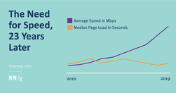
"In spite of an increase in Internet speed, webpage speeds have not improved over time."