Curated Resource ( ? )
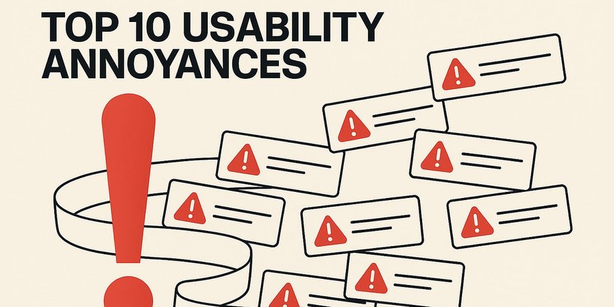
Top 10 UI Annoyances
Curated:
24/07/2025 from
jakobnielsenphd.substack.com/p/ui-annoyances
my notes ( ? )
Watch: Explainer video about the top-10 UI annoyances (YouTube, 6 min.)
Usability problems are not minor irritations; they are expensive business failures. While often dismissed as complaints by overly picky users, these design flaws have a direct and measurable negative impact on key business metrics.
Each individual exposure to a usability annoyance may be just that: a fleeting annoyance. But since the annoyances don’t go away, their impact compounds, leading to low adoption, wasted development cycles, and long-term damage to brand trust.
One usability annoyance is bad enough, but it can be shrugged off. Unfortunately, users encounter a profusion of these annoyances every day, and the cumulative effect is severe. (GPT Image-1)
In this article, I slam 10 of the most common and damaging usability sins that persist in modern interfaces. (Plus 6 bonus annoyances at the end of the article.) These are not general issues, such as “cluttered screens” or “confusing navigation,” but specific, identifiable design patterns that frustrate users, impede task completion, and drive customers away.
1: Pop-Up Pandemic & Pushy Pings
Pop‑ups were once reserved for desperate advertisers; now they appear on everything from news articles to e‑commerce sites. A visitor begins reading, and within seconds, a subscription box slides into view, a cookie banner covers the bottom, and a chat widget bounces in from the corner. The user must dismiss a stack of overlays before they can even see the page. It’s like trying to go shopping in a mall while promoters from every store shove flyers into your hands.
The real-world equivalent of the pop-up barrage that faces users on many websites. You would quickly give up shopping in a city where the shopkeepers accosted you like this. (GPT Image-1)
Overlapping pop‑ups degrade professionalism and overwhelm visitors; many people close them without reading. Pop‑ups are particularly obnoxious on small screens, where they consume precious space. Google’s mobile guidelines even penalize sites that use intrusive interstitials. Yet some designers still treat the visitor’s first few seconds as an opportunity to capture an email rather than to deliver value.
If it’s not this, it’s that. Leave us alone, already! Anything that overlays the primary information is especially detrimental for the mobile user experience. (GPT Image-1)
From a usability perspective, unsolicited modal dialogs violate the heuristic of user control and freedom. They require an extra step to dismiss and often reset the scroll position. They disrespect the user’s goals; an advertisement or sign‑up form inserted between the user and the article they came to read is the very definition of friction. Worse, many pop‑ups use small “X” icons or low‑contrast dismiss buttons, making them feel like traps.
Users immediately aim to close any pop-up or overlay box, but unfortunately the close button is often small or obscure. (GPT Image-1)
To improve, treat overlays as rare exceptions rather than default behavior. Ask for sign‑ups only after the user has engaged with the content or completed a relevant action. For cookie notices, use a slim banner that doesn’t block the page, or integrate consent into the design unobtrusively. If you must display a modal, make it easy to dismiss with a clearly labelled button and ensure that focus returns to the original position. Respectful timing and minimalism turn pop‑ups from plagues into optional helpers.
One cookie banner is bad enough, since it’s a useless disruption in your day, but the profusion of them that attack users is enough to make anybody despair. (GPT Image-1)
(If you are in the EU, lobby your representative in the European Parliament to get rid of the stupid GDPR regulations that have caused so much harm to users all over the world.)
Push notifications have become ubiquitous across mobile and web apps. Done well, they can remind users of important tasks or alert them to something they care about. Done poorly, they interrupt at inopportune times, ask permission too soon, and deliver irrelevant messages. The result is an alert avalanche that users rush to disable.
Common mistakes include requesting notification permissions immediately after app launch, bombarding users with excessive messages, and sending generic promotions that feel like spam.
Intrusive notifications violate the heuristic of user control and respect for context. They add cognitive load and can even wake people up at night if mis-timed. On desktop, they pull focus away from work; on mobile, they crowd the lock screen. Overuse of alerts trains users to ignore or disable notifications entirely, undermining the channel’s usefulness.
Design for the scenario that users might silence notifications: make sure they can still get info via checking in manually (don’t rely on nagging them into enabling notifications if they don’t want them).
To design effective notifications, ask permission only after the user has experienced value from your app. Let users customize the types and frequency of notifications they receive. Keep messages concise and relevant, and time them to coincide with natural usage patterns. Group multiple notifications into a summary rather than sending each individually. Use silent notifications for non-urgent updates. By reducing noise, your truly important alerts stand out more: quality over quantity. Remember, a user’s attention is a precious resource; don’t squander it. By respecting users’ attention, notifications can be helpful nudges rather than buzzing nuisances.
A final example of annoying interruptions has become even more common with the growth in AI capabilities: annoying chat invitations. (Even worse, for those companies that still employ human service agents to operate their chat lines, the invitation to “start a live chat” often dump users in a queue instead of immediately connecting them with an agent.)
Chat can be helpful when users request it, but when it's pushy and overlays the information users want, the experience quickly turns sour. (GPT Image-1)
Chat assistance (whether human or AI) can be helpful, but it should not be advertised with overlays that obstruct users from solving their problems on your main website or app.
2: Autoplaying Media: Surprise Sounds
Autoplaying media is one of the quickest ways to sour a user’s first impression. Designers who build pages to automatically launch a video or jingle ignore the basic principle that visitors should decide what to play and when. A quiet browsing session can turn into an unwanted concert the instant a page loads. Instead of feeling engaged, the user scrambles for the mute button and wonders why the site thought it appropriate to blare at them.
Aside from startling people, forced media drives them away. A survey reported that 92% of users find autoplay annoying and 88 % call it intrusive; more than a third leave the site when confronted with such behavior. On mobile, it burns data and battery without consent, and it often obscures the very content users came to read. Automatic playback is therefore both disruptive and wasteful.
Autoplay is startling, annoying, and (with sound on) highly disruptive. (GPT Image-1)
Usability heuristics emphasize user control and minimalistic design. Autoplay violates both: it seizes control from the user, adds noise to the interface, and increases cognitive load. It can also interfere with screen readers and assistive devices, reducing accessibility. A website that surprises its visitors with noise shows more interest in its own agenda than in helping users achieve their goals.
Better alternatives are simple. Provide a clear play button and let visitors opt‑in to multimedia. If the media is critical, preload it silently or loop a muted preview that hints at the content (this is a second reason to include subtitles, in addition to accessibility). Indicate duration so users can judge whether to invest their time. On mobile, respect limited data plans by deferring large downloads until the user presses play. Designers who resist the urge to autoplay not only avoid annoying people but also increase the likelihood that visitors will stay long enough to engage with the content.
The persistence of the autoplay anti-pattern highlights a flawed, metric-driven business logic. A company may experience a spike in “video plays,” a metric that can be easily manipulated by autoplay, while failing to account for the corresponding increase in user annoyance, immediate site abandonment, and lasting brand damage. It is a classic case of optimizing for a misleading metric at the expense of the actual user experience.
3: Tiny Touch Targets
On touch devices, every button, link, and control becomes a physical target that fingers must hit. When designers shrink buttons to fit more on the screen or cluster links together, tapping becomes a game of precision. Users with large fingers or limited dexterity miss the target, triggering the wrong action. Frustration grows as they zoom in or repeatedly tap, only to misfire again.
The fat-finger problem will remain with us as long as human hands don’t change. (And evolution takes a long time, even though skinny fingers do help in using many current user interfaces.) (GPT Image-1)
I have long recommended a minimum touch target size of 1×1 cm to ensure easy interaction. The minimum UI widget size is determined by the size of human fingers and the accuracy of our motor system, neither of which changes with new technology generations. (In fact, for any given individual, the precision of their movements decreases as a normal result of the human aging process.) Yet many websites still feature tiny social icons, minuscule pagination dots, and cramped checkbox hit areas.
Tiny touch targets violate Fitts’s law, which states that larger targets are easier to hit. They also fail the principle of error prevention by making mis‑taps likely. In enterprise applications, small controls slow down data entry; on consumer sites, they cause accidental purchases or cancellations. When buttons are small, users may avoid interacting at all.
If each touch target is small, users are likely to hit the wrong one. (GPT Image-1)
To fix this, size interactive elements generously and provide adequate spacing between them. Follow the 1×1 cm guideline or larger. Use padding to increase the clickable area without making the visual element disproportionate. Group related controls but separate them enough to prevent accidental activation. For critical actions like “Delete,” place the button away from other controls and add confirmation. Consider the context: on a smartphone held in one hand, the bottom half of the screen is easiest to reach. Designing with touch in mind makes interfaces comfortable for everyone, not just those with precision styluses.
Microhit misery plagues many modern designs, based on the reasonable assumption that people want content, not chrome. (By “chrome,” I mean the GUI widgets that are used to control the user interface, not Google’s browser named Chrome.) However, users need some chrome to get to the content and to manipulate it.
Scrolling is one of the most common user interface operations, and yet anorexic scrollbars make it hard to move up and down a page. The extreme thinness of these scrollbars also increases the likelihood that the user will click or touch inside the page (potentially activating an unwanted operation) instead of hitting the scroll elevator.
Pixel-thin scroll bars can be hard to even see and harder to operate. Poor usability is especially unfortunate for such a common and important feature. (GPT Image-1)
Accept it: the fat-finger problem will always be with us as long as mobile devices use touchscreens. Even on mouse-driven user interfaces, demanding extreme accuracy delays users and causes errors.
Demanding extreme precision in using the mouse lowers the usability of desktop user interfaces. (GPT Image-1)
4: Forced Registration
You follow a link to an article or a forum answer, only to be stopped by a wall: “Please create an account (or log in) to continue.” Many users groan and hit the back button at this point. Similarly, on mobile, some sites aggressively push “Open in App” and might even block content unless you download their app. These login/paywall walls are extremely annoying when they appear too early or without an alternative. They violate the user control principle by blocking progress until the user complies with a site-centric demand. They also break flexibility: maybe I just want a one-off quick read, but the site is forcing a long-term commitment or installation.
Forced registration is the practice of requiring users to create an account, provide personal information, or subscribe to a service before they can experience the core value of a product or website. This anti-pattern erects a significant barrier at the very beginning of the user journey, demanding commitment from the user before demonstrating any tangible benefit.
Forced registration feels like a bait-and-switch. The user came for content or a quick task, but now they have to divert to a possibly lengthy registration process or clutter their device with a new app. It’s a big ask at a delicate time; the user likely has not yet seen enough value to justify it. For many, it’s a privacy concern too (why give email, etc., just to read one thing?). It’s especially irritating if it happens in the middle of something — say you’re reading half an article, and then boom, “Login to read more” cuts it off. That disrupts the flow and engenders resentment (“They trapped me into this”).
On mobile, an interstitial that says “Use our App instead” can hide content or make the mobile web experience useless. If the user wanted the app, they’d have gotten it; forcing it to see content is presumptive and often backfires by losing the user entirely.
Forced registration is a primary driver of user abandonment for several reasons. First, it creates high interaction cost. Registration is a chore. Users must divert from their primary goal to fill out forms, invent and remember yet another password, and often verify their email address. This hassle is a major point of friction, and research shows that the higher the interaction cost, the fewer people will complete a process.
Completing one more form, just to get through to where you want to go. Highly annoying! (GPT Image-1)
Second, it erodes trust. In an era of heightened sensitivity about data privacy, asking for personal information upfront feels presumptuous and untrustworthy. Users rightly associate registration with receiving unwanted marketing emails and having their personal data stored indefinitely. Before a site has proven its value, this demand feels like a one-sided transaction benefiting only the business.
Third, it prevents evaluation. Users visit a site or download an app to solve a problem or accomplish a goal, such as buying a product or organizing their tasks. Forced registration prevents them from evaluating whether the service can actually meet their needs, leading them to abandon the effort rather than invest time and data on an unknown quantity. For mobile apps, a complicated or premature registration process is a leading cause of immediate uninstalls, contributing to Day 1 churn rates that can exceed 80%.
If possible, provide a guest mode, especially for ecommerce checkout. People should be allowed to give you their money without further harassment. Registration can be offered as an optional, one-click step after the transaction is complete, framed as a convenience for tracking the order. If someone becomes a repeat shopper on your site, that user will likely create an account for easier future checkout and other benefits.
Allow users to consume content or perform actions without requiring immediate account creation. Many successful services delay the sign-up ask until after the user has seen value or actually needs to save data. For example, let the user browse a few articles before nudging them to subscribe, or allow browsing with a subtle reminder to log in for more features. If login truly is necessary (maybe for a private community or paid content), at least explain why and what benefits they get. Perhaps provide options like social login to ease the burden (though that has its own trade-offs). If you must wall, consider a soft wall: e.g., show most of the content with a gentle overlay or prompt at the end rather than blocking immediately.
On mobile, use smart banners (thin banner suggesting the app) but do not block the web content. Let the “x” to dismiss it actually dismiss it for good. Recognize when the user says “no thanks” and don’t nag repeatedly. The goal should be to make account creation or app install appealing, not forced. You can do that by highlighting advantages (“Save your progress,” “Get personalized features”) rather than simply presenting it as a non-negotiable block. And always consider, as a user, would you sign up for something before experiencing it? Rarely. So design the funnel to build trust first, then ask.
The bottom line: earn the right to the user’s account. If your content or service is good, many users will sign up voluntarily when gently prompted. If you strong-arm them, you risk losing them permanently. For UX designers, often the recommendation is: if marketing insists on a login wall, push back with data: for instance, what percentage bounces when confronted with it? Often it’s high. Businesses often miscalculate, viewing the cost of not getting a registered user as higher than the cost of losing a potential customer entirely, which is a fatal flaw in strategic thinking. Propose alternatives, such as a delayed or partial wall. It’s a classic UX vs short-term business tension, but increasingly, businesses realize long-term retention and goodwill suffer under draconian walls.
5: Hamburger Menu on Desktop
Mobile apps popularized the “hamburger” icon, which hides an entire navigation tree behind three horizontal lines. Designers adopted it everywhere, often without considering whether it was a suitable fit for the context. A hidden menu may save space, but it also hides your site’s structure and forces users to recall rather than recognize what lies inside. It’s akin to organizing a restaurant menu into a mysterious binder that diners must open before seeing what’s available.
A master’s thesis comparing hidden navigation patterns with tab navigation found that these patterns are less usable and less efficient, especially for complex tasks. The study observed that tab designs allowed faster access and better recall, whereas users of hamburger menus spent more time exploring. While experienced users recognize the icon, it still violates universal design principles because it makes navigation less discoverable.
Across 6 tasks in the study, the design with regular desktop-appropriate tab navigation allowed the tasks to be completed in 2.4 seconds, whereas the hamburger-menu design required 3.5 seconds. One second doesn’t sound like a lot, but those seconds add up across the many menu operations users perform annually. I don’t know of any formal research that has measured how often people use computer menus, but a reasonable estimate from GPT Deep Research suggests 15,000 menu uses per year on a business professional’s computer (plus many more on smartphones, although since hamburger menus are reasonable there, I won’t count the phone-based menu use). The 15,000 desktop menu uses per year will thus cost each user more than four hours of lost time each year if all menus were hamburgers, which thankfully they aren’t.
Hidden navigation increases the cognitive burden by forcing users to remember which categories exist and to perform extra taps to access them. It also hides important calls to action: if you bury “Checkout” or “Contact us” behind a menu, you should not be surprised if conversions drop. The pattern conflicts with the heuristic that information and options should be visible without requiring memory. It is also harder for people with motor impairments to hit a small icon in the corner than to tap a big tab.
The hamburger menu hides navigation; you must first open it up before you can pass through. And until you open it, you can’t see your options. (GPT Image-1)
Designers should favor visible navigation for core tasks. On mobile, bottom navigation bars with a few key icons and labels work well. Secondary options can live in a “More” tab. If you must use a hamburger menu, accompany it with the word “Menu” to aid recognition and test whether users can find it quickly. For desktop sites, don’t hide the primary navigation at all! Vertical sidebars and horizontal menus may seem old‑fashioned but they work because they make options obvious. Reveal structure rather than concealing it, and your users will thank you.
6: Password Policy Pain
We’ve all encountered forms that demand passwords with eight characters, one uppercase letter, one lowercase letter, a number, a symbol, and no repeated characters. Complicated rules may seem like good security, but they often hurt usability more than they help. Users struggle to create and remember such passwords, leading to lockouts, password resets, and, paradoxically, weaker security as people reuse the same complex password across sites.
Password requirements are getting ever weirder. (GPT Image-1)
Research by the Baymard Institute found that requiring overly complex passwords results in fewer users creating accounts and more users being unable to sign in. Their benchmark revealed that 82% of e-commerce sites impose unnecessarily strict requirements, inhibiting account creation. Participants in usability tests complained about lengthy lists of rules and reconsidered purchases when confronted with them. The study observed up to an 18% checkout abandonment rate due solely to password reset issues.
Overly strict password policies violate the heuristic of error prevention by making errors inevitable. They increase cognitive load and encourage insecure coping strategies — writing passwords down, reusing them, or following predictable formulas (e.g., city name plus zip code). Users may choose easily guessable patterns just to satisfy the complexity rules. When sites prevent reuse of previous passwords, frustration grows further.
A balanced approach focuses on password length and user education rather than arbitrary composition rules. Allow passphrases that are easier to remember but long enough to be secure. Use password meters to guide users toward stronger choices rather than rejecting inputs outright. Support password managers to completely free users from the memory burden. When a password does not meet requirements, explain the specific rule that failed. By simplifying complex requirements and providing guidance, you help users create secure credentials without forcing them into a password purgatory.
Data entry of complex passwords is error-prone. The risk of errors is multiplied by the common practice of masking the user’s entry with a string of bullets or asterisks. Masked password entry fields make it impossible to check what you have typed and to correct any errors on the spot. They do serve a security purpose if the user is in an environment where others can spy on their screen, but masking is unnecessary when the user is at home or in many offices. The default setting should be to treat the password field as any other data entry: keep it in the clear. (Then offer a simple feature to “hide password” for when that’s needed.)
Online services increasingly demand two-factor authentication that requires a working cellphone connection and for the user to have their phone handy before they can access the service. If you lose your phone, you can’t do anything on the Internet. The same is true if you are in a situation with poor cellphone coverage. While security breaches are now so common that I accept the need for two-factor authentication when people attempt to log in from new locations, at least offer a backup alternative for cases where the user is unable to receive an SMS message.
Using SMS messages for required two-factor authentication can often be annoying. (GPT Image-1)
(And please stop considering it to be an “unknown log-in location” every time the user’s browser is updated with a new release.)
A final login-related usability annoyance is the tendency to prematurely sign people out of a service after a short period of inactivity. Be a little more accommodating of users who need to check another file or take a short break.
A log-in session can easily expire while the user is engaged in looking at other information. (GPT Image-1)
7: Breaking the Browser
The most common form of this usability sin is when a website or web application interferes with the standard, expected behavior of the browser’s “Back” button. This happens in several ways: completely disabling the button so it does nothing, or trapping the user in a loop where clicking Back reloads the same page or sends them back to the page they just came from, causing a back button trap. The worst-case scenario of breaking the Back button is resetting the user’s session state, allowing them to go back, but at the penalty of being logged out or losing all their work.
It’s a significant usability breakdown when the Back button refuses to do its job as expected. (GPT Image-1)
(And no, you can’t just put a statement at the top of every page, “Do not click the Back button.” This browser button is the user’s lifeline, and usage has been entrenched through thousands of previous browser sessions.)
You can’t impose a rule on users that they are not allowed to click the Back button. They’ll do it anyway because it’s a deeply ingrained behavior. (GPT Image-1)
The primary cost is a violation of a firmly established user expectation. Users have a powerful mental model of how the Back button works: it will take them to the previous page they were on. When it fails to do this, it causes immediate confusion and disorientation. It breaks the user's model of how the web works, making the site feel unpredictable and broken.
This leads to a profound loss of user control. The Back button is the user’s primary tool for undoing a navigation mistake or simply retracing their steps. When a site hijacks this functionality, the user feels trapped and powerless. This is especially frustrating in multi-step processes, such as a checkout flow, where a user might want to go back to change an item, only to find that the back button either doesn't work or empties their entire cart.
In the worst cases, it can lead to lost work and data. For example, if a user fills out a long form, navigates to a help page, and then clicks Back only to find the application has reset and their form data is gone, the frustration is immense.
Breaking the Back button is a technical failure that demonstrates a fundamental misunderstanding of how people use the web. It prioritizes a specific application logic over a universal and deeply rooted user behavior, a trade-off that is never acceptable.
A second example of breaking basic browser functionality is when designers have become so enamored with storytelling that they override the browser’s scroll behavior. On a scroll-jacked site, flicking your mouse wheel doesn’t smoothly move the page; instead, it snaps to the next section, triggers animations, or refuses to scroll until a video finishes. The user feels as if their mouse is broken or the site is fighting them. What should be a simple downward motion becomes a series of jarring leaps.
When the page flips screens or slows the scroll, users lose control and must navigate according to the designer’s narrative, rather than their own. Many people abandon such sites because the custom scrolling feels like the UI is malfunctioning. The intention — to create a cinematic experience — comes at the cost of basic usability.
Breaking expected scroll behavior violates the fundamental heuristic of consistency with platform conventions. Users have built mental models around how scrolling works; hijacking it erodes trust and creates friction. It also harms accessibility, as screen readers and keyboard users rely on predictable scroll states. On mobile, scroll hijacking is particularly frustrating when the site intercepts the natural swipe gesture.
To avoid these issues, respect native scrolling. Use the browser’s default scroll whenever possible. If you want to create sections with distinct narratives, provide clear in‑page links or a sticky table of contents. For parallax effects or animations, ensure that the scroll still moves in a continuous fashion and does not trap users in a scene. Remember that the user, not the designer, should control the pace of consumption. When in doubt, follow Jakob’s Law: a site that scrolls like all others allows visitors to focus on the content rather than the control scheme.
Use native or standard UI components whenever possible, especially for common tasks. Modern web and OS frameworks provide pretty good default widgets that have built-in expected behavior (like keyboard support, focus indicators, screen reader labels). If you need to customize appearance, do so without killing the standard behavior. For example, you can style a button to look unique, but it should still depress on click, be focusable, etc.
8: CAPTCHA
CAPTCHAs were invented to distinguish humans from bots, but many implementations feel like mini‑IQ tests. Users are asked to identify traffic lights hidden in noisy photographs or decipher distorted strings of letters that most humans struggle to read. As bots have improved, CAPTCHAs have become more convoluted, pushing legitimate users into the role of unpaid machine‑learning annotators.
A 2024 study surveying 259 participants found that users struggled with increasingly difficult CAPTCHAs; only 28% of users said that they were always able to solve CAPTCHAs on the first attempt. 65% of regular users who could not solve them after multiple attempts abandoned the page altogether. (However, the university students in the study were more diligent and only 25% of them claimed to abandon sites after failed CAPTCHA attempts.) Furthermore, 68% of respondents found CAPTCHAs harder to solve on a phone or a tablet than on a computer. People expressed concerns about security, reliability, and fairness. CAPTCHAs punish humans for the misbehavior of bots.
From a usability standpoint, CAPTCHAs violate the principle of error prevention by introducing needless obstacles. They increase cognitive load and slow down tasks. For users with visual impairments or dyslexia, deciphering wavy characters is nearly impossible; audio CAPTCHAs are often garbled. When the cost of entry to a form is solving a puzzle, many will simply go elsewhere.
Having to solve a convoluted puzzle before you can access a treasure is fun in pirate stories, but not in everyday business use of computers. (GPT Image-1)
There are more humane alternatives. Invisible CAPTCHAs monitor behavior, such as mouse movements, to distinguish bots without requiring user input. Simple math questions or logic questions can filter automated scripts without frustrating humans. You can also send a confirmation email or SMS after the user requests something that would be costly to fulfill. If you must use a visual CAPTCHA, keep the characters clear, provide an audio alternative with high-quality sound, and allow multiple attempts without clearing the form. Recognizing that your visitors are not adversaries, but customers, will guide you to solutions that protect your site without driving people away.
Many CAPTCHA challenges are now so difficult that they present a true accessibility barrier for elderly users with reduced eyesight acuity. And remember that eyesight typically starts to degrade around age 40. (GPT Image-1)
9: Unlabeled Icons
Icons are visual shortcuts: a magnifying glass for search, a house for home. Problems arise when designers assume that every icon is universally understood. Presenting a row of symbols without labels turns navigation into a guessing game. Users have to interpret hieroglyphic‑like imagery, hoping they press the right button.
Few icons are universally recognizable beyond the home and search symbols; concepts like “share” vary widely between apps. When labels are absent, newcomers must experiment or consult help pages. Even long‑time users suffer when icons move or change.
Unlabeled icons violate the heuristic of recognition over recall. They force users to memorize the meaning of each glyph or risk triggering the wrong action. What does a pencil icon mean? “Edit”? “Create”? “Draw”? “Take a Note”? This ambiguity forces the user to think and decode the interface, slowing them down and increasing the risk of misinterpretation. Users often hesitate to click on an icon they don’t understand, especially if they fear it might perform a destructive action. In enterprise systems with dozens of functions, hiding labels saves a few pixels at the cost of productivity. On mobile, small icons without text can be hard to tap accurately.
Where do these icons lead? Even a one-word label would clarify much. (GPT Image-1)
When users are forced to guess, they will inevitably guess wrong some of the time. Clicking the wrong icon can lead to navigating to the wrong page, applying the wrong filter, or even accidentally deleting data. This is not user error; it is a design failure. The interface has failed to communicate its function clearly.
Finally, unlabeled icons hinder feature discoverability. If a user doesn’t understand what an icon represents, he or she is unlikely to ever use that feature. The functionality becomes effectively invisible, reducing the value of the product.
The remedy is to accompany icons with concise labels wherever space permits. Bottom navigation bars often include an icon and a word, providing clarity without clutter. If you use an unlabeled icon for a common action, ensure it is truly universal and test it with real users. Avoid changing icons frequently. Ultimately, words are faster to read than cryptic symbols. Choosing clarity over minimalism makes interfaces friendlier and reduces the cognitive effort required to use them.
An associated annoyance, also caused by a desire to save space, is the unlabeled form field. Even the worst designer would probably not put a box on the screen without any indication of what it’s for, but it’s common to place the label (and any associated help information about the required format) inside the form field, meaning that it disappears as soon as the user starts entering anything in that field. Better hope the user has photographic memory.
10: Form Reset After Error
This is one of the most infuriating usability problems a user can encounter. It occurs when a user fills out a form, clicks “Submit,” and due to a single error (e.g., a mistyped email or a required field left blank), the server returns an error message, but wipes out all the data the user had just entered. The user is presented with a blank or partially blank form and is forced to re-enter all their information from scratch.
The user cost of this anti-pattern is exceptionally high, leading to extreme frustration and task abandonment.
If one field is wrong, don’t erase all the others. (GPT Image-1)
The most immediate cost is the wasted time and effort. The user has invested cognitive energy and physical action into carefully entering their data. Having all that work erased by the system because of one small mistake is a cruel (but sadly not that unusual) punishment. For long or complex forms, this can mean several minutes of lost work, which is more than enough to make a user give up entirely.
This leads to intense user frustration and anger. Unlike many other usability issues that are merely confusing, this one feels like a personal attack. The system is essentially telling the user, “You made one mistake, so you must do everything all over again.” This can create a strong negative emotional response and severely damage the user's perception of the brand or service.
It dramatically increases the likelihood of task abandonment. After experiencing a full data wipe, many users will not have the patience to try again. They will abandon their purchase, their sign-up, or their application process and are unlikely to return. This has a direct and devastating impact on conversion rates.
A particularly egregious instance of resetting a form after an error is to reverse any user actions to opt out of follow-up marketing messages. In fact, I would call this a very dark pattern.
This problem is almost always a result of lazy back-end development and is completely avoidable by following two simple guidelines:
First, never clear user input on error: This is the cardinal rule. When a form is submitted with an error, the server must return the user to the form with all of their previously entered data intact.
Second, implement client-side and inline validation: The best approach is to prevent the submission error from happening in the first place. Use client-side validation (in the browser) to provide instant feedback as the user fills out the form. For example, if a username is already taken, inform the user immediately after they leave the field, not after they have filled out the entire form and clicked submit.
There is no justification for a system that erases user data because of a simple error. Its continued existence is a sign of poor technical implementation and a profound disregard for the user’s time and data.
Dishonorable Mentions
I’ll mention six more usability problems, some of which are more technical in nature than those caused by misguided design. Thus, they don’t qualify as UI annoyances per se, but they are certainly UX annoyances. (The difference between UI and UX is that UI constitutes the design elements on the screen, whereas UX is constructed from everything the user encounters, even if it’s not a UI design element.)
Dishonor A: Slow Response Time
Progress indicators exist to reassure users that a task is underway and to set expectations. When a progress bar fills up arbitrarily, regardless of actual progress, and then jumps to 100 % at completion, it is more magic trick than measurement. Users feel deceived: they think the operation is nearly done only to wait longer, or they see a full bar and still cannot proceed.
Fake progress bars violate the heuristic of visibility of system status. They erode trust when reality doesn’t match the visual representation. Worse, misleading indicators can cause users to abort tasks prematurely or assume that something is wrong. In enterprise contexts, inaccurate progress bars waste employee time; in consumer apps they produce negative reviews and abandoned installations.
Long waits are deadly. It adds insult to injury if you furthermore can’t trust the progress bar. (GPT Image-1)
Instead, build progress indicators on real data. If the total time is unknown, use indeterminate spinners and accompany them with messages like “This may take several minutes.” For multi-step tasks, show each stage and a count (“Step 2 of 5”). If your operation has phases of different lengths, use segmented bars that fill proportionally. Always provide contextual information (such as file sizes or estimated time remaining) when possible. Honest feedback sets expectations and allows users to plan, whereas deceptive animations only serve the developer’s convenience.
Modern web frameworks often load ads and images asynchronously, causing the content below them to jump up and down unless the download is essentially instantaneous. A user begins to read or tries to click a link, only to have the entire page shift and a different element slide under the cursor. It feels like trying to hit a moving target. This “jumping page syndrome” is not a trivial annoyance; it breaks concentration and leads to mis-clicks.
Within-page apps and dynamically loaded adverts push content around, resulting in missed clicks. Users may click the wrong link or add the wrong item to a cart when the layout shifts at the last second. Aside from wasted time, such errors erode confidence in the product. People expect a page to behave like a stable sheet of paper, not a jittery slot machine.
Chasing moving click targets caused by slow loading and dynamic rendering is a prescription for errors. (GPT Image-1)
The cure is straightforward: reserve space for dynamic content so nothing else moves when it loads. Use skeleton screens or placeholders to indicate where images and ads will appear. Delay the loading of non‑critical elements until after the primary content has settled.
Dishonor B: Linkrot
Few things extinguish user goodwill faster than clicking a link and landing on a 404 page. Broken links are digital dead ends; they waste time, interrupt flows, and cast doubt on the reliability of the site. Whether the link points to a missing page, an old document that has been moved, or a changed URL, the result is the same: frustration.
When users hit a dead end, they often cannot complete their task. A broken “checkout” link means a lost sale; a broken documentation link leaves customers without answers; a broken support link says, “We don’t care.” Broken links also hurt search‑engine ranking and increase bounce rates. Each time a visitor encounters linkrot, trust erodes, and they become less likely to return.
When even one step is missing, it disrupts the entire bridge between the user’s origin and the desired destination. (GPT Image-1)
Usability heuristics emphasize error prevention. A stable navigation structure and working hyperlinks are basic expectations, not extras. Sites that constantly change their URL structure without redirects ignore the simple fact that users bookmark pages and rely on search results. Designing a robust linking strategy is about respecting users’ time and mental model.
When a page truly no longer exists, provide a helpful 404 page that offers search and contextual suggestions rather than a blank apology. Thinking of hyperlinks as infrastructure rather than decoration prevents your site from becoming a minefield of dead ends.
Dishonor C: Forced Update
Forcing a software update at an inopportune moment is a severe usability failure. It fundamentally violates one of the most basic heuristics: User Control and Freedom.
Leaving users with no choices should be a warning sign that a design is violating usability heuristic number 3, user control and freedom. (GPT Image-1)
Users approach a system with a specific goal. By locking them out until an update is complete, the system selfishly prioritizes its own maintenance over the user’s immediate needs. This abrupt seizure of control obstructs the user’s task flow, leading to significant frustration and lost productivity. The user wanted to complete an action, but is instead held captive by a progress bar. (Furthermore, upgrades are often excruciatingly slow, as millions of users are forced to download the revised software simultaneously from overburdened servers.)
This design pattern demonstrates a profound lack of empathy for the user’s context. Whether they are rushing to catch a flight or need to make an urgent payment, the system’s demands are treated as more important. Good design provides options, such as deferring the update. Forcing it shows disrespect for the user’s time and goals, eroding trust in the product.
Dishonor D: Low-Contrast Text
Light grey text on a white background may look elegant in a mock‑up, but in practice it is hard to read. Low‑contrast text is one of the most widespread accessibility issues. In 2025, the WebAIM Million project found that out of one million homepages they tested, 79% had insufficient contrast between text and background. (At least this was a two percentage-point improvement over the 2024 report’s miserable finding of 81% of sites with low-contrast text.)
The Web Content Accessibility Guidelines (WCAG) require a contrast ratio of at least 4.5:1 for body text; however, designers often overlook these requirements, particularly for placeholder text and secondary labels.
Low contrast makes reading harder for everyone and effectively excludes people with visual impairments or color‑vision deficiencies. When instructions, links, or input hints fade into the background, users squint, zoom in, or give up. It also worsens in bright environments, such as when using mobile devices outdoors. Fancy typography is worthless if your audience can’t see it.
Low-contrast text slows down even users with keen eyesight, such as our owl here. It’s worse for users with degraded eyesight. (GPT Image-1)
Using insufficient contrast signals that aesthetics took precedence over readability. For older users or those with cataracts, reading faint text is simply impossible. (In this context, “older” often means people over the age of 40.) The problem becomes acute on mobile devices, where glare and small screens already strain the eyes.
Fixing contrast is easy. Use tools to check contrast ratios and adjust colors to meet or exceed WCAG. Dark text on a light background is safest; if your brand palette is light, darken your typography accordingly. For secondary text, reduce size or weight rather than contrast. Ensure that the placeholder and hint text also meet contrast requirements. Good design strikes a balance between style and legibility; err on the side of being readable.
Dishonor E: Error Indication Subtle or Hidden
Try as you may to prevent errors, they do happen. It’s then incumbent on the user interface to help users recognize, diagnose, and recover from the error. Unfortunately, many designs fail to help users in this already-unpleasant situation.
Maybe there is an error message, but it’s scrolled off the screen, so users don’t see it and are left to wonder why the system is ignoring them. At the very least, ensure that error messages are clearly visible. This is a case where it’s not only acceptable, but advisable, to disrupt the user by bringing the error into immediate focus.
If the error message has scrolled off the top of the page, users are left stumped. (GPT Image-1)
Almost as bad are imprecise error messages. Error messages that state “complete all required fields” without clearly indicating which field the user needs to complete are putting the burden on the user to overcome the problem. Which field is missing? Why? The interface forces users to hunt for the mistake. Instead, high-usability designs highlight the specific problematic field, often with a red border, and provide a constructive, inline message explaining exactly what is needed for recovery.
Error messages must precisely state the problem in terms that users can understand. Good error messages help users overcome a challenging situation and can be a teachable moment. (GPT Image-1)
Dishonor F: Dark Design
I’ve written an entire article about the 12 most common dark design patterns, so I won’t belabor the point here. Let me just point out that, in addition to being unethical, dark design is a usability annoyance because it forces users to be constantly on their guard. When users realize they have been tricked or manipulated, they feel deceived and patronized. This creates a powerful negative emotional response and permanently damages their trust in the brand or product.
At the Roach Motel, you can famously check in, but you can’t check out. The infamous dark design pattern known as a subscription trap operates along the same principles. (GPT Image-1)
Subscription traps are often implemented through another dark pattern: Interface interference, taking advantage of our well-known usability finding that busy designs make small options effectively invisible, even if they’re formally present and can be used by the company to defend itself by claiming that it is indeed possible to unsubscribe “easily” on the website. (GPT Image-1)
False urgency is another common dark pattern that pressures users. (GPT Image-1)
Watch: Explainer video about the top-10 UI annoyances (YouTube, 6 min.)
Read the Full Post
The above notes were curated from the full post jakobnielsenphd.substack.com/p/ui-annoyances.Related reading
More Stuff I Like
More Stuff tagged user interface design , user experience design