Design Breakpoint for Responsive Design

my notes ( ? )
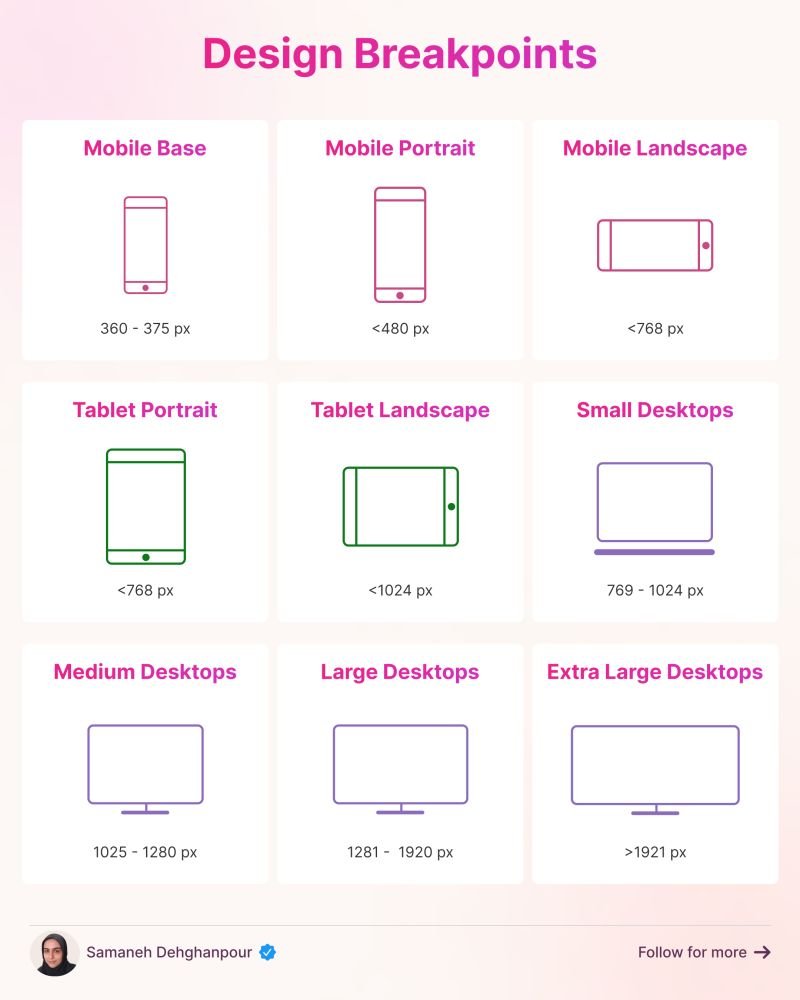
This cheat sheet shows the design breakpoints in detail including minor and major breakpoints.
Designers often pick 3 major breakpoints to aim for responsiveness:
💎 480 px
💎 768 px
💎 1024, 1280, or 1440 px
You have to define the breakpoints based on the content and layout of the design. Test and iterate to ensure your product looks good on all devices.
Read the Full Post
The above notes were curated from the full post www.linkedin.com/posts/dehghanpoursamaneh_ux-uxui-uidesign-activity-7272595994003845120-aCU5?utm_source=share&utm_medium=member_desktop.Related reading
More Stuff I Like
More Stuff tagged responsive design , adaptive web design , breakpoints