or
or
or
&
Design Breakpoint for Responsive Design
www.linkedin.com
Card image

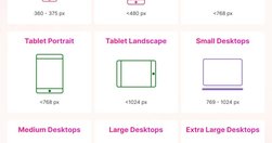
This cheat sheet shows the design breakpoints in detail including minor and major breakpoints. Designers often pick 3 major breakpoints to aim for responsiveness: 💎 480 px 💎 768 px 💎 1024, 1280, or 1440 px You have to define the breakpoints based on the content and layout of the design.

Cookies disclaimer

MyHub.ai saves very few cookies onto your device: we need some to monitor site traffic using Google Analytics, while another protects you from a cross-site request forgeries. Nevertheless, you can disable the usage of cookies by changing the settings of your browser. By browsing our website without changing the browser settings, you grant us permission to store that information on your device. More details in our Privacy Policy.