Relevant Overviews
To design the best UX, pay attention to what users do, not what they say. Self-reported claims are unreliable, as are user speculations about future behavior. Users do not know what they want.

The smaller the word count (and in general, the more concise your online communication), the more users will comprehend and retain your message.

Unsure where to start? Use this collection of links to our articles and videos to learn how to write and present information that aligns with users’ needs and online reading behaviors.

...from news media to legal guidance to academic research, the way we write often creates barriers to who can read it. Plain language—a style of writing that uses simplified sentences, everyday vocabulary, and clear structure—aims to remove those barriers.

Plain language and website fonts affect the reading experience more than you think

To keep your stakeholders and team members engaged, incorporate storytelling techniques such as writing for your audience, adding anecdotes, and using analogies in your asynchronous research deliverables.

Table design should support four common user tasks: find records that fit specific criteria, compare data, view/edit/add a single row’s data, and take actions on records.

To strengthen people’s memory skills, we should design interfaces that help users practice recall.

Addressing these 3 fundamental psychological needs in our products increases user motivation and well-being and keeps them engaged and likely to use our designs.

Both UX workshops and usability tests benefit when facilitators are focused on goals, follow a meeting guide yet are open to improvisation, encourage participants to act, and don’t talk too much.

Fitts's Law describes how long time it takes to click a target, based on the distance to the target and its size. Use this information to make buttons and links faster to click.

Wherever you work, we all have stakeholders that we need to win over, and the language we use to communicate with them will have a significant impact on whether we succeed or not.
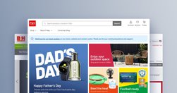
The homepage remains the “front door” for the many users who still begin their browsing experience here. Avoiding the 8 common UX issues discussed in this article is the first step toward improving users’ Homepage experience

User journeys should be managed like products — by people and teams with specialized, journey-dedicated roles who continually research, measure, optimize, and orchestrate the experience.
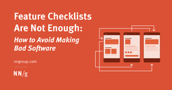
A good design relies on a thorough task analysis of the steps required to complete a task, as well as determining what information users need at each step.

Tried and true principles for the past, present, and future of good design

there are many straightforward methods and strategies for measuring design impact. Two areas I recently combined while exploring the design impact at Gem—where we're building the source of truth for top-of-funnel recruiting—are top tasks and PURE (Pragmatic Usability Ratings by Experts). Here's how I did it.

It isn’t a mystery that a large part of delivering a highly successful user experience is understanding what the customer wants/needs along with the cognition that consequently gets customers thinking about what they want/need.
As designers, as creators and managers of websites and apps, we can start by focusing on two principles: Do not track Delete

Any efficient communication requires that communication partners establish and rely on common ground so that they can take communication shortcuts.

Succinctly documenting the right details in key places helps Agile teams avoid information overload. When UX documentation is skipped or disorganized, teams waste time trying to find or remember information instead of improving the product.

A survey of people in user experience and product management shows that these professionals disagree on who should be responsible for many key tasks, like doing discoveries and early design.

Persistent headers can be useful to users if they are unobtrusive, high-contrast, minimally animated, and fit user needs.

A survey of 372 UX and PM professionals shows that duplicative work is frequent and generates confusion and inefficiency.
Frequent major redesigns and changes throughout the interface support users’ need to learn and adapt to new situations.
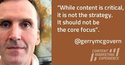
The single most important thing I’ve learned about online marketing is that it is about paying attention. Offline marketing is about getting attention, but once someone is on your website, they know what they want to do, so your first job is to help them do what they came to you website to do as quickly and easily as possible.

Vertical navigation is a good fit for broad or growing IAs, but takes up more space than horizontal navigation. Ensure that it is left-aligned, keyword front-loaded, and visible.
90% of data does not get used three months after it’s published. Most Web teams know that they are not working in a professional manner, and yet they feel that there is nothing they can do about it. Digital has in so many ways destroyed content professionalism.

Probably my biggest frustrations ... is the utter contempt they seem to hold content in. ... they won’t hire a professional copywriter to work on the content ... never teach content creators how to create appropriate web content.

Summary: For mobile navigation, image grids should be saved for deeper IA levels where visual differentiation between menu items is critical, as they increase page load times, create longer pages, and cause more scrolling.