Relevant Overviews
www.nngroup.com

Succinctly documenting the right details in key places helps Agile teams avoid information overload. When UX documentation is skipped or disorganized, teams waste time trying to find or remember information instead of improving the product.
www.nngroup.com

A survey of people in user experience and product management shows that these professionals disagree on who should be responsible for many key tasks, like doing discoveries and early design.
www.nngroup.com

Persistent headers can be useful to users if they are unobtrusive, high-contrast, minimally animated, and fit user needs.
www.nngroup.com
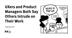
A survey of 372 UX and PM professionals shows that duplicative work is frequent and generates confusion and inefficiency.
www.nngroup.com
Frequent major redesigns and changes throughout the interface support users’ need to learn and adapt to new situations.
www.i-scoop.eu
The single most important thing I’ve learned about online marketing is that it is about paying attention. Offline marketing is about getting attention, but once someone is on your website, they know what they want to do, so your first job is to help them do what they came to you website to do as quickly and easily as possible.
www.nngroup.com

Vertical navigation is a good fit for broad or growing IAs, but takes up more space than horizontal navigation. Ensure that it is left-aligned, keyword front-loaded, and visible.
Like
ux,
web design,
information architecture,
user experience,
clear menu,
clear navigation,
visual design
gerrymcgovern.com
90% of data does not get used three months after it’s published. Most Web teams know that they are not working in a professional manner, and yet they feel that there is nothing they can do about it. Digital has in so many ways destroyed content professionalism.
theconversation.com

The authors of the article "wanted to know more about what really helps scientists talk to the public". Science is essential to solving many of society’s biggest problems, but it doesn’t always find a receptive audience. Today, when curbing COVID-19 ... it’s more urgent than ever for scientists to be able to communicate effectively with the public.
design.zeta.in

For digital designers who want to organise their working files to improve clarity and collaboration within and across teams
uxdesign.cc

Clarity, not creativity, is the backbone of good UX writing. Choose simple words and craft shorter sentences. Explain acronyms users might not know. Use proper punctuation. Be extra careful about things like cleverness, wordplay, and idioms that might affect usability. Above all, write to be understood.
www.nngroup.com

Although successful websites typically have high usability, average sites can hurt their business by copying design elements that don't work well in other contexts.
www.nngroup.com
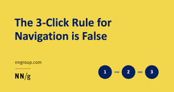
While it is important to keep key information easily accessible, the 3-click rule is an arbitrary rule of thumb that is not backed by data.
boagworld.com

Probably my biggest frustrations ... is the utter contempt they seem to hold content in. ... they won’t hire a professional copywriter to work on the content ... never teach content creators how to create appropriate web content.
Do
ux,
web design,
content,
web writing,
content creation,
web architecture,
user experience,
content management,
copywriting
www.wyliecomm.com
Don’t start with the blah blah blah
futurecrunch.com

Social science: Instead of calling it science though, we should call it what it is: pattern recognition. That's a far better description of what sociologists, historians, geographers, economists and anthropologists actually do.
www.nngroup.com

Summary: For mobile navigation, image grids should be saved for deeper IA levels where visual differentiation between menu items is critical, as they increase page load times, create longer pages, and cause more scrolling.
gerrymcgovern.com
We must design things on the basis that we want them to last, ... Because when you expect nothing to last, nothing does.
www.wyliecomm.com

Imperative voice gets shared. Imperative voice boosts email click, open and read rates.
www.nngroup.com

A clear visual hierarchy guides the eye to the most important elements on the page. It can be created through variations in color and contrast, scale, and grouping.
Like
ux,
web design,
content,
user experience,
visual communication,
visual content,
visual hierarchy
www.fearlessculture.design

Forget Empowerment. Encourage Autonomy Instead. ... People also need authority.
Like
self confidence,
be a better person,
team-leader,
teams,
team building,
autonomy,
distributed teams,
empowerment,
authority
sarah-weiler.medium.com
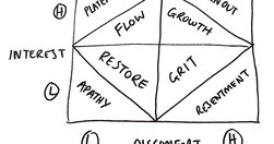
"WHY did I want to quit? ... — ‘is it disinterest or discomfort?’"
www.nngroup.com
Jakob Nielsen's 10 general principles for interaction design. They are called "heuristics" because they are broad rules of thumb and not specific usability guidelines.
boagworld.com

The biggest challenge for distributed teams lies in communication and collaboration.
Like
team,
communication,
team building,
collaboartion,
remote working,
working from home,
distributed teams
boagworld.com

"Users rarely read an entire webpage. That means you need to adopt a different style when writing for the web. A style that accommodates this lack of attention."
reesmccann.com
Want a handy list of the core Clean Language questions? Here goes:
thecorrespondent.com

Whether we’re looking at The Correspondent, the world atlas or the national news, migration across the Mediterranean is depicted on maps as thick red arrows heading towards us. Far more than we realise, these arrows define how we view migration. Can that be changed?
www.kooslooijesteijn.net

ood UI design is all about guiding attention to what’s important. When making the right thing for the user the easy and obvious thing, you can’t ignore cognitive biases. After all, these biases are brain shortcuts that let us quickly and effortlessly make decisions and react to our environment.
gerrymcgovern.com
The illusion of cheap storage has encouraged by far the worst hoarding habits in human history.
www.linkedin.com
"understand the digital reader’s brain, and to get a couple of concrete writing tips for your next digital text." "Nothing can surpass a text when it comes to transforming abstract thoughts into concrete expression."