Curated Resource ( ? )
Design Systems vs. Style Guides
Curated:
01/07/2024 from
www.nngroup.com/articles/design-systems-vs-style-guides/
my notes ( ? )
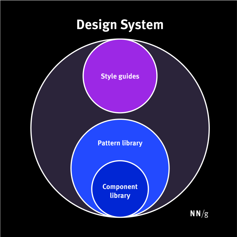
A Parent-Child Relationship
Design systems and style guides both capture certain guidelines, principles, and visuals for creating interfaces or other designs within a company, product, or service. They allow UX professionals and developers to design and develop with visual consistency that otherwise would be challenging to produce and maintain at scale.
Their main distinction lies in their depth of complexity and relationship to each other. Design systems and style guides take the form of a parent-child relationship. The design system is the “parent” — it contains different smaller pieces, including style guides. Style guides, pattern libraries, and component libraries are the “children” that collectively make up a larger design system.
Design System
Definition: A complete set of standards intended to manage design at scale using reusable components and patterns
Scope: Broad and holistic: Covers all aspects of design and development from visual style to UI patterns and code implementation
Style Guide
Defenition: A piece of documentation that contains specific guidelines, visual references, and design principles
Scope: Narrow and focused: Each style guide focuses on a specific aspect of the experience design (such as visual design, content, or branding) ensuring that all elements adhere to a consistent style
Design Systems
A design system is a living, complete set of standards intended to manage design at scale using reusable components and patterns.
The main goal of a design system is to maintain consistent design at scale and reduce the redundancy of duplicated design elements and patterns. Without a design system, large organizations often end up designing and coding multiple versions of the same design element. This leads to internal inconsistency, wasted time, and messy code.
Design systems also create a shared design language with the design and development teams, as well as across departments within a company.
For example, consider two different design teams working in different departments within a single company. Both of these teams can pull ready-made elements and components from the design system for their specific projects. Even though the design teams are not working directly with each other, they are using the shared design patterns, thus ensuring the final outputs will be consistent.
The development teams can then use and reference the components from the design system to code the design very efficiently. The developers don’t have to spend time writing code for each element from scratch. Instead, the devs can copy and paste the existing code that’s already available in the design system.
Repository: Housing a Design System
A repository is used to house and access the pieces of a design system. This generally takes the form of a website.
A design system repository often contains:
- One or more style guides: Documentation that provides style guidance on specific style needs, including brand, content, and visual design
- A component library: These specify reusable individual UI elements, for example buttons. For each UI element, specific design and implementation details are provided, including information like attributes that can be customized (size, copy, etc), different states (enabled, hover, focus, disabled), and the reusable clean, tight code for each element.
- A pattern library: these specify reusable patterns, or groups of individual UI elements taken from the component library. For example, you might see a pattern for a page header, which could be made up of a title, a breadcrumb, a search, and a primary and secondary button.
- Additional resources: For designers to actually use and design with the components and libraries, a design file is required (usually in Figma). Resources such as logos, typefaces and fonts, and icons are usually also included for designers and developers to use.
The lines between the pieces that make up a design system, (style guides, component and pattern libraries) can sometimes be blurred. To add to the confusion, sometimes different organizations use these terms differently.
Maintaining Design Systems
Design systems require continuous maintenance and oversight to ensure they do not become outdated, so a team is needed to manage it.
In companies with a more established design presence, there could be an entire internal team dedicated to overseeing, creating, and maintaining the design system. In smaller companies (or those with a less mature approach to design), an individual contributor (typically senior-level) could be responsible for the upkeep of the design system.
Style Guides
A style guide is a piece of documentation that contains specific implementation guidelines, visual references, and design principles for creating interfaces or other designs.
Style guides, as the name suggests, provide specific style guidance. Each guide typically focuses on one of three distinct style needs: content, brand, or front-end / visual design.
Content Style Guides
These guides contain content standards. They specify writing style and may also include information about the company’s editorial and publication processes.
Content style guides often specify:
- Tone of voice: How the content should be expressed; the feelings or emotions it should invoke
- Grammar and spelling: Guidelines on grammar and spelling variations, such as abbreviations, capitalization, contractions, numbers, dates, or punctuation
- Formatting styles: Rules around when to use formatting techniques like bolding, subheadings, and bullet points
Brand Style Guides
These guides specify brand-related rules and the foundational elements needed to define a brand.
Brand style guides include components like:
- Color palettes: Primary and secondary palettes; accessible color combinations
- Typography: Font family or specific typefaces; recommended HTML elements (for example, “subheadings should be H2 elements”)
- Logos: Approved logo variations; when to use specific logos, wordmarks, or symbols; additional guidance on logo sizing, spacing, and color requirements
- Imagery: Guidance on photography, illustration, or video styling
Front-End (or Visual) Style Guides
Sometimes referred to as visual- and interaction-design standards, front-end style guides contain a modular collection of all the elements in your product’s user interface, guidelines for how to use each element, and code snippets for developers to copy and paste.
This probably sounds similar to a pattern or component library, but they are different. Front-end guides are used by UX practitioners and developers to define broad design ideas, not specific implementation details. They generally take the form of a web page.
A front-end style guide usually has some overlap with the brand style guide. The front-end style guide may include elements like:
- Responsive layout or grid system
- Product color palette
- Typeface styles
- Common UI components
Maintaining Style Guides
Just like design systems, style guides need a team to create, oversee, and maintain them.
- Brand style guides can be created by an internal design team, or through a third-party design or marketing agency. They do not typically change much once created (unless the company goes through a rebranding project), and thus do not need much maintenance.
- Content style guides are usually created and maintained by the company’s content team — especially content strategists.
- Front-end style guides are typically created and maintained by a UX team with help from the development or engineering team.
Conclusion
Design systems are made of many different pieces — components, patterns, styles, and guidelines — and can help operationalize and optimize design efforts.
Use them to:
- Design and develop work quickly, consistently, and at scale
- Create a shared design language across teams and departments
- Reduce redundancy of design patterns
Style guides are much more focused and provide guidelines for use, and are only one piece that makes up a design system.
Use them to:
- Establish a cohesive experience across designs
- Enforce consistency in specific aspects of the experience, such as content or visual design
Read the Full Post
The above notes were curated from the full post www.nngroup.com/articles/design-systems-vs-style-guides/.Related reading
More Stuff I Do
More Stuff tagged style guide , user experience design , guides , design system , guidelines
See also: UX study guides & guidelines