www.nngroup.com

Usability assesses how easy user interfaces are to use. Usability is defined by 5 quality components: learnability, efficiency, memorability, errors, and satisfaction.
timo-m-lange.myhub.ai
Surveys asking users to give feedback during or after an interaction should not interrupt the users' task and should be sent to the appropriate channel. They need to be short, easy to complete, and give the user the opportunity to provide details about their experience.
www.nngroup.com

Unsure where to start? Use this collection of links to our articles and videos to learn about quant research, quant usability testing, analytics, and analyzing data.
www.nngroup.com

Unsure where to start? Use this collection of links to our articles and videos to learn about conducting user testing remotely.
www.nngroup.com

Unsure where to start? Use this collection of links to our articles and videos to learn about personas and how to create and apply them.
www.nngroup.com

Unsure where to start? Use this collection of links to our articles and videos to learn about planning, conducting, and analyzing qualitative user testing.
www.nngroup.com

Unsure where to start? Use this collection of links to our articles and videos to learn about design thinking.
www.nngroup.com

Unsure where to start? Use this collection of links to our articles and videos to learn more about the basics of user experience.
www.linkedin.com
HEART model will have a positive impact on your organisation, will boost your customer (user) experience and make your customer (user) love you! HEAR - EMPATHISE - APOLOGISE - RESPOND - THANK
www.adhamdannaway.com
User interface design is hard. With so many options to choose from regarding layout, spacing, typography, and colour, making design decisions can be overwhelming. When you add usability, accessibility, and psychology to the mix, it gets even harder. Luckily, UI design doesn’t have to be so hard.
boagworld.com
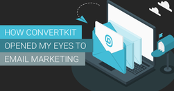
Go look through the emails you’ve received recently that you actually wanted to read. They probably came from individuals. Not big brands or companies, but someone you have a connection with. Those emails certainly didn’t have a fancy template or design. They were just plain text, that got straight to the point.
www.searchenginejournal.com

Monitor site metrics, focus on quality content, and optimize technical aspects to maintain a strong presence in search results. Prioritize the user experience and provide valuable content to prepare for future algorithm updates.
timo-m-lange.myhub.ai
I came across those two talks.In view of work load, deliverables, priorities, dissemination and channels and activities to communicate on...I thought watching those might have some good inspiration, food-for-thought, something for everyone.In my case, I can take a lot to think about and apply the web; user behaviour, accessibility, web writing a…
www.interaction-design.org

Determining the nature and properties of trust at first may seem pointless [...] As it relates to UX design, it’s a scientific concept that means the difference between a user building faith in a design and staying to interact more, or that user leaving, never to return and perhaps telling others to beware of it.
uxdesign.cc

The choices are so many that the decision to pick one (the optimal), becomes unmanageably hard. And even when a choice is made, second thoughts and doubts about whether it was the best, linger in the background, slowly consuming brain energy and peace of mind.
uxdesign.cc
What makes a text nice to read? To know more about this, it is important to take a closer look at how people are reading. Additionally, it may be the case that someone is impaired, physically or mentally, to read a text. How does it work?
uxdesign.cc
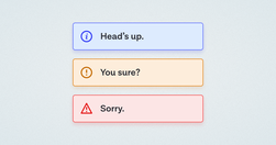
A while back, in the early days of our design system, we had a ticket for a component sitting in our backlog, with the title “Alert.” My initial reaction was “Oh yeah, a colored box with a little icon to the left of it and some text, easy.” Oh dear reader, how naive I was…
www.nngroup.com
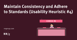
Users should not have to wonder whether different words, situations, or actions mean the same thing. Follow platform and industry conventions.
contentcompany.biz
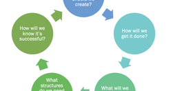
When organizations want to get more strategic about their content – when they want it to be more effective, more efficient, and advance their goals, they turn to content strategists. The core of what we do is to help the organization ask and answer key questions.
www.linkedin.com
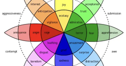
What separates great products from good ones? Attractive designs? User testing? Genius designers? Well, these might be contributory factors, but the true distinction lies in how they make users feel. Emotional design plays a huge role in the success of UX design.
uxdesign.cc
Oral evidence is valid, and great histories have been told because of it. Memories are not true in the sense that they are not perfect depictions of the past. No, we cannot trust most interviewees.
uxdesign.cc

The MVP awoke one morning from uneasy dreams and found itself transformed into a giant insect. It had devolved so far that it bore no resemblance to its former self. However, the fault was not in The Lean Startup but in a pervasive culture of overpromising and underdelivering.
www.uxmatters.com
Skilled UX designers and teams use tools such as empathy mapping to help them create products that keep the user or customer at the center of the design process, resulting in a product that resonates with users and provides a good user experience. But what is an empathy map, what are its uses, and how does empathy mapping fit into the process?
www.nngroup.com
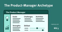
Product managers share common goals, strengths, activities, and skill sets. Awareness of these commonalities helps designers figure out how to best collaborate with product managers on Agile teams.
www.nngroup.com
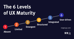
Our UX-maturity model has 6 stages that cover processes, design, research, leadership support, and longevity of UX. Use our quiz to get an idea of your organization’s UX maturity.
forms.nngroup.com
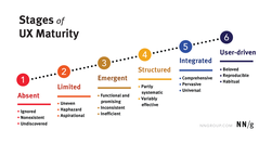
We'll ask questions about how your organization approaches UX. Based on your answers, we'll give you an estimate of your organization's UX maturity. This assessment is based on the Nielsen Norman Group UX Maturity Model. There are six stages in the UX maturity model.
boagworld.com

The case for accessibility has to be about more than a legal and moral requirement. It has to persuade management that accessibility will generate a return on investment.
www.nngroup.com
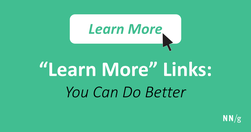
The phrase ‘Learn More’ is increasingly used as a crutch for link labels. But the text has poor information scent and is bad for accessibility. With a little effort, transform this filler copy into descriptive labels that help users confidently predict what the next page will be.
www.niemanlab.org
accessibility in journalism is important for everyone: Making news products more accessible, after all, often means making them more user-friendly and efficient. He hopes to discover and standardize ways of making the Post’s journalism accessible to as many people as possible.
boagworld.com

Chat GPT to brainstorm ideas, write document outlines, compose tweets, make my emails friendlier, and much more. Recently, I even used it to suggest a possible information architecture based on the site content I provided.