Relevant Overviews
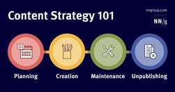
A content strategy is a high-level plan that guides the intentional creation and maintenance of information in a digital product.

Unsure where to start? Use this collection of links to our articles and videos to learn about visual design in UX.

A myriad of fields, skills and insights come together to create the overarching discipline of user experience design... Let’s explore five behavioral science insights you can use right now to design better products
Visitors are arriving at your website, but they’re leaving at an alarmingly high (and fast) rate. In a frenzy, you search through all your data and rummage through different digital metrics to try and find the culprit. While bounce rate seems to convey a simple message... Not everyone who bounces is a disappointed visitor.

Financial writing is full of jargon and complexity. But a series of research suggests that investors are drawn to simple, clear writing with short sentences. The simple reason is that complex writing is off-putting — people tune out and find it dull, a fact confirmed by neuroscience research.

In this article we’ll be taking at look at what exactly UX designers mean by the term heuristic evaluation, how to conduct a heuristic evaluation for yourself, what to do if you can’t afford a usability expert, and the difference between a heuristic evaluation and user testing.
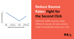
Different traffic sources imply different reasons for why visitors might immediately leave your site. Design to keep deep-link followers engaged through additional pageviews. Given growing bounce rates, we must stop using "unique visitors" as a metric for site success. Site tourists who leave a site immediately ratchet up the unique visitor count,

Use bounce rate as a red flag for possible issues lurking on your site, but don’t make design decisions aimed solely at chasing that second click. Optimize for long-term engagement through return visits and track deeper conversion goals.

Here’s what I hear: “I can’t get ahold of this person” or “They’re not responding to me.” What’s not being said: “Because all I’ve done is emailed them.”

UX (user experience) research is the systematic study of target users and their requirements, to add realistic contexts and insights to design processes. UX researchers adopt various methods to uncover problems and design opportunities. Doing so, they reveal valuable information which can be fed into the design process.
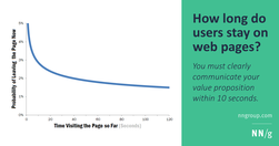
Users often leave Web pages in 10–20 seconds, but pages with a clear value proposition can hold people's attention for much longer. To gain several minutes of user attention, you must clearly communicate your value proposition within 10 seconds.

To design the best UX, pay attention to what users do, not what they say. Self-reported claims are unreliable, as are user speculations about future behavior. Users do not know what they want.

In this guide, I’m going to teach you my step-by-step process for writing high-converting website copy.

The pandemic suspended our fear of missing out. Did it also teach us how to handle it better?

For almost seven years, my studies have shown the same user behavior: users look straight at the content and ignore the navigation areas when they scan a new page. (Remember, users almost always scan — they rarely read carefully online.)

Structure and navigation must support each other and integrate with search and across subsites. Complexity, inconsistency, hidden options, and clumsy UI mechanics prevent users from finding what they need.

Unsure where to start? Use this collection of links to our articles and videos to learn about what information architecture (IA) is, how to run an IA research study, and how to design navigation effectively.

Jakob Nielsen's 10 general principles for interaction design. They are called "heuristics" because they are broad rules of thumb and not specific usability guidelines.

This is a list of strategies, tactics and tips observed over the course of years independent podcasters and newsrooms have used to grow their listeners
Users visit websites and use apps to get things done, so emphasize the content of interest to communicate with your audience. Avoid design pollution that decorates the UI with non-communicative elements.

The foundation of user experience is the difference between the people on the design team and the people using the product. You can't ask users to design, but you also can't ask the designers whether their own design will be easy for the target audience to use.

Some UX designers (and many clients) aim to "jazz up" the design to supposedly engage users. This usually backfires because extraneous design elements get in the way of users' tasks.

The smaller the word count (and in general, the more concise your online communication), the more users will comprehend and retain your message.

The funnel technique is used in user interviews and usability tests and ensures you get rich insights while not compromising validity.

To design a delightful product, it isn’t enough to have your user in mind—you need to truly know your user’s mind. And the most effective way to achieve this is through user interviews.

concept of card sorting... UX. The popular, low-tech research technique is used to organize data sets. It’s especially useful for information architecture, menu structures, workflows and website navigation. While it’s easy enough to run a card sort, there’s a massive difference between a flop and a success.

User research is an essential part of UX design. Unless we understand who we are designing for and why, how can we even know what to create or where to begin?

User research is the methodic study of target users—including their needs and pain points—so designers have the sharpest possible insights to work with to make the best designs. User researchers use various methods to expose problems and design opportunities, and find crucial information to use in their design process.
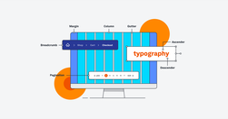
If you want to work in UI (or work with a UI designer), you need to speak the language. In our UI glossary, we’ve compiled (and explained) 100 terms, phrases and resources all designers should know.

Aaron Berman shared some useful writing tips for anyone writing on complex issues that he learned writing the (US) President's Daily Briefs. Check out the five tips below, illustrated with examples from Star Wars and Star Trek.