Relevant Overviews
Overview: UX
Relevant resources
www.linkedin.com
Undoubtedly there are major advantages of live validation in forms. Most importantly, if an input expects a particular type of content, we can flag issues immediately, so users can fix these issues rather than operating under a wrong assumption.
www.linkedin.com
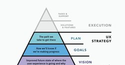
UX strategy is a plan of action that allows the organization to reach a higher state of user experience over a certain period of time. It lies at the intersection of product design and business strategy and serves as a guide for prioritizing and executing UX work over time.
www.linkedin.com
The content - not the beautiful scroll animations - is the thing people use your product for. It is not lesser than. It is not an afterthought. It even has its own set of roles (content design, UX writing, information architecture, etc). The content is the scaffolding of the experience. When you minimize it, it is only to your own detriment.
www.linkedin.com
Design System In 90 Days Canvas (FigJam template), with useful prompts to get a design system up and running — and adopted! — in 90 days, for small and large organizations that are building a design system or plan to set up one. Kindly shared by Dan Mall as a part of the Design System University. (shared by Vitaly Friedman, LinkedIn)
www.nngroup.com

Effective homepages are simple and easy to access, communicate the organization’s and site’s purpose, show engaging content, and prompt users to take action.
jakobnielsenphd.substack.com
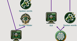
Traditional methods for accessibility have been tried for 30 years without substantially improving computer usability for disabled users. It’s time for a change, and AI will soon come to the rescue with the ability to generate a different user interface for every user, optimized for that person’s unique needs.
Like
usability,
ux,
ai,
user experience,
accessibility,
design and ai,
user interface design,
artificial intelligence
www.nngroup.com

To be effective, QR codes need clear, brief, contextual information and must lead the user to relevant pages. QR codes provide a seamless transition from the physical world to digital spaces or across digital channels. QR codes have a lower interaction cost than typing in a URL,
www.linkedin.com
We spent over 60 hours analyzing 150+ companies to find the best user onboarding examples. From home page copy and sign-up pages to onboarding emails and product tours, you can find plenty of examples to take inspiration from.
jakobnielsenphd.substack.com

AI can already perform many UX tasks, ranging from design and research ideation to analyzing qualitative user data at scale. It’s the perfect assistant that quickly produces the first drafts of any UX method plan or deliverable. It will do more in the future,... possibly complete UI designs. But AI will not eliminate the need to watch human users.
Like
ux,
ai,
user experience,
ux design,
ux research,
user experience research,
artificial intelligence
jakobnielsenphd.substack.com

UX unfolds over time, with a factor of 31 billion from the shortest time period of interest (0.1 seconds for the illusion of instantaneous response time) to the longest time span we can realistically consider (a century for major social channels).
www.interaction-design.org

Jakob Nielsen and Rolf Molich’s Ten User Interface Guidelines. These heuristics have been reflected in many of the products designed by Apple, Google, and Adobe. This article will teach you how to follow the ten rules of thumb in your design work so you can further improve the usability, utility, and desirability of your designs.
theuxrsannotations.substack.com

Frameworks and principles for improving UX Research report writing. By following the frameworks and principles outlined in this article, UX researchers can improve their reports through logical structure and organization of ideas, clear and concise writing, and effective use of visuals and graphs.
adplist.substack.com

How did he overcome the stranger-danger bias? Through good design.
www.nngroup.com

Updated intranet guidelines feature enhanced content practices by teams, refined search design to meet elevated expectations, task-oriented navigation, and standardized design elements for visual consistency.
www.linkedin.com
Link collection (LinkedIn post by Vitaly Friedman): Free Storytelling Masterclass (+ PDFs) (https://lnkd.in/eiFscUtf), a comprehensive guide with 9 modules on storytelling, PDF worksheets, 1-pager sketchnotes, reading lists, free lectures, video courses, etc. Kindly shared by Jeremy Connell-Wait
jakobnielsenphd.substack.com

In a case study of ChatGPT evaluating 12 e-commerce screenshots, most of the AI-driven redesign suggestions were inconsistent and untrustworthy. Human UX expertise must be employed to judge UX advice from AI.
www.nngroup.com

Design effective error messages by ensuring they are highly visible, provide constructive communication, and respect user effort.
www.linkedin.com
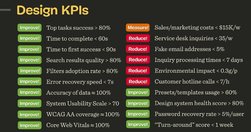
Good design decisions are intentional. They aren’t guesses nor a matter of personal preference. They are deliberate and measurable. Over the last few years, I’ve started using design KPIs that inform and guide design decisions. - by Vitaly Friedman
www.nngroup.com
Use generative-AI tools to support and enhance your UX skills — not to replace them. Start with small UX tasks and watch out for hallucinations and bad advice. All UX professionals should use AI: it’s helpful at any level of seniority and for many tasks within the UX lifecycle (including research, design, and writing).
www.nngroup.com

Free study guides by Nielsen Norman group on almost every UX topic. Each study guide is a curated collection of free articles and videos, organised by theme and suggested reading order.
jakobnielsenphd.substack.com
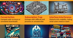
New regulations from the Government of India prohibit the use of 12 common dark design patterns. These sneaky practices are unethical applications of established UX knowledge to make interface designs that harm users instead of helping them.
jakobnielsenphd.substack.com

Two short infographics define UX and summarize why and how to run UX projects. Show to your boss or colleagues who don’t understand UX. This ticket to UX mastery only requires 3 minutes of your time.
jakobnielsenphd.substack.com
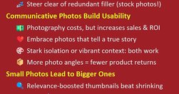
High-quality, detailed photographs convey information with authenticity, fostering trust in the content provided on a website. Investing in premium images is essential, as indistinct or amateurish pictures can perplex users and erode credibility. But AI-generated images can sometimes substitute at drastically lower cost.
www.nngroup.com

Use this glossary to quickly clarify key terms and concepts related to research methods in UX.
jakobnielsenphd.substack.com
In a case study of ChatGPT evaluating 12 e-commerce screenshots, most of the AI-driven redesign suggestions were inconsistent and untrustworthy. Human UX expertise must be employed to judge UX advice from AI.
www.uxtigers.com

For its first two years, the web was a text-only medium with a command-line user interface similar to the UI for current generative AI tools like ChatGPT. Only after GUI browsers launched in 1993 did the web explode. AI needs a similar GUI revolution in usability.
www.nngroup.com
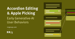
Two new user behaviors are prevalent in interactions with text-based AI chatbots. User research shows the iterative and often complex ways users engage with AI tools for productivity.
jakobnielsenphd.substack.com

Users spend most of their time on other websites, so they expect your site to work like all the other sites they already know. When a design deviates from users’ expectations, usability suffers. Don’t be arrogant and assume that your new design idea is so brilliant that it can overrule decades of user habituation.
www.nngroup.com
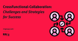
To improve crossfunctional collaboration, UX teams must be aware of the challenges they face and develop tailored solutions for each unique challenge
www.interaction-design.org
Heuristic evaluation is the activity of using a set of guidelines (heuristics) to evaluate if an interface is user-friendly. Let’s look at what heuristics are and how you can conduct a heuristic evaluation to improve the usability of your designs