Curated Resource ( ? )
Design KPIs and UX Metrics. How to measure UX and impact of design, with useful metrics to track the outcome of your design work.
Curated:
14/12/2023 from
www.linkedin.com/posts/vitalyfriedman_ux-design-activity-7140641630507687936-YTI7?utm_source=share&utm_medium=member_desktop
my notes ( ? )
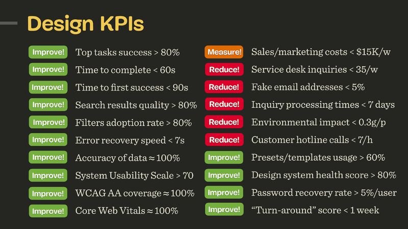
1. Top tasks success > 80% (for critical tasks)
2. Time to complete top tasks < 60s (for critical tasks)
3. Time to first success < 90s (for onboarding)
4. Time to candidates < 120s (nav + filtering in eCommerce)
5. Time to top candidate < 120s (for feature comparison)
6. Time to hit the limit of free tier < 7d (for upgrades)
7. Presets/templates usage > 80% per user (to boost efficiency)
8. Filters used per session > 5 per user (quality of filtering)
9. Feature adoption rate > 80% (usage of a new feature per user)
10. Time to pricing quote < 2 weeks (for B2B systems)
11. Application processing time < 2 weeks (online banking)
12. Default settings correction < 10% (quality of defaults)
13. Relevance of top 100 search requests > 80% (for top 3 results)
14. Search query iterations < 3/query (to avoid dead-ends)
15. Service desk inquiries < 35/week (poor design -> more inquiries)
16. Form input accuracy ≈ 100% (user input in forms)
17. Frequency of errors < 3/visit (mistaps, double-clicks)
18. Password recovery frequency < 5% per user (for auth)
19. Fake email addresses < 5% (for newsletters)
20. Customers follow-up rate < 4% (quality of service desk replies)
21. “Turn-around” score < 1 week (frustrated users -> happy users)
22. Acquisition costs < $15K/week (poor design -> high acquisition costs)
23. Environmental impact < 0.3g/page request (sustainability)
24. Flesch reading ease score > 60 (readability)
25. Rage and tap clicks rate ≈ 0% (for touch, mouse)
26. User frustration score < 10% (AUS + SUS/SUPR-Q + Lighthouse)
27. System Usability Scale > 75 (overall usability)
28. WCAG AA coverage ≈ 100% (accessibility)
29. Accessible Usability Scale (AUS) > 75 (accessibility)
30. Core Web Vitals ≈ 100% (performance)
These KPIs aren’t chosen randomly. They are shaped together by designers, engineers, stakeholders and users, and they must be guided by user needs and aligned with business goals. I can’t emphasize that last part enough: design shouldn’t be seen as a standalone activity as it impacts all parts of business.
For a given project and a given design team, 3–4 KPIs will be most critical. If we work on search, then we can track the quality of search over time. If we work on filters, we track how many filters are used per session, and how effective they are. As we move to a new project, we track a new set of KPIs.
This requires engineering to implement mechanisms to track adoption, and as designers, we test our work in qualitative testing. And: whenever possible, I always prefer usability testing as surveys are incredibly difficult to get right.
Read the Full Post
The above notes were curated from the full post www.linkedin.com/posts/vitalyfriedman_ux-design-activity-7140641630507687936-YTI7?utm_source=share&utm_medium=member_desktop.Related reading
More Stuff I Like
More Stuff tagged ux , kpi , key performance indicators , user experience
See also: UX