Relevant Overviews

To design the best UX, pay attention to what users do, not what they say. Self-reported claims are unreliable, as are user speculations about future behavior. Users do not know what they want.

The pandemic suspended our fear of missing out. Did it also teach us how to handle it better?

For almost seven years, my studies have shown the same user behavior: users look straight at the content and ignore the navigation areas when they scan a new page. (Remember, users almost always scan — they rarely read carefully online.)

Structure and navigation must support each other and integrate with search and across subsites. Complexity, inconsistency, hidden options, and clumsy UI mechanics prevent users from finding what they need.

Unsure where to start? Use this collection of links to our articles and videos to learn about what information architecture (IA) is, how to run an IA research study, and how to design navigation effectively.

Jakob Nielsen's 10 general principles for interaction design. They are called "heuristics" because they are broad rules of thumb and not specific usability guidelines.

This is a list of strategies, tactics and tips observed over the course of years independent podcasters and newsrooms have used to grow their listeners
Users visit websites and use apps to get things done, so emphasize the content of interest to communicate with your audience. Avoid design pollution that decorates the UI with non-communicative elements.

The foundation of user experience is the difference between the people on the design team and the people using the product. You can't ask users to design, but you also can't ask the designers whether their own design will be easy for the target audience to use.

Some UX designers (and many clients) aim to "jazz up" the design to supposedly engage users. This usually backfires because extraneous design elements get in the way of users' tasks.

The smaller the word count (and in general, the more concise your online communication), the more users will comprehend and retain your message.

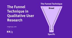
The funnel technique is used in user interviews and usability tests and ensures you get rich insights while not compromising validity.

To design a delightful product, it isn’t enough to have your user in mind—you need to truly know your user’s mind. And the most effective way to achieve this is through user interviews.

concept of card sorting... UX. The popular, low-tech research technique is used to organize data sets. It’s especially useful for information architecture, menu structures, workflows and website navigation. While it’s easy enough to run a card sort, there’s a massive difference between a flop and a success.

User research is an essential part of UX design. Unless we understand who we are designing for and why, how can we even know what to create or where to begin?

User research is the methodic study of target users—including their needs and pain points—so designers have the sharpest possible insights to work with to make the best designs. User researchers use various methods to expose problems and design opportunities, and find crucial information to use in their design process.

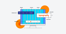
If you want to work in UI (or work with a UI designer), you need to speak the language. In our UI glossary, we’ve compiled (and explained) 100 terms, phrases and resources all designers should know.

...the role of “Social Media Manager” was too ambitious in its scope. To run good social media is a multimedia, multimodal, multiskilled operation [...] The idea that this could all fall to one person to pull off seemed a bit crazy...

Being aware of our cognitive biases helps to recognize their power in shaping our thoughts, opinions, attitudes and the decisions we make. Let’s check out these effects by analyzing ten cognitive biases that shape our world today.

Table design should support four common user tasks: find records that fit specific criteria, compare data, view/edit/add a single row’s data, and take actions on records.

To strengthen people’s memory skills, we should design interfaces that help users practice recall.

Addressing these 3 fundamental psychological needs in our products increases user motivation and well-being and keeps them engaged and likely to use our designs.

Both UX workshops and usability tests benefit when facilitators are focused on goals, follow a meeting guide yet are open to improvisation, encourage participants to act, and don’t talk too much.

The big takeaway from 2021: consumers are now in charge of your brand. They want more personalized content, faster service, and better experiences. And they want it all now. The pandemic has accelerated The Age of the Consumer, and for your brand to survive, you need to listen and respond to consumer demands.

“We found, surprisingly, that no single feature of a headline’s writing style makes much of a difference in forecasting success.”

Research spanning 20 years proves PDFs are problematic for online reading. Yet they’re still prevalent and users continue to get lost in them. They’re unpleasant to read and navigate and remain unfit for digital-content display.

When it comes to data visualization, are you playing world domination? There are too many data visualizations that use maps, losing our audience in irrelevant, distracting information. Most of the map visualizations I see could be better shown in alternative, simpler, more informative layouts like tables or graphs. Let’s take a look.

The reasons behind management gobbledygook

“If you are not calling out sections of your web pages or prose on those pages with subheads, you are making a big mistake!” write Pernice et al. “If you take nothing else [away], please take this: Use subheads and subsubheads.”
