Curated Resource ( ? )
A complete UI Glossary: 100 terms all designers should know
my notes ( ? )
When you work in UI, it becomes quickly apparent that it’s an industry that comes with its own language. Every new language comes with its own dictionary so that is why we have compiled our UI glossary, complete with 100 UI terms all designers should know.
UI design is a language unto itself. With lots of interesting terms and niche buzzwords, it can take some time to learn this new way of communicating. If you are considering a career in UI, we have created a glossary that should become your quick one-stop-shop to help you speak fluently.
We’ve compiled 100 of the most important UI terms, phrases and resources that all designers should know, ordered from A to Z.
- Accessible design
Accessibility or accessible design helps users of all abilities to interact with a product. To implement accessible design, you must design for people who are colour blind, visually impaired, deaf or hearing impaired and people with cognitive disabilities. - Accordion
In UI design, an accordion is a type of menu that vertically stacks items that lets the user expand and collapse the content. When a user clicks a label, that section expands to show extended content. One or more labels can be open at a time and it helps users navigate large amounts of information quickly. - Adobe XD
Adobe XD is one of the most popular UX and UI design tools. Part of the Adobe Creative Cloud suite, it’s a vector-based design tool used for creating wireframes, prototypes, animations and UI designs. - Alignment
Alignment is the design principle that is used to create structure and readability. It builds order and helps lead people through your design. - Animation
In UI terms, animation is the act of adding motion to any UI element to improve a product’s interactivity. Animations can be used to mark the different stages in a progress bar or they can simply be used to add an element of fun and movement to a logo. - Ascenders
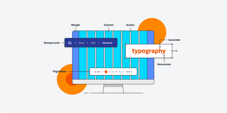
In typography (covered below in number 90), letters are written on a baseline. Most letters will reach the x-height, which we explain in number 100, but the letters that reach above that are called the ascenders. These letters include b, d, f, h, i, j, k, l and t. - Baseline
As mentioned in numbers 6 and 24, the baseline is the invisible line where text sits on a page. In UI design, the baseline is an important measuring tool between text and any other elements. - Bento menu
Named after the Japanese lunch box that packs meals into neat sections, a bento menu is a menu with gridded items. It provides an overview of multiple items at once. - Breadcrumb
Continuing with the food theme, a breadcrumb is a navigation system which shows where a user is currently situated within a website. Usually located at the top of a page, breadcrumbs let users see their current location and steps they took to get there. As these are clickable links, users can move back to read or edit any information they filled in.
For example, if you’re browsing the ASOS clothing website, you might see a trail of links which shows where you are (and how you got there) as follows: Home > Men > Sportswear > Shoes - Breakpoints
A breakpoint is the predetermined ranges in screen sizes that require particular changes in layouts. - Button
A button instructs a user through text, images or both to take an action. - Call-to-action/CTA
A call-to-action button – or a CTA – encourages users to take a specific action on a website or application. For example: Sign Up, Book Now, Subscribe.
CTA buttons exist as a conversion goal, encouraging users to buy, consume or register for a product or service. - Card
Cards group related content side-by-side so that users don’t have to scroll through a list to find the information they are looking for. Square or rectangular-shaped, they have the appearance of a business card and they can include buttons, text and images. - Carousel/image carousel
A lot of people will be familiar with image carousels as LinkedIn and Instagram use this format to display multiple images. However, these images are hyperlinked so users can browse through a set of items/images and select one for a particular action. This is another clever way to save space on a screen as it allows multiple items to be displayed in one section. - Checkboxes
Checkboxes allow users to “check” or “uncheck” items from a box on a screen. Each item operates individually but a user can usually check more than one item. You would normally see a checkbox on an application or survey form. - Chunking
Also known as grouping, chunking is used by designers to break down large chunks of information, images or text into smaller chunks, making it easier to understand. When items or information is “chunked” in the same region on a web page or app, it is believed that they are related or connected. - Colour palette
A colour palette is a small combination of colours for a new design. The UI designer will use these to visually represent the brand, be visually pleasing and communicate different information. For example, red can be used for warnings or errors and green can be used for success. - Colour models
A colour model is a system that helps to describe colours using numbers or letters. The most popular colour models for UI design are:
RGB – Red, Green, Blue
HSL – Hue, Saturation, Lightness
HSV/HSB – Hue, Saturation, Value or Brightness
HEX is a shorthand combination of six numbers and letters used to represent the many different values of RGB. For example, the green used in Starbucks’ branding is #00704A and red used in Coca-Cola’s branding is #F40009. - Comment boxes
Comment boxes are a common feature on most interfaces these days. They are used to display comments and feedback from users, running in chronological or popular order. - Containers
A container is a UI element designed to contain page elements to a certain width based on the size of a user’s screen. An accordion is an example of a container. - Counters
In typography, which we explain below in number 90, a counter is the area of a letter that is entirely or partially enclosed by a letter or symbol. This area forms a “bowl” shape.
Closed counters are letters that are entirely closed and they include: A, B, D, O, P, Q, R, a, b, d, e, g, o, p and q.
Open counters are letters that are partially closed and they include but aren’t limited to: c, f, h, s. - Critique
While some people may fear any form of criticism, critiques allow designers, researchers and content strategists to come together and provide constructive criticism to improve a product. The creator of the product will discuss the design with the rest of the team, who will then ask questions to explore the design even further.
The two most popular forms of critique are:
Silent – Using post-it notes on a whiteboard, your colleagues will write feedback as a question. For example, if someone is unhappy with the colour of a button, they could write “Could we try some other colour options?” In this format, everybody gets a chance to have their say.
Regular– In a group setting, the wider team will sit and discuss the design journey of the product. However, these critiques can sometimes go off topic and some people may not get the chance to speak. - Date or time picker
A date or time picker allows users to select a date and/or time from a digital calendar or clock. The chosen date or time is then formatted and put into the system.
An everyday example of this is booking a table in a restaurant. Once you click your chosen date and time, your request will be sent to the restaurant for confirmation. - Descenders
The opposite of number 6. In typography, descenders are the letters that fall under the x-height and below the baseline. These letters include q, g, p, y and j. - Design patterns
UX and UI design patterns are repeatable, reusable design components used to solve usability issues that users commonly experience. For example, the breadcrumb navigation element (number 9 in our UI glossary) is a design pattern used to show the user their pathway from the homepage to the page that they’re currently viewing. - Design systems
A design system is a universal source of truth for the design team — a collection of design assets, guidelines, constraints and best practices to adhere to when embarking on a new design project. Google, IBM and Workday all have their own design system canvasses that people can access and use. - Design thinking
The design thinking process comprises five phases: Empathise (with the user), Define (the problem), Ideate (potential solutions), Prototype and Test. Design thinking is used to address particularly tricky UI problems. - Döner menu icon
The döner menu icon is similar to the hamburger menu, which we explain in further detail down at number 43. A döner menu consists of three lines stacked on top of each other but each line descends in length. The top line is the longest, the middle line is shorter and the third line below that is even shorter. - Dribbble
Dribbble is the go-to spot for all designers. It’s a social media platform that focuses on building a strong community of designers, whether you’re looking for inspiration or collaboration. It’s an excellent resource for connecting with other designers or to look for feedback on your own work. - Dropdown/dropdown lists
Dropdown lists are similar to radio buttons, which we cover in number 73, but they save a lot of space on screen. The dropdown action happens when a user selects an item from a list and the menu drops down to reveal more information. These lists might require an instruction, like “click here”, to help users navigate the space. - Dropdown buttons
The dropdown button is the clickable button used in a dropdown list to reveal, yes, a list of items. - Easing
Easing – or ease-in and ease-out – is the slow and gradual movement of an animated UI element. Specifically, easing refers to the movement of the animation and how it gradually begins to move, rather than jolting to start or abruptly coming to an end. - Feed
Feeds are everywhere and some of us are growing quite tired of them too… Feeds usually display user activity in chronological or popular order but some are determined by an algorithm. Think of your Twitter or Instagram feed that has ever-changing content, ranging from text to images to videos to external links to sponsored posts. - Figma
Figma is a browser-based interface design tool that empowers fast design and prototyping and a smooth, collaborative workflow. It is one of the most popular design tools and you would struggle to find an UI or UX designer that doesn’t use it. - Fluid UI
Fluid UI is a prototyping and wireframing software tool used to design mobile touch interfaces. It comes with extensive component libraries, easy animations and real-time collaboration options. - Font
Font is the name given to the particular size, weight and style of a typeface or text. We cover typeface in more detail below in number 89 but it is easily confused with font. Here is an easy way to understand the difference between the two: Helvetica is a typeface, whereas Helvetica Bold or Helvetica Italia are fonts. - Form
Forms are a regular feature in our lives but thanks to autofilling features, the labour of forms has been made a lot easier. Forms, as in real life, are filled out by users who wish to submit information. A common example is when you order something online and fill in your address in the shipping form. - Form field states
Digital forms should change their state or appearance so that users know what to do when they encounter them.
Field states can have the following forms:
Pristine – This is the default state before the user interacts with it
On hover – This is the state that occurs when the user’s cursor hovers above the form field. Users won’t see this option on mobile, touch or swipe devices
Selected/focused – When the user interacts with the form, this state tells them to input information. It should be visually different from other form field states. For example, having a keyboard appear in the field or having the screen focusing entirely on this field.
Disabled – This state lets users know that this element isn’t currently available for interaction. It will tell users that they either need to complete something else first or that this option is not available. For example, when you are ordering food online but have not filled in your delivery address, you may not be able to fill in your payment details.
Inline validation – If a user has successfully or unsuccessfully completed a field, this state usually appears with a green tick or a red X. For example, if you have entered your credit card details but the information is wrong, you will be told to enter your information correctly. - Full-stack designer
A full-stack designer is a designer who has the skills and know-how to take on all the “stacks” (or layers) of the product design and development process. While most designers will specialise in just one area, such as UX design or UI design, full-stack designers can take on UX design, UI design, interaction design and frontend development. - Gestalt Principles
The Gestalt principles are a set of psychology laws that describe how our minds organise and interpret visual data. The Gestalt principles can be used to inform design decisions and shape a user’s interaction with a product.
For example, the law of proximity states that elements which are positioned close together appear to be more related than elements which are spaced further apart. If you were designing a website based on the law of proximity, you’d group related elements closer together.
Proximity: Elements that are close to each other are perceived as more closely related than those placed further apart
Similarity: Similar elements are perceived to be more related than elements that dissimilar elements. Shape, scale, orientation and colour all contribute to making elements seem similar.
Continuity: When elements are placed in a line or soft curve, they are perceived to be more related than those that are arranged randomly. This same concept applies when content flows in a certain direction.
Connectedness: When we see connections in disjointed or incomplete objects. A great example of this is recognising an image in a connect the dots picture before actually connecting the dots.
Closure: When we look at complex visual elements, we naturally look for a single or recognisable pattern. In other words, we fill in the gaps that we do not see. We do not need to see every element in a logo for us to recognise which company or brand it belongs to. Examples of this include the logos for Starbucks, Adobe or NBC. - Grids
In UI design, a grid is a layout constraint that determines where UI elements will sit on a screen or page. Fundamental to effective design systems, they bring order to a layout using columns and rows and they help to maintain consistency and remove any room for error. It makes the decision-making process around sizing and space much faster and easier.
These are the standard numbers for the different grid types:
Desktop: 12 columns
Tablet: 8 columns
Mobile: 4 columns
Wearables: 2 columns - Gutters
Gutters are the vertical strips between columns in grids that are used to prevent elements from bumping into each other. - Hamburger menu
With three, equi-length, horizontal lines stacked on top of each other, the hamburger menu looks like – but doesn’t taste anything like – hamburger. This very commonly used icon usually sits at the top corner of an app. When clicked, it opens up like a drawer, revealing a list of multiple navigation links. - Hierarchy
Hierarchy is a UI design principle used to present information with different levels of emphasis according to its importance. In doing so, it helps guide users through a web page or application. - Icon
There are a number of images that work as symbols that are universally understood. An icon is a very basic version of the original image that helps users navigate a web page or app. Usually hyperlinked, they communicate content or prompt an action without using any text. A clear example of this is the shopping cart icon that tells you what items you have purchased in an online store. - Informational components
In UI design, informational components are elements that tell users what’s going on. While we go into more details of these elements elsewhere in the glossary, tooltips, icons, progress bar, notifications, message boxes and modal windows are all examples of informational components. - Input control
Input controls are the interactive elements used on any interface. These include checkboxes, radio buttons, dropdown lists, list boxes, buttons, toggles, text fields and date fields.
Starts 3 August 2022Professional Certificate in UI Design
Become a stronger professional by mastering the key concepts and techniques of user interface design.Learn More - Input field
Fairly self-explanatory, input fields are a place where users can enter content into a system. Forms are the most common example but a search bar is an example of an input field that we use on an hourly basis. - InVision Studio
InVision Studio is another powerful tool that all designers should be familiar with. It includes features and functions for drawing, wireframing, prototyping and animating — pretty much everything you need to bring your designs to life. It counts as one of the best UI design tools. - Kebab menu
Not just a late night menu to savour, the UI kebab menu consists of three vertical dots that represent a set of grouped options for a user to navigate. Not to be confused with the meatball menu, which we explain in number 58. - Line height
Line height is the distance above and below lines of text. When there is too much space, the content may come across as disconnected and where there is too little space, it can be quite hard to read. - List boxes
Much like checkboxes, list boxes allow users to check single or multiple items at a time. They are great for saving space on a screen as they are compact and can carry a longer list of options for the user. - Loader or loading bar
Loaders come in many shapes and sizes. Loading bars are designed to let users know how long an action will take to complete, instructing us to wait or be patient. A great example of this is the Deliveroo loading bar which shows a person on a bike cycling as we wait for our delivery to arrive. - Logo
A logo is a symbol or a small design used by companies, brands, organisations – anyone – to identify their products. Logos are part of the overall UI branding design of a product, with brand colours, typography, animations and images all relating to each other. - Margin
When people talk about margins, they are talking about the areas sitting left and right of a grid, which we explained above in number 41. - Marvel
Unfortunately, this has nothing to do with Spiderman but everything to do with UI. Marvel promises all the core functionality you need to design and build digital products, including wireframing, prototyping and design specs for handoff. And, with its user-friendly and intuitive platform, it’s the ideal UX/UI design tool for beginners. - Meatball menu
Similar to the kebab menu, the meatball menu is a set of three horizontal dots. When the user clicks on the dots, more options are revealed. - Message box
A message box is a small window that pops up, providing information to users and asking them to take action before they can move to the next step. A good example of this is if you are deleting an app from your phone and a little message pops up to confirm if you definitely want to delete it. - Modal
Message boxes are also known as modal windows and they work in the same way. - Moodboard
Moodboards are essentially a collage of images, text and samples of objects in a design composition. They’re a visual presentation used in the brainstorming stage of a product. - Navigational components
Navigational components are elements that allow the user to interact with and use your product. Breadcrumb, slider, search field, pagination, slider, tags and icons are all examples of navigational components. They let the user know where they are and help them to get to their next desired location. - Notification
Notifications are a regular feature in our lives. Used in apps or web pages, notifications alert users when there is something new to see, like a new message, a completed task or if an error has occurred. They can be displayed as dots, flags, exclamation points – anything. - Origami Studio
Origami Studio is a free design tool that was created by Facebook. It’s primarily a prototyping tool, enabling designers to rapidly build and share interactive interfaces. However, it’s not recommended for beginners. - Padding
Padding is the spacing inside grid columns and it acts like a cushion around the edges. Paddings allow for more breathing space in a design – something that luxury brands take advantage of – but by doing so, you allow for less content. - Pagination
By dividing content between separate pages, pagination lets readers know where they are while allowing them to skip between pages or read them in order. - Plus button
Usually shaped like a plus sign, the plus button indicates that new content can be added to a digital product. For example, in your phone contacts, the plus button means that you can add a new person to your phone book. On Spotify, the plus button means you can add a new song to a playlist.
In some cases, clicking a plus button will open a modal window to create new content. - Primary button and secondary button
If there are multiple CTAs (explained in number 12) on a screen, the primary button lets us know which action is the most important.
The secondary button is still an important CTA but it is less important than the primary button. It should be less visually dominant and should not clash with the image or appearance of the primary. - Principle
Principle for Mac is an easy-to-use design software for creating animations and interactive elements. - Progress Bar
Progress bars are used to visually tell a user where they are in a multistep process. They are usually used in checkouts for online stores, telling a user how many stages they have left until they have fully purchased an item. - Prototype
A prototype is a simulation or model of what the final product will (or could) look like. UX designers create prototypes to gather feedback and improve their designs before pushing them through to development. You can learn more about prototyping and some of the most popular prototyping tools in this guide. - ProtoPie
ProtoPie is a flexible yet powerful prototyping tool praised among the design community for its easy-to-use interface and almost non-existent learning curve. - Radio buttons
Radio buttons are small circular buttons that are used to allow a user to select one item at a time. These can be confused with checkboxes, which allow users to click multiple items at a time. - Responsive design
Responsive design ensures that your designs display accurately on different screen sizes. A website that’s been designed responsively will look great whether it’s viewed on a desktop computer, a tablet or a smartphone. - Scanning patterns
When planning the layout of a web page or application, designers must carefully choose the placement of important text or images to accommodate the “scanning” styles of readers. Jacob Nielsen conducted a study based on eye-tracking data and it concluded that people don’t usually read the web but they scan it.
Two scanning patterns to keep in mind are:
F Pattern – By scanning a page horizontally and reading left to right, back to left, down and left to right, users read in an F-shape.
Z Pattern – By scanning a page left to right, diagonal down, left to right, users read in a zig-zag or Z-shape. - Search field
A search field allows users to type a keyword, phrase or query to search an index and find the most relevant results. Search fields are usually single-line text boxes – sometimes with a magnifying glass image inside of it – and they come with an accompanying search button. - Share button
The share button is used to share a page or a product externally to other social networking accounts. Each social networking account is represented by its own easily recognised logo. While most share buttons simply say “share”, it has a number of associated logos.
On Android phones, the share button is shaped like the “less than” sign with a circle at each point. On iPhones, it is an arrow pointing out from a rectangle. - Sidebar
A sidebar can be visible or tucked away and it displays a menu of navigational actions or content on the side of a web page or app. - Sketch
Sketch is a vector graphics editor used for drawing, wireframing, prototyping and design handoff — essentially everything you need to bring your designs to life. It’s a powerful and flexible UX and UI design platform built for collaborative design. It has long been considered an industry-standard tool, ideal for both beginner and advanced designers. - Slider controls
A slider allows users to set or change a value. A very common example of this is when you are searching for holiday accommodation, you can set your price range. Another example is changing the brightness levels on the screen of your phone. - Stepper
Steppers are quite similar to sliders, in that they let users adjust a value. However, steppers only allow users to alter a value in predefined amounts. - Tag
Tags are an easy way for users to find content – like blog posts – in the same category. Tags act as labels to categorise content with relevant keywords so that users can find what it is that they are looking for. - Tab bar
Tab bars appear at the bottom of a mobile app and they tell users where they are, using easily distinguishable icons. It also allows users to move back and forth between the different sections of an app.
For example, at the bottom of the Instagram mobile app, users can go home, use the search field, watch reels, go shopping or look at their profile. - Text fields
Text fields, very simply, allow users to enter text. Used in forms or questionnaires, the users can enter single or multiple lines of text. - Thumb reachability
Easily remembered as the rule of thumb. When people use their mobile phones, they can usually operate with just their thumbs. People can’t stretch their thumbs to the top or middle of a screen so designers need to consider the placement of on-screen interactive elements around this.
The top left side of a screen is hard for a thumb to reach, whereas the bottom left side is easy. The bottom right and centre of a screen is doable but not ideal. - Tooltip
When a user hovers over a certain item, a tooltip appears to explain it further. For example, when asked for your CVV number on an online shop, a tooltip usually appears to tell you where to find the CVV number on your credit or debit card. - Toggle
Toggle buttons act like an on and off switch, allowing users to change a setting between two states. For example, a toggle switch can be used on your phone’s settings to switch Wi-Fi or bluetooth connections on or off. - Type
Type is the very basic description of any text or lettering on a screen. - Typeface
Typeface is the design set of lettering. It can vary in size, weight, slope, width and so on. Times, Arial and Sans Serif are all examples of a typeface. - Typography
Easily confused with typeface, typography is the art of lettering itself. It refers specifically to how letters are arranged and styled. Designers must choose typography that is both legible and visually appealing for the user. - Uizard
Uizard is a UI design platform for those who want to create digital products but don’t necessarily have advanced design expertise. Easy-to-use, it’s perfect for ideation, low-fidelity wireframing, rapid prototyping, UI styling and real-time collaboration. - User interface
A user interface (a UI) is the point of interaction between humans and computers.
It contains all the features a user needs to interact with a digital product:
Input controls enable a user to input information
Navigational elements allow the user to move from one point to the next
Informational components which provide the user with valuable information
Containers group the content into meaningful sections.
Designers are responsible for creating interfaces that are user-friendly and aesthetically pleasing. - User interface design
UI design is the process of designing user interfaces. A user interface is the point of interaction between humans and computers . User interface design takes care of how digital products look, feel and behave for the end user. Good UI is part of creating a delightful user experience and UX and UI designers work closely together.
You’ll find a complete explanation of user interface design here. - UI elements
UI elements are the building blocks used in the design of apps and websites. When you use a website or app, you encounter buttons, forms, menus, drop-down lists, image carousels and more. These are all examples of UI elements. - UX
UX stands for “user experience” and it basically describes how a user feels when they use a product or service. A good user experience is easy and enjoyable, while a bad user experience is complicated, confusing and frustrating. - UX design
UX design is the process of designing these experiences explained above in number 95. It involves identifying and understanding a specific user problem and designing products or services to address the problem in a way that centres the user. - UXPin
UXPin is a popular UX and UI tool, used by both new and seasoned designers alike. UXPin is an end-to-end platform capable of delivering polished, interactive prototypes, with no coding skills required. - Visual design
Visual design considers the aesthetics of an app or website. There is heavy overlap between visual design and UI design but one distinction commonly made is that visual designers consider the overall visual brand and identity, rather than focusing on individual designs. - Wireframes
A wireframe depicts the “bare bones” of a website or app, focusing on the layout and positioning of different elements on the screen. Wireframing allows you to test and validate your initial concepts before developing them into high-fidelity designs and, eventually, live products.
You can read about the best wireframe tools to use in 2022 here. - X-height
When deciding a font and its size, designers will use the height of a lowercase x to determine the height of all lowercase letters in a typeface. If any letters go above the x-height, they are known as ascenders.
Any letters that fall below the x-height are known as descenders. If the x is small in height, the font size will need to be increased for readability. - Zeplin
Zeplin is a cloud-based software that bridges the gap between UI designers and front-end developers. It provides an organised workspace to publish your designs and generate specs, assets and code snippets for a smooth developer handoff.
Read the Full Post
The above notes were curated from the full post www.uxdesigninstitute.com/blog/ui-glossary/.Related reading
More Stuff I Like
See also: UX