Tags
Filter 465 resources:
- user experience (108)
- ux (102)
- ux design (60)
- content design (43)
- web writing (42)
- guides (41)
- artificial intelligence (41)
- ai (40)
- clear writing (39)
- user experience design (38)
- design (36)
- guidelines (35)
- user experience research (33)
- content creation (29)
- usability (24)
- accessibility (22)
- user behaviour (22)
- ux research (21)
- writing for web (21)
- web design (21)
- psychology and ux (20)
- user interface design (20)
- ux writing (18)
- design for websites (17)
- copywriting (16)
- information architecture (14)
- study guide (14)
- interface design (14)
- design patterns (13)
- cognitive psychology (11)
- clear navigation (11)
- communication (11)
- cognitive bias (11)
- ui (11)
- visual design (11)
- user research (10)
- digital communication (9)
- research methods (9)
- design and ai (9)
- readability (9)
- usability heuristics (9)
- content management (9)
- style guide (8)
- heuristics (8)
- audience research (8)
- usability testing (8)
- writing for digital (8)
- search engine optimisation (7)
- biases (7)
- navigation (7)
- writing (7)
- seo (7)
- behavioral science (7)
- interaction design (6)
- chatgpt (6)
- prototyping (6)
- clean language (6)
- web architecture (6)
- content structure (6)
- web content (6)
- writing sample (6)
- web usability (6)
- online reading (5)
- wireframe (5)
- content strategy (5)
- design for mobile (5)
- pdf (5)
- team building (5)
- web copywriting (5)
- content (5)
- glossary (5)
- information (5)
- images (5)
- generative ai (5)
- design thinking (5)
- links (5)
- eyetracking (5)
- photos (5)
- fake news (4)
- design system (4)
- task based approach (4)
- user interface (4)
- figma (4)
- customer (4)
- prompt structure (4)
- design process (4)
- plain language (4)
- visuals (4)
- task completion (4)
- prompt engineering (4)
- recognition (4)
- visual content (4)
- user journey (4)
- card sorting (4)
- genai (4)
- user testing (4)
- ux slogan (4)
- disinformation (4)
- team-leader (3)
- kpi (3)
- generative artificial intelligence (3)
- inclusive design (3)
- analytics and metrics (3)
- ui design (3)
- know your audience (3)
- web development (3)
- user satisfaction (3)
- memory distortion (3)
- channel-optimised content (3)
- error messages (3)
- artificial-intelligence chatbot (3)
- user interview (3)
- accordions (3)
- application design (3)
- forms (3)
- agile (3)
- conversation (3)
- architecture (3)
- visual communication (3)
- interaction (3)
- ai interactions (3)
- teams (3)
- social media (3)
- webwriting (3)
- reading pattern (3)
- management (3)
- words matter (2)
- bad ux (2)
- mobile design (2)
- personas (2)
- distributed teams (2)
- design kpi (2)
- user flow (2)
- findability (2)
- digital reading (2)
- autonomy (2)
- openai (2)
- content audit (2)
- conversational ai chatbot (2)
- pattern recognition (2)
- trust (2)
- bad ui (2)
- features (2)
- documents (2)
- websites (2)
- flow (2)
- collaboartion (2)
- user mistakes (2)
- structure (2)
- customer experience (2)
- f-shaped pattern (2)
- product design (2)
- complexity (2)
- search (2)
- discoverability (2)
- mobile ux (2)
- multimedia (2)
- leadership (2)
- science communication (2)
- understanding (2)
- data protection (2)
- workflow (2)
- news (2)
- impostor syndrome (2)
- llm (2)
- patterns (2)
- website structure (2)
- metrics (2)
- persona (2)
- self confidence (2)
- team organisation (2)
- career (2)
- hick's law (2)
- tree-testing (2)
- clear menu (2)
- headlines (2)
- usability tests (2)
- misinformation (2)
- open links in the same or a new browser tab (2)
- tables (2)
- templates (2)
- media (2)
- responsive design (2)
- imposter syndrome (2)
- sentence length (2)
- design principles (2)
- publishing (2)
- print reading (2)
- adaptive web design (2)
- layer cake pattern (2)
- voice and tone (2)
- ux and ai (2)
- testing (2)
- web analytics (2)
- tasks (2)
- chat gpt (2)
- bullet points (2)
- dark patterns (2)
- be a better person (2)
- burn out (1)
- code-switching (1)
- comprehension (1)
- top task approach (1)
- popups (1)
- mailchimp (1)
- checkboxes (1)
- number of clicks (1)
- email marketing (1)
- heat map (1)
- ux for mobile (1)
- ux copywriting (1)
- lists (1)
- job story (1)
- climate crisis (1)
- diet (1)
- visual-design principles (1)
- content innovation (1)
- consultant (1)
- html (1)
- homepage (1)
- redesign (1)
- jargon (1)
- life-hacks (1)
- storytelling (1)
- calculators and quizzes (1)
- content testing (1)
- a (1)
- breadcrumbs (1)
- google (1)
- banner blindness (1)
- key performance indicators (1)
- visual hierarchy (1)
- typography (1)
- minimalism (1)
- bullshit (1)
- user onboarding (1)
- syndrome (1)
- algorithm (1)
- channels (1)
- edge cases (1)
- numbering (1)
- data visualisation (1)
- ux design strategy (1)
- cookie permission (1)
- loading speed (1)
- morale (1)
- vr (1)
- calculator and quizzes (1)
- cultural probe (1)
- heart model (1)
- connection (1)
- scanning (1)
- clarity (1)
- paradox of choice (1)
- desktop (1)
- mvp (1)
- impostor (1)
- balance (1)
- get things done (1)
- recall (1)
- consumption (1)
- conversation with an ai (1)
- social (1)
- long sentences (1)
- offline audience (1)
- simple language (1)
- imperative (1)
- fonts (1)
- jakob's law (1)
- impact measurement (1)
- debunking (1)
- words (1)
- smartwatch interaction (1)
- reporting (1)
- naming (1)
- demographic questions (1)
- gaze patterns (1)
- legal documents (1)
- read more (1)
- grit (1)
- reading score (1)
- processing (1)
- overpublishing (1)
- clear language (1)
- reaching people (1)
- empowerment (1)
- convertkit (1)
- surveys (1)
- categorisation (1)
- training (1)
- photography (1)
- intranet (1)
- metadata (1)
- local navigation (1)
- optimisation (1)
- paradigm (1)
- ux interviews (1)
- photo (1)
- environment (1)
- remote usability testing (1)
- apathy (1)
- email service (1)
- accessibility checklist (1)
- video (1)
- person (1)
- team (1)
- usability assessment (1)
- qr code (1)
- happiness (1)
- nudging (1)
- file naming (1)
- migration (1)
- barlund's transaction model (1)
- choice (1)
- curse of knowledge (1)
- customer journey (1)
- web vs native app (1)
- transmission model (1)
- well-being (1)
- resentment (1)
- authority (1)
- marketing (1)
- user habits (1)
- neurodiversity (1)
- quantitative usability testing (1)
- product designer (1)
- decision making (1)
- tablet (1)
- smart watch (1)
- self-improvement (1)
- users are stupid (1)
- privacy (1)
- discovery (1)
- self-growth (1)
- illegal ux (1)
- strategic user-driven project assessment (1)
- zigzag pattern (1)
- minimal viable product (1)
- platform (1)
- well being (1)
- podcast (1)
- impact (1)
- professional association for design (aiga) (1)
- product management (1)
- be (1)
- text (1)
- research (1)
- project management (1)
- agent (1)
- easy-to-read (1)
- quantitative research (1)
- communication training (1)
- breakpoints (1)
- reading comprehension (1)
- stress (1)
- better (1)
- cognitive load (1)
- expectation (1)
- social science (1)
- unethical ux patterns (1)
- multichannel (1)
- supa (1)
- politics (1)
- live validation (1)
- pagination (1)
- natural language ai chatbot (1)
- virtual-reality (1)
- networks (1)
- scrolling (1)
- response time (1)
- mobile accessibility (1)
- skimming (1)
- web maintenance (1)
- framing (1)
- mobile (1)
- repository (1)
- prompt frames (1)
- content inventory (1)
- double diamont model (1)
- map (1)
- user task (1)
- information patterns (1)
- designing for older adults (1)
- data visualisations (1)
- product manager (1)
- work-life (1)
- emotional design (1)
- analytics (1)
- branding (1)
- working from home (1)
- remember (1)
- internal communication (1)
- remote working (1)
- chunking (1)
- link label (1)
- empathy maps (1)
- grow (1)
- restore (1)
- qualitative testing (1)
- files (1)
- contract templates (1)
- clicks (1)
- user story (1)
- rot analysis (1)
- cross-functional team (1)
- quantitative (1)
- maps (1)
- self esteem (1)
- accuracy (1)
- pinball pattern (1)
- development (1)
- data-viz (1)
- engagement (1)
- political communication (1)
- footer (1)
- user feedback (1)
- website menus (1)
- focus groups (1)
- business (1)
Relevant Overviews
www.nngroup.com
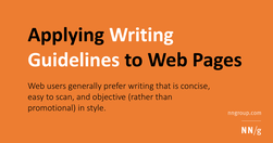
Web users generally prefer writing that is concise, easy to scan, and objective (rather than promotional) in style. We incorporated these and other attributes into a redesign of Web content. The rewritten website scored 159% higher than the original in measured usability.
www.nngroup.com
Use this curated set of free NN/g templates and guides for inspiration and to accelerate your product development activities and UX career.
www.smashingmagazine.com
Designing for digital products requires a different mindset than traditional websites. It’s all about continuous adaptation, refining, and iterating as user behavior and needs evolve. Paul Boag reflects on the key differences, including how the frequency of usage impacts your design approach and what you can do about it.
www.linkedin.com
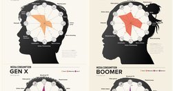
With frequent myths and actual behavior patterns that go beyond heavy use of social media
www.nngroup.com

Use this glossary to quickly clarify key terms and concepts related to UX deliverables.
psychologymeetscopywriting.substack.com
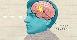
Create engaging stories by synchronizing with the readers’ brains.
www.forbes.com

Artificial intelligence has revolutionized everything from customer service to content creation, giving us tools like ChatGPT and Google Gemini, which can generate human-like text or images with remarkable accuracy. But there’s a growing problem on the horizon that could undermine all of AI’s achievements—a phenomenon known as "model collapse."
www.nngroup.com
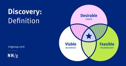
Although many different instigators, roles, and activities are involved in a discovery, all discoveries strive to achieve consensus on a problem to be solved and its desired outcomes.
jakobnielsenphd.substack.com

Stakeholders deem UX work to be “obvious” | Rubric for scoring insightful use of AI | Make it easy to see all user-contributed photos | New image-generation model from Black Forest Labs
boagworld.com

Learn how to boost website conversion rates through effective objection handling. Identify concerns, address them proactively, and implement strategies to build trust and drive sales.
www.buttonconf.com
Naming is in our nature. It’s a way to express ourselves and signal an object’s significance. Naming products, features, and plans effectively is more about logic than imagination. Names signal a product’s purpose, benefit, or behavior and collectively align user expectations with functionality and value.
www.nngroup.com
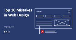
The ten most egregious offenses against users. Web design disasters and HTML horrors are legion, though many usability atrocities are less common than they used to be.
tulkit.substack.com
Content creation is more like building with Legos. You take different pieces and put them together to make something new. You start with a bunch of ideas, tools, and resources. Your job is to piece them together in a way that makes sense and connects with your audience. This means planning, organizing, and even redoing things.
www.nngroup.com
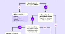
It’s easy to place too much trust in genAI tools. Use only information you can verify or recognize to be true.
www.nngroup.com

Unsure where to start? Use this collection of links to our articles and videos to learn how users interact with the web and how to design effective web user experiences.
www.nngroup.com
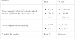
Researchers often want to ask about sensitive topics in surveys and screeners. A sensitive question is one that respondents might find embarrassing or invasive. Handle them appropriately and delicately to avoid dropoffs and inaccurate data.
boagworld.com
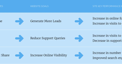
How do you know your site is succeeding? How do you know if that redesign was worth it? How can you justify your work to clients or management? You need a way of measuring success.
www.forbes.com

The prompt addition to make ChatGPT-written content not sound like ChatGPTHere’s the prompt addition, to use when giving ChatGPT a writing task. Add at the end of your prompt, after you’ve described the desired writing style of your generated content, and after you’ve set up the task and structure. Revisit your past conversations to see how much d…
medium.com

Being a lone content designer (also known as UX writer) can be tricky — no one to help with those quick questions, feedback from non-content designers, and lots of work from every direction. But we have a great opportunity in front of us. Here are my tips for navigating being a lone content designer based on my experience at Gett.
uxdesign.cc
Whether you identify as a content designer, strategist or UX writer, it’s likely you’ve thought about where you go from here.
www.nngroup.com
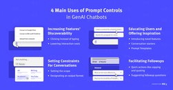
When following good practices, prompt controls can increase the discoverability of genAI chatbots’ features, offer inspiration, and minimize manual user input.
raindrop.io
A growing directory of free articles, tools and resources to help you write clear, accessible content.
www.nngroup.com

Unsure where to start? Use this collection of links to our articles and videos to learn how UX can build trust, influence, and partner with product managers to drive positive product outcomes.
jakobnielsenphd.substack.com
Do you feel that you don’t know enough about AI and what it will do to your industry? You are not alone. The Wall Street Journal reports that a survey of 10,000 workers and executives cited AI as a reason 71% of CEOs said they had “impostor syndrome.”
jakobnielsenphd.substack.com
There’s a classic proverb saying that “the nail that sticks out gets hammered down.” However, in a user interface, an item that looks out of place is more likely to be ignored than to be attended to. This is a tweak on the classic usability observation of banner blindness.
jakobnielsenphd.substack.com
While Suno 3.5 is indeed faster than version 3, it took me a while to realize the trick they use to make users think that the service is much faster than it actually is.
www.nngroup.com
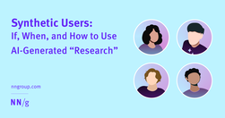
Synthetic users are fake users generated by AI. While there may be a few use cases for them, user research needs real users.
www.nngroup.com
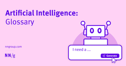
Use this glossary to quickly clarify key terms and concepts related to artificial intelligence.
linkedin.com
Psychology plays such a huge role in user interface and user experience design. Nowhere is this more obvious than in the arena of charity web design.
Loading more...