Curated Resource ( ? )
Time to kill the annoying popups
Curated:
19/06/2024 from
uxdesign.cc/time-to-kill-the-annoying-popups-c7430cf10c29
my notes ( ? )
I remember when The Internet was this cool new place. I have“surfed” it’s pixellated waves going from page to page eating up information.
Looking at photos, videos, reading, learning.
When you liked something you bookmarked it. Emailed the link to a friend and so on.
Those were the days…
Let’s UX the S*** out of it.
Then the offensive of bad UX has started.
Of course that BAD UX™ was intially “good UX ©”. They researched some new patterns and found out that:
If you hide the entire page a few seconds in under a “sign up to our newsletter popup” a lot of people will do it. We have the numbers to show it!
Like all novelty that has quickly worn off.
The European Union™ has also added their five euro-cents to the mix with OBLIGATORY cookie information (and a consent button) on nearly every internet page. 😖
Side note: my personal website michalmalewicz.com doesn’t have that annoying ugly popup. I decided to NOT have any cookies (even statistics) because I want my website’s experience to be about information, not annoyances.
That GDPR / Cookie policy is eating up vertical website space and breaking immersion. Maybe that’s the reason why most websites look the same nowadays. 🧐
Imagine going to a movie theater and seeing a disclaimer box on the screen for the first 20 minutes. That’d break the immersion too. 😢
The numbers now tell a different story.
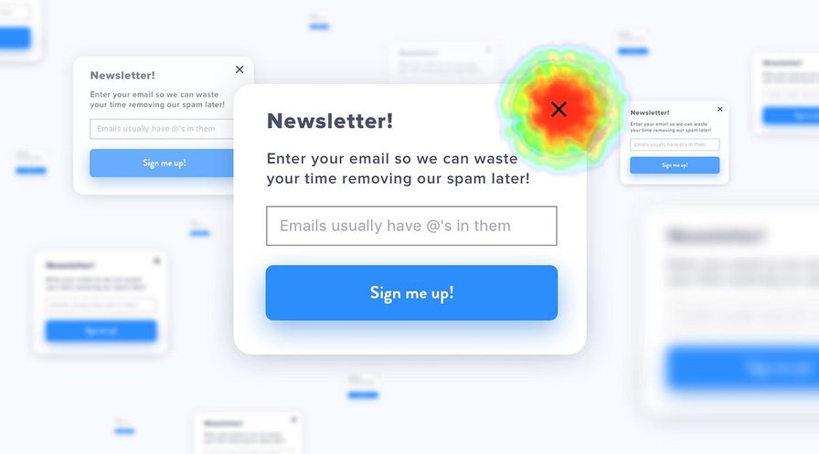
We’ve done a couple of hotjar analytics exercises lately on three completely different websites. Guess what was the most popular, most often clicked thing on all of them.
Was it the CTA, you ask?
Nope. It was the smal “X” to close the newsletter popup. 80% clicks on average. And maybe people were saving that one click for the CTA, but wasted it on the X. Who knows 🤣
But seriously…
If most people are now instinctively closing these popups, then maybe it’s time to actually stop using them this way? Is that the only way you can convince people to sign up for your newsletter?
Or maybe you can deliver good enough content so they will sign up anyway? Without annoying popups?
If you’re building websites think about that and persuade your team to destroy the immersion breakers. Deliver an experience around your brand, not frustration.
It’s time to reclaim the web!
We want it back! Every time a new website jumps a popup at you, close the tab. As quickly as possible. Show those number crunching “marketers” the exact moment you quit.
If there’s enough of us doing that maybe we can make a difference.
The other alternative is practicing aiming, as those X’s are getting smaller and smaller every year.
You in?
Read the Full Post
The above notes were curated from the full post uxdesign.cc/time-to-kill-the-annoying-popups-c7430cf10c29.Related reading
More Stuff I Like
More Stuff tagged popups , user interface design , user experience design