Filter 464 resources:
- user experience (108)
- ux (102)
- ux design (60)
- content design (43)
- web writing (42)
- guides (41)
- artificial intelligence (41)
- ai (40)
- clear writing (39)
- user experience design (38)
- design (36)
- guidelines (35)
- user experience research (33)
- content creation (29)
- usability (24)
- accessibility (22)
- user behaviour (22)
- ux research (21)
- writing for web (21)
- web design (21)
- psychology and ux (20)
- user interface design (20)
- ux writing (18)
- design for websites (17)
- copywriting (16)
- information architecture (14)
- study guide (14)
- interface design (14)
- design patterns (13)
- cognitive psychology (11)
- clear navigation (11)
- communication (11)
- cognitive bias (11)
- ui (11)
- visual design (11)
- user research (10)
- digital communication (9)
- research methods (9)
- design and ai (9)
- content management (9)
- readability (9)
- writing for digital (8)
- style guide (8)
- heuristics (8)
- usability heuristics (8)
- audience research (8)
- usability testing (8)
- search engine optimisation (7)
- biases (7)
- navigation (7)
- writing (7)
- seo (7)
- behavioral science (7)
- interaction design (6)
- chatgpt (6)
- prototyping (6)
- clean language (6)
- web architecture (6)
- content structure (6)
- web content (6)
- writing sample (6)
- web usability (6)
- online reading (5)
- wireframe (5)
- content strategy (5)
- design for mobile (5)
- pdf (5)
- team building (5)
- web copywriting (5)
- content (5)
- glossary (5)
- information (5)
- images (5)
- generative ai (5)
- design thinking (5)
- links (5)
- eyetracking (5)
- photos (5)
- fake news (4)
- design system (4)
- task based approach (4)
- user interface (4)
- figma (4)
- customer (4)
- prompt structure (4)
- design process (4)
- plain language (4)
- visuals (4)
- task completion (4)
- prompt engineering (4)
- recognition (4)
- visual content (4)
- user journey (4)
- card sorting (4)
- genai (4)
- user testing (4)
- ux slogan (4)
- disinformation (4)
- team-leader (3)
- kpi (3)
- generative artificial intelligence (3)
- inclusive design (3)
- analytics and metrics (3)
- ui design (3)
- know your audience (3)
- web development (3)
- user satisfaction (3)
- memory distortion (3)
- channel-optimised content (3)
- error messages (3)
- artificial-intelligence chatbot (3)
- user interview (3)
- accordions (3)
- application design (3)
- forms (3)
- agile (3)
- conversation (3)
- architecture (3)
- visual communication (3)
- interaction (3)
- ai interactions (3)
- teams (3)
- social media (3)
- webwriting (3)
- reading pattern (3)
- management (3)
- words matter (2)
- bad ux (2)
- mobile design (2)
- personas (2)
- distributed teams (2)
- design kpi (2)
- user flow (2)
- findability (2)
- digital reading (2)
- autonomy (2)
- openai (2)
- content audit (2)
- conversational ai chatbot (2)
- pattern recognition (2)
- trust (2)
- bad ui (2)
- features (2)
- documents (2)
- websites (2)
- flow (2)
- collaboartion (2)
- user mistakes (2)
- structure (2)
- customer experience (2)
- f-shaped pattern (2)
- product design (2)
- complexity (2)
- search (2)
- discoverability (2)
- mobile ux (2)
- multimedia (2)
- leadership (2)
- science communication (2)
- understanding (2)
- data protection (2)
- workflow (2)
- news (2)
- impostor syndrome (2)
- llm (2)
- patterns (2)
- website structure (2)
- metrics (2)
- persona (2)
- self confidence (2)
- team organisation (2)
- career (2)
- hick's law (2)
- tree-testing (2)
- clear menu (2)
- headlines (2)
- usability tests (2)
- misinformation (2)
- open links in the same or a new browser tab (2)
- tables (2)
- templates (2)
- media (2)
- responsive design (2)
- imposter syndrome (2)
- sentence length (2)
- design principles (2)
- publishing (2)
- print reading (2)
- adaptive web design (2)
- layer cake pattern (2)
- voice and tone (2)
- ux and ai (2)
- testing (2)
- web analytics (2)
- tasks (2)
- chat gpt (2)
- bullet points (2)
- dark patterns (2)
- be a better person (2)
- burn out (1)
- code-switching (1)
- comprehension (1)
- top task approach (1)
- popups (1)
- mailchimp (1)
- checkboxes (1)
- number of clicks (1)
- email marketing (1)
- heat map (1)
- ux for mobile (1)
- ux copywriting (1)
- lists (1)
- job story (1)
- climate crisis (1)
- diet (1)
- visual-design principles (1)
- content innovation (1)
- consultant (1)
- html (1)
- homepage (1)
- redesign (1)
- jargon (1)
- life-hacks (1)
- storytelling (1)
- calculators and quizzes (1)
- content testing (1)
- a (1)
- breadcrumbs (1)
- google (1)
- banner blindness (1)
- key performance indicators (1)
- visual hierarchy (1)
- typography (1)
- minimalism (1)
- bullshit (1)
- user onboarding (1)
- syndrome (1)
- algorithm (1)
- channels (1)
- edge cases (1)
- numbering (1)
- data visualisation (1)
- ux design strategy (1)
- cookie permission (1)
- loading speed (1)
- morale (1)
- vr (1)
- calculator and quizzes (1)
- cultural probe (1)
- heart model (1)
- connection (1)
- scanning (1)
- clarity (1)
- paradox of choice (1)
- desktop (1)
- mvp (1)
- impostor (1)
- balance (1)
- get things done (1)
- recall (1)
- consumption (1)
- conversation with an ai (1)
- social (1)
- long sentences (1)
- offline audience (1)
- simple language (1)
- imperative (1)
- fonts (1)
- jakob's law (1)
- impact measurement (1)
- debunking (1)
- words (1)
- smartwatch interaction (1)
- reporting (1)
- naming (1)
- demographic questions (1)
- gaze patterns (1)
- legal documents (1)
- read more (1)
- grit (1)
- reading score (1)
- processing (1)
- overpublishing (1)
- clear language (1)
- reaching people (1)
- empowerment (1)
- convertkit (1)
- surveys (1)
- categorisation (1)
- training (1)
- photography (1)
- intranet (1)
- metadata (1)
- local navigation (1)
- optimisation (1)
- paradigm (1)
- ux interviews (1)
- photo (1)
- environment (1)
- remote usability testing (1)
- apathy (1)
- email service (1)
- accessibility checklist (1)
- video (1)
- person (1)
- team (1)
- usability assessment (1)
- qr code (1)
- happiness (1)
- nudging (1)
- file naming (1)
- migration (1)
- barlund's transaction model (1)
- choice (1)
- curse of knowledge (1)
- customer journey (1)
- web vs native app (1)
- transmission model (1)
- well-being (1)
- resentment (1)
- authority (1)
- marketing (1)
- user habits (1)
- neurodiversity (1)
- quantitative usability testing (1)
- product designer (1)
- decision making (1)
- tablet (1)
- smart watch (1)
- self-improvement (1)
- users are stupid (1)
- privacy (1)
- discovery (1)
- self-growth (1)
- illegal ux (1)
- strategic user-driven project assessment (1)
- zigzag pattern (1)
- minimal viable product (1)
- platform (1)
- well being (1)
- podcast (1)
- impact (1)
- professional association for design (aiga) (1)
- product management (1)
- be (1)
- text (1)
- research (1)
- project management (1)
- agent (1)
- easy-to-read (1)
- quantitative research (1)
- communication training (1)
- breakpoints (1)
- reading comprehension (1)
- stress (1)
- better (1)
- cognitive load (1)
- expectation (1)
- social science (1)
- unethical ux patterns (1)
- multichannel (1)
- supa (1)
- politics (1)
- live validation (1)
- pagination (1)
- natural language ai chatbot (1)
- virtual-reality (1)
- networks (1)
- scrolling (1)
- response time (1)
- mobile accessibility (1)
- skimming (1)
- web maintenance (1)
- framing (1)
- mobile (1)
- repository (1)
- prompt frames (1)
- content inventory (1)
- double diamont model (1)
- map (1)
- user task (1)
- information patterns (1)
- designing for older adults (1)
- data visualisations (1)
- product manager (1)
- work-life (1)
- emotional design (1)
- analytics (1)
- branding (1)
- working from home (1)
- remember (1)
- internal communication (1)
- remote working (1)
- chunking (1)
- link label (1)
- empathy maps (1)
- grow (1)
- restore (1)
- qualitative testing (1)
- files (1)
- contract templates (1)
- clicks (1)
- user story (1)
- rot analysis (1)
- cross-functional team (1)
- quantitative (1)
- maps (1)
- self esteem (1)
- accuracy (1)
- pinball pattern (1)
- development (1)
- data-viz (1)
- engagement (1)
- political communication (1)
- footer (1)
- user feedback (1)
- website menus (1)
- focus groups (1)
- business (1)
Relevant Overviews
How minimizing reader decisions makes writing more powerful 💪

Text makes up the entire web. How you write and format your text can make it more readable for everyone and more accessible for people with disabilities. Some text accessibility issues include underlined text, justified text, and very small text. Each of these is easy to avoid and fix.
Content should be written and structured to help them understand and take the most important actions.
Typefaces are groups of designed text characters, such as Arial, Helvetica, and Times New Roman. Fonts are sub-sets of typefaces that have a consistent appearance, such as a 14 point and bold font in the Arial typeface. Typography—how typefaces and fonts present text—is very impactful on reading, which is a core component of visual accessibility.
Helpful guides and starter kits to design effective journey maps that generate insights
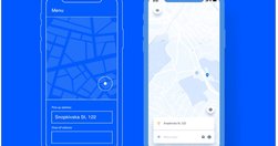
Wireframes miss the plot on nearly every perceived benefit. Here’s how to stop wasting your time and produce better designs faster.
Wireframes miss the plot on nearly every perceived benefit. Here’s how to stop wasting your time and produce better designs faster.

Wireframes miss the plot on nearly every perceived benefit. Here’s how to stop wasting your time and produce better designs faster.
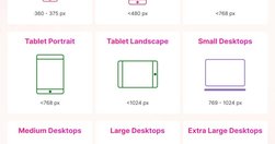
This cheat sheet shows the design breakpoints in detail including minor and major breakpoints. Designers often pick 3 major breakpoints to aim for responsiveness: 💎 480 px 💎 768 px 💎 1024, 1280, or 1440 px You have to define the breakpoints based on the content and layout of the design.
comprehensive design system for enterprise products for employees and IT operations — with data visualization, workspace templates, conversational interfaces, on mobile and on desktop. Some kits are work in progress, others are very advanced.
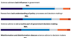
Killer viruses. Artificial intelligence. Extreme weather. Microplastics. Mental health. These are just a few of the pressing issues on which governments need science to inform their policies. But the systems that connect scientists with politicians are not working well...
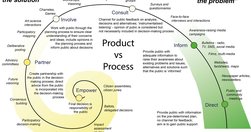
Reaching beyond the immediate, easy and accessible but narrow science-informed and science-aware audiences requires a deep and enduring focus on processes of engagement and partnership rather than dissemination products. It's a mindset switch to seeing the public as the solution to the communication challenge.
The truth about navigation patterns Four patterns that drive results How to make faster UI decisions in Figma
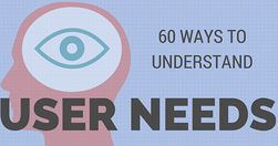
People new to user research often think of surveys and focus groups as the main ways to get insights into customer needs. Here are 60 alternative ideas you might want to try.
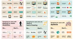
Guidelines to understand and design for Dyslexia, Dyscalculia, Autism and ADHD
SUPA: A strategic UX service to validate projects early. Align user needs with business goals, mitigate risks, and shape product strategy from the start.
These are the official guidelines for the Plain Writing Act of 2010. We developed these guidelines to help you and your agency write clearly, so your users can: Find what they need Understand what they find Use what they find to meet their needs
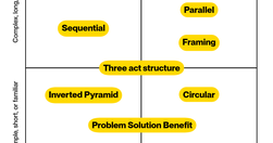
10 patterns to structure your content for understanding, engagement, and effectiveness - and a matrix to help you choose the right one.

Each product has a unique user base with distinct behaviors and preferences. Applying generic strategies without understanding the specific user base is like trying to solve a puzzle while blindfolded.
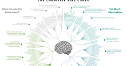
UX & Psychology: Guides and Cheatsheets. With useful resources on how people think, decide, remember and focus attention — guides, glossaries, Miro/Figjam boards and cheat sheets (LinkedIn post by Vitaly Friedman)
Golden Rules For UX Writing. With practical guidelines on how to avoid confusion and help people understand better (LinkedIn post by Vitaly Friedman)
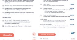
Free Practical Guides To Web Accessibility. With useful guidelines and books to designing with accessibility and run accessibility testing (LinkedIn post by Vitaly Friedman)
Hi and welcome to User Inyerface, a challenging exploration of user interactions and design patterns. To play the game, simply fill in the form as fast and accurate as possible.
Inspired by Reddit r/badUIbattles (a joke subreddit for intentionally bad UI designs), I created BadUI as an open repository for BadUI's made by me and others. This repository contains all best (or worst?) bad-UI I've seen.

A simpler approach to a complicated topic.

So, the “content research beyond competitor analysis” approach helps us bring unique and fresh perspectives to our content research, creating incredible value for our audience and clients and scaling our SEO results extensively.
UX has come a long way since its early beginnings at Bell Labs in the 1940s. As we enter Year 2 of the AI revolution, it’s clear that the core principles of UX design are not being replaced but are evolving with AI integration.
Effective icons depend on recognizability and interpretation. Evaluate them with methods appropriate for your specific research questions
Web users generally prefer writing that is concise, easy to scan, and objective (rather than promotional) in style. We incorporated these and other attributes into a redesign of Web content. The rewritten website scored 159% higher than the original in measured usability.
Loading more...
