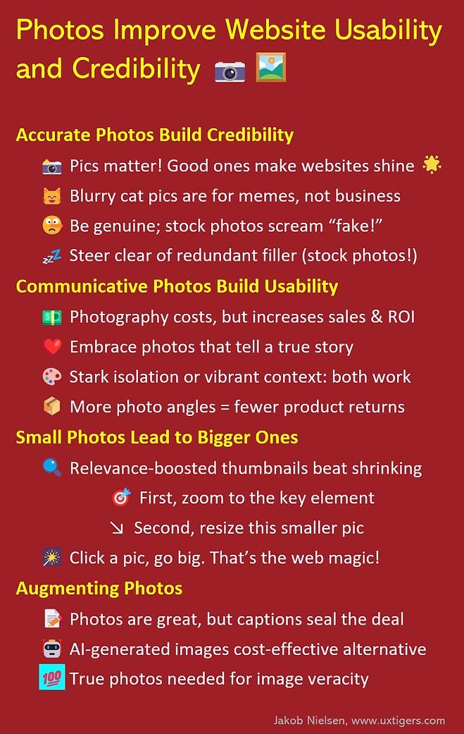
Photos Improve Website Usability and Credibility

my notes ( ? )
Here’s a great example of content-enriching photography from an article by SeriousEats.com on how to prepare a steak with sous vide (a cooking technique):
The imagery here is not mere decoration but a communicative force in 5 ways:
- Show, don’t tell. I can see how beef looks when cooked to various temperatures, which is a much better way of communicating than only using words like “rare” or “medium,” which have different interpretations. Even if I don’t agree with the author’s labels, I can recognize the steak that suits my preference and then dial in that temperature on my sous-vide cooker.
- Specific. The figure shows the exact temperatures used to cook the steaks the author considers rare, medium, and well-done. Steaks are also shown for the two common intermediate values of medium-rare and medium-well, and I don’t think any meat lover will need to have those two steaks labeled to understand the photo.
- Credible. Everything else in that article and on that website now has elevated credibility because the author bothered to cook 5 steaks and photograph them. Based on the photo, I believe SeriousEats.com isn’t fabricating information but is a reliable source of culinary wisdom that merits trust.
- Good photo technique. Clear image, crisp focus, well-lit, no extraneous background or foreground. Just the steaks, ma’am.
- Highly detailed. The steaks are big enough in this photo that we can easily discern specific details and the exact appearance of the meat at each temperature.
Extra credit to SeriousEats.com for supporting international users by stating temperature readings in both Fahrenheit and Celsius. (This is not a photo issue, but a critical usability guideline nonetheless.)
Bad Web Photos
The internet is blighted by subpar photography that reverses one or more of the above bullets:
- Not showing anything important. Redundant filler photos induce unnecessary scrolling, prolong download time, and squander users' time as they attempt to make sense of meaningless imagery.
- Generic. For example, a generic stock photo of a steak on a skillet (or even in a sous vide machine) would not be helpful. Even a photo of a medium-rare steak (labeled as such) that had been cut through to show us its color would not be nearly as valuable as the progression of 5 steaks cooked at a spectrum of temperatures.
- Unbelievable. Stock photos often violate this guideline as well. How many customer service staff look like supermodels with perfect makeup? I’m not saying that you must shoot staff on a bad hair day because everybody wants to look good in photos, but actual photos of real team members are more credible than anything that clearly comes from a catalog.
- Blurry photos or poor technique. Bad lighting, flawed color correction, wrong focus (or too narrow focus, blurring essential elements of bigger objects) — the number of ways a photoshoot can go wrong is legion.
- Insufficient detail. Usually caused by using a too-small photo. Since I was the champion of small images during the Internet’s dial-up era (in defense of snappy response times), you may be surprised to see me condemn small photos. But often, photos are only useful if they’re big enough to show all the details of interest. One way of compromising is to initially show a thumbnail and then enlarge the photo when the user clicks the thumbnail. But even thumbnails need to be big enough that users can differentiate them and click only the one(s) of interest. And when the user asks for a photo to be enlarged, you need to make it really big, not just 25% bigger.
Read the Full Post
The above notes were curated from the full post jakobnielsenphd.substack.com/p/photography?utm_source=post-email-title&publication_id=1748390&post_id=138290673&utm_campaign=email-post-title&isFreemail=true&r=2wvv4&utm_medium=email.Related reading
More Stuff I Like
More Stuff tagged photography , usability , visual communication , photos , visuals , images
See also: UX