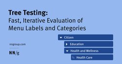
Follow these tips to effectively evaluate a site’s navigation hierarchy and to avoid common design mistakes.
ite “Golden Rules,” that are applicable in most interactive systems. These principles, derived from experience and refined over three decades, require validation and tuning for specific design domains. No list such as this can be complete, but even the original list from 1985, has been well received as a useful guide to students and designers.

If you're a marketer, manager, developer, designer or writer wanting to up your UX writing game, then these guides are right up your alley.
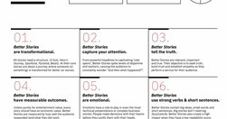
Link collection (LinkedIn post by Vitaly Friedman): Free Storytelling Masterclass (+ PDFs) (https://lnkd.in/eiFscUtf), a comprehensive guide with 9 modules on storytelling, PDF worksheets, 1-pager sketchnotes, reading lists, free lectures, video courses, etc. Kindly shared by Jeremy Connell-Wait
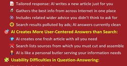
Content creators face reduced search traffic due to AI's prowess in delivering tailored answers, challenging traditional SEO strategies. Social will also drive less traffic. Permission marketing will be the main way to survive on the Internet.

To maximize the benefits to humanity, decisions to deploy AI solutions must be based on comparing AI with the average performance of unaided humans, not an unrealistic comparison with the single best human or with unachievable perfection.

In a case study of ChatGPT evaluating 12 e-commerce screenshots, most of the AI-driven redesign suggestions were inconsistent and untrustworthy. Human UX expertise must be employed to judge UX advice from AI.

Modern day UX research methods answer a wide range of questions. To help you know when to use which user research method, each of 20 methods is mapped across 3 dimensions and over time within a typical product-development process.

A bottom sheet is a user-interface pattern used commonly in mobile apps for providing contextual details or controls in the lower area of the screen. Definition: A bottom sheet is an overlay that is anchored to the bottom edge of a mobile device’s screen and that displays additional details or actions.
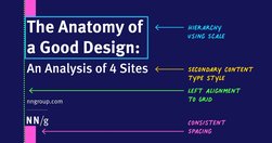
Visually pleasing designs use consistent type styles and spacing, create a visual hierarchy, and utilize an underlying grid structure.
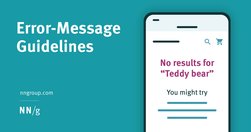
Design effective error messages by ensuring they are highly visible, provide constructive communication, and respect user effort.

AI is introducing the third user-interface paradigm in computing history, shifting to a new interaction mechanism where users tell the computer what they want, not how to do it — thus reversing the locus of control.
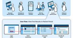
User journeys and user flows both describe processes users go through in order to accomplish their goals. While both tools are useful for planning and evaluating experience, they differ in scope, purpose, and format.
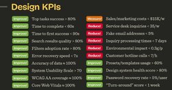
Good design decisions are intentional. They aren’t guesses nor a matter of personal preference. They are deliberate and measurable. Over the last few years, I’ve started using design KPIs that inform and guide design decisions. - by Vitaly Friedman
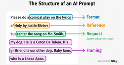
Most prompts contain a combination of the following components: request, framing context, format specification, and one or more references to previous answers or external sources. There are also 3 types of unconventional prompts that do not follow this structure: "Can you do X," "Give me more," and filler prompts.

Use generative-AI tools to support and enhance your UX skills — not to replace them. Start with small UX tasks and watch out for hallucinations and bad advice. All UX professionals should use AI: it’s helpful at any level of seniority and for many tasks within the UX lifecycle (including research, design, and writing).
When interacting with generative-AI bots, users engage in six types of conversations, depending on their skill levels and their information needs. Interfaces for UI bots should support and accommodate this diversity of conversation styles.

Free study guides by Nielsen Norman group on almost every UX topic. Each study guide is a curated collection of free articles and videos, organised by theme and suggested reading order.
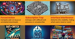
New regulations from the Government of India prohibit the use of 12 common dark design patterns. These sneaky practices are unethical applications of established UX knowledge to make interface designs that harm users instead of helping them.

ChatGPT is a bullshit generator. AI systems ... are trained with text from Twitter, Facebook, Reddit, and other huge archives of bullshit, alongside plenty of actual facts (including ... text ripped off from professional writers). But there is no algorithm in [AI] to check which parts are true.
UX Guidelines For... Almost Everything! Design patterns and best practices, from dashboards, data tables and filters to onboarding, sorting and search UX -- by Vitaly Friedman, UX Designer • Smart Interface Design Patterns • Founder/Editor-in-chief of SmashingMag

Two short infographics define UX and summarize why and how to run UX projects. Show to your boss or colleagues who don’t understand UX. This ticket to UX mastery only requires 3 minutes of your time.
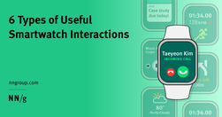
Smartwatches are for more than just receiving notifications and tracking steps. They afford at least 6 different types of interactions that users find useful.

Techniques like summaries, bullet points, callouts, bolding, and helpful visuals improve comprehension and engagement with content exceeding 1,000 words.
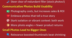
High-quality, detailed photographs convey information with authenticity, fostering trust in the content provided on a website. Investing in premium images is essential, as indistinct or amateurish pictures can perplex users and erode credibility. But AI-generated images can sometimes substitute at drastically lower cost.

Use this glossary to quickly clarify key terms and concepts related to research methods in UX.

In a case study of ChatGPT evaluating 12 e-commerce screenshots, most of the AI-driven redesign suggestions were inconsistent and untrustworthy. Human UX expertise must be employed to judge UX advice from AI.

For its first two years, the web was a text-only medium with a command-line user interface similar to the UI for current generative AI tools like ChatGPT. Only after GUI browsers launched in 1993 did the web explode. AI needs a similar GUI revolution in usability.
Two new user behaviors are prevalent in interactions with text-based AI chatbots. User research shows the iterative and often complex ways users engage with AI tools for productivity.

User interviews help you learn who your users are, what their experiences are like, and what they need, value, and desire.