Heuristic evaluation is the activity of using a set of guidelines (heuristics) to evaluate if an interface is user-friendly. Let’s look at what heuristics are and how you can conduct a heuristic evaluation to improve the usability of your designs
Individuals often modify their behavior if they know they are being observed. That phenomenon became known as the Hawthorne effect or the observer bias. We can mitigate this effect by building rapport, designing natural tasks, and spending more time with study participants.
I came across those two talks.In view of work load, deliverables, priorities, dissemination and channels and activities to communicate on...I thought watching those might have some good inspiration, food-for-thought, something for everyone.In my case, I can take a lot to think about and apply the web; user behaviour, accessibility, web writing a…
Scientists need to have some understanding of audiences to improve the chance of a true dialogue. Science communication requires well-trained science communicators with a high-level of skill and expertise to help people to understand research.
Never be afraid to speak up, simply because you feel there are more valuable voices in the room.

Think you can multitask well? Think again. Take this test.
This blog post was submitted to online course "Professional Communication: Business Writing and Storytelling" (Economist Education) . It was then adapted and used on an intranet. "Easy writing makes hard reading" - Ernest Hemingway "The discipline of the written word punishes both stupidity and dishonesty" - John Steinbeck

Five texts that explain how to write simply and well: 1 Politics and the English Language - 2 Style: Lessons in Clarity and Grace - 3 On Writing Well: The Classic Guide to Writing Nonfiction - 4 The Sense of Style: The Thinking Person’s Guide to Writing in the 21st Century - 5 Merriam-Webster’s Dictionary of English Usage.

It's like learning a new language - kind of.
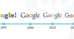
People get easily bored with trends, and every few years, the pendulum swings from one way to another. We have all seen the rise and fall of iconic fashion pieces or art movements. The same thing happens in User Interface (UI) design.

Your constantly-updated definition of Mobile User Experience (UX) Design and collection of topical content and literature

In a distracted environment, the best form of smartphone interaction is a high-speed, easy-to-use one. Luke calls the typical mobile usage a "one thumb, one eyeball" experience, since the highly distracted environment causes most mobile users to engage in one-handed use with short spans of partial attention.

It’s not about learning a fixed number of prompts; it’s about mastering the art of creating well-structured, clear, and specific prompts that cater to your unique needs and interests. With the help of refining your prompt crafting skills, you can ensure that your interactions with ChatGPT consistently produce the best possible outcomes.
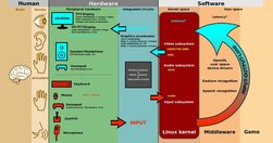
The easier your mobile application is to learn to use and the easier it is for your users to find the functionality to learn it – the more useful that application is likely to be to the user. The user experience is also likely to greater.

Hick’s Law (or the Hick-Hyman Law) states that the more choices a person is presented with, the longer the person will take to reach a decision. Named after psychologists William Edmund Hick and Ray Hyman, Hick’s Law finds frequent application in user experience (UX) design—namely, to avoid overwhelming users with too many choices, thereby keeping

Discoverability is not a new concept for web designers. In fact Search Engine Optimization and various forms of Search Engine Marketing arose from the need to make websites easy to discover by users. In the mobile application space this issue of discoverability is becoming ever more important – with nearly 700 apps a day being released on Apple’s s

A good design process: How is someone navigating through it? How are these things co-located together? Which pages are we grouping together? Can people find them? ... less attached to the tone of voice and more interested in simplicity and utility ... more like an architect than a prose-writer, putting LEGO blocks together in the most useful w…

ProPublica’s plain language experiment is a first for a mainstream news organization. Disability experts say it shouldn’t be the last.

An examination of translating text to make it as accessible as possible. Looking at how to make writing easier to read

Easy-to-read information is important for people with intellectual disabilities. It is important so they can: Learn new things. Take part in society. Know their rights and stand up for them. Make their own choices.

If a website is difficult to use, people leave. How to define usability? How, when, and where to improve it? Why should you care? Overview defines key usability concepts and answers basic questions.

Usability assesses how easy user interfaces are to use. Usability is defined by 5 quality components: learnability, efficiency, memorability, errors, and satisfaction.
Surveys asking users to give feedback during or after an interaction should not interrupt the users' task and should be sent to the appropriate channel. They need to be short, easy to complete, and give the user the opportunity to provide details about their experience.

Unsure where to start? Use this collection of links to our articles and videos to learn about quant research, quant usability testing, analytics, and analyzing data.

Unsure where to start? Use this collection of links to our articles and videos to learn about conducting user testing remotely.

Unsure where to start? Use this collection of links to our articles and videos to learn about personas and how to create and apply them.
Unsure where to start? Use this collection of links to our articles and videos to learn about planning, conducting, and analyzing qualitative user testing.

Unsure where to start? Use this collection of links to our articles and videos to learn about design thinking.

Unsure where to start? Use this collection of links to our articles and videos to learn more about the basics of user experience.
