Relevant Overviews
Overview: Writing content
Relevant resources

A good design process: How is someone navigating through it? How are these things co-located together? Which pages are we grouping together? Can people find them? ... less attached to the tone of voice and more interested in simplicity and utility ... more like an architect than a prose-writer, putting LEGO blocks together in the most useful w…

ProPublica’s plain language experiment is a first for a mainstream news organization. Disability experts say it shouldn’t be the last.
An examination of translating text to make it as accessible as possible. Looking at how to make writing easier to read

Easy-to-read information is important for people with intellectual disabilities. It is important so they can: Learn new things. Take part in society. Know their rights and stand up for them. Make their own choices.
What makes a text nice to read? To know more about this, it is important to take a closer look at how people are reading. Additionally, it may be the case that someone is impaired, physically or mentally, to read a text. How does it work?
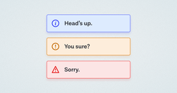
A while back, in the early days of our design system, we had a ticket for a component sitting in our backlog, with the title “Alert.” My initial reaction was “Oh yeah, a colored box with a little icon to the left of it and some text, easy.” Oh dear reader, how naive I was…

After all, we’ve changed dramatically as a news consuming public over the decades; think about how Twitter threads, TikTok videos, and interactive graphics have all burrowed their way into our news habits. Why shouldn’t our most basic story form change as well?

Financial writing is full of jargon and complexity. But a series of research suggests that investors are drawn to simple, clear writing with short sentences. The simple reason is that complex writing is off-putting — people tune out and find it dull, a fact confirmed by neuroscience research.

In this guide, I’m going to teach you my step-by-step process for writing high-converting website copy.

The smaller the word count (and in general, the more concise your online communication), the more users will comprehend and retain your message.

Aaron Berman shared some useful writing tips for anyone writing on complex issues that he learned writing the (US) President's Daily Briefs. Check out the five tips below, illustrated with examples from Star Wars and Star Trek.

Unsure where to start? Use this collection of links to our articles and videos to learn how to write and present information that aligns with users’ needs and online reading behaviors.

...from news media to legal guidance to academic research, the way we write often creates barriers to who can read it. Plain language—a style of writing that uses simplified sentences, everyday vocabulary, and clear structure—aims to remove those barriers.

Plain language and website fonts affect the reading experience more than you think

"...when reading a book excerpt or newspaper article, students were better at recalling “other relevant information” when reading in the print versus the digital medium."

“We found, surprisingly, that no single feature of a headline’s writing style makes much of a difference in forecasting success.”
Forcing users to browse PDF files causes frustration and slow task completion, compared to standard webpages. Use PDF only for documents that users will print. In those cases, following 10 basic guidelines will minimize usability problems.
Research spanning 20 years proves PDFs are problematic for online reading. Yet they’re still prevalent and users continue to get lost in them. They’re unpleasant to read and navigate and remain unfit for digital-content display.

The reasons behind management gobbledygook

“If you are not calling out sections of your web pages or prose on those pages with subheads, you are making a big mistake!” write Pernice et al. “If you take nothing else [away], please take this: Use subheads and subsubheads.”

Take a tip from the Times. Write headlines that: Average 8 or 9 words Never grow longer than 14 words Sometimes have as few as four words

Clarity, not creativity, is the backbone of good UX writing. Choose simple words and craft shorter sentences. Explain acronyms users might not know. Use proper punctuation. Be extra careful about things like cleverness, wordplay, and idioms that might affect usability. Above all, write to be understood.

Probably my biggest frustrations ... is the utter contempt they seem to hold content in. ... they won’t hire a professional copywriter to work on the content ... never teach content creators how to create appropriate web content.

Don’t start with the blah blah blah

Imperative voice gets shared. Imperative voice boosts email click, open and read rates.
"Users rarely read an entire webpage. That means you need to adopt a different style when writing for the web. A style that accommodates this lack of attention."
Want a handy list of the core Clean Language questions? Here goes:
"understand the digital reader’s brain, and to get a couple of concrete writing tips for your next digital text." "Nothing can surpass a text when it comes to transforming abstract thoughts into concrete expression."
The “known-new contract” is a linguistic concept used to describe how writers achieve cohesion between sentences by first presenting what readers already know (information previously presented) before introducing new information.
