Relevant Overviews

A myriad of fields, skills and insights come together to create the overarching discipline of user experience design... Let’s explore five behavioral science insights you can use right now to design better products

In this article we’ll be taking at look at what exactly UX designers mean by the term heuristic evaluation, how to conduct a heuristic evaluation for yourself, what to do if you can’t afford a usability expert, and the difference between a heuristic evaluation and user testing.
Users visit websites and use apps to get things done, so emphasize the content of interest to communicate with your audience. Avoid design pollution that decorates the UI with non-communicative elements.

The foundation of user experience is the difference between the people on the design team and the people using the product. You can't ask users to design, but you also can't ask the designers whether their own design will be easy for the target audience to use.

Some UX designers (and many clients) aim to "jazz up" the design to supposedly engage users. This usually backfires because extraneous design elements get in the way of users' tasks.

The funnel technique is used in user interviews and usability tests and ensures you get rich insights while not compromising validity.

User research is an essential part of UX design. Unless we understand who we are designing for and why, how can we even know what to create or where to begin?

User research is the methodic study of target users—including their needs and pain points—so designers have the sharpest possible insights to work with to make the best designs. User researchers use various methods to expose problems and design opportunities, and find crucial information to use in their design process.

Being aware of our cognitive biases helps to recognize their power in shaping our thoughts, opinions, attitudes and the decisions we make. Let’s check out these effects by analyzing ten cognitive biases that shape our world today.

To strengthen people’s memory skills, we should design interfaces that help users practice recall.

principles of design every graphic designer should be familiar with:HierarchyBalanceAlignmentEmphasisProportionMovementNegative SpaceContrastRepetitionVarietyUnity

Fitts's Law describes how long time it takes to click a target, based on the distance to the target and its size. Use this information to make buttons and links faster to click.

The homepage remains the “front door” for the many users who still begin their browsing experience here. Avoiding the 8 common UX issues discussed in this article is the first step toward improving users’ Homepage experience

Qualitative usability testing aims to identify issues in an interface, while quantitative usability testing is meant to provide metrics that capture the behavior of your whole user population.

We’re not as rational as we think. The human brain is designed to make quick and effective decisions rather than stick to facts at all times. Instead of acting rationally, we prefer to act fast. This may lead to better outcomes indeed, but it might also lead you astray. Cognitive biases can be both a blessing and a curse.

We can’t “fix” our minds and stop making errors in judgment, but we can become more aware of biases that influence our decision making.
Below is a list of cognitive biases and design principles (with examples and tips) for each category. Let’s dive right in.
A good design relies on a thorough task analysis of the steps required to complete a task, as well as determining what information users need at each step.
Even people with limited drawing abilities can learn to sketch a wireframe if they learn a few common conventions used to represent various design elements.

Tried and true principles for the past, present, and future of good design
there are many straightforward methods and strategies for measuring design impact. Two areas I recently combined while exploring the design impact at Gem—where we're building the source of truth for top-of-funnel recruiting—are top tasks and PURE (Pragmatic Usability Ratings by Experts). Here's how I did it.
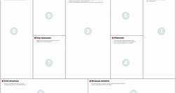
One of these roles is a UX Strategist, which aligns user experience design with the business goals and strategy of the company.

100. When we design products and services, it’s not about what we want them to be — it’s what we want the people using them to be: generous, helpful, thoughtful, useful, beautiful, respectful, kind.
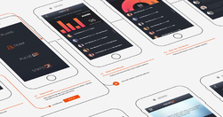
what the differences are between the many different types of visualizations, from “flow-charts” to “User Flows,” and why so many people misunderstand them.

This article explores a few cognitive biases I’ve experienced first-hand as well as strategies for mitigating their influence.
As designers, as creators and managers of websites and apps, we can start by focusing on two principles: Do not track Delete

Any efficient communication requires that communication partners establish and rely on common ground so that they can take communication shortcuts.

Succinctly documenting the right details in key places helps Agile teams avoid information overload. When UX documentation is skipped or disorganized, teams waste time trying to find or remember information instead of improving the product.
For digital designers who want to organise their working files to improve clarity and collaboration within and across teams

Clarity, not creativity, is the backbone of good UX writing. Choose simple words and craft shorter sentences. Explain acronyms users might not know. Use proper punctuation. Be extra careful about things like cleverness, wordplay, and idioms that might affect usability. Above all, write to be understood.